Posts Tagged ‘Ink’

The Working Dead

Thursday, April 19th, 2012

It might be a bit telling that during a conference call yesterday, I doodled this in my daily planner.

The Working Dead Ink Drawing

The Working Dead Ink Drawing

During the meeting I did a quick pencil doodle, and inked it in during my lunch break.

Let’s back up.

Yesterday morning, my alarm went off at 6:30 am, like it always does. In my haze of half-sleep, my first thought was, “why is my alarm going off on Saturday?”

When I realized it was only Wednesday morning, I thought something might be a bit off. I’m been pretty burnt out with the Day Job, and realized I needed a few days away. I looked at my schedule, and realized I could take a couple days off, and so here I am, resting up, and having a “mental health” day, as my Dad would say.

Also gives me time to post again here, and work on a “proof of concept” for an idea I’ve had brewing.

Oh, hey! Now things are looking up!

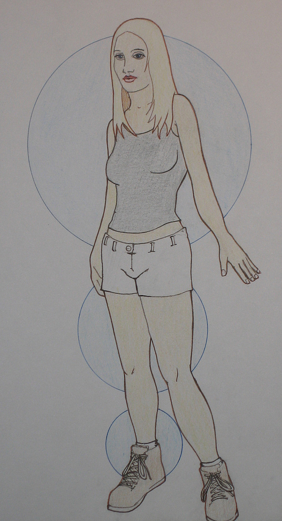
Woman And Circles

Monday, August 1st, 2011

I was at San Diego Comic-Con last week, and it got the illustration juices flowing again.

One of the best parts about Comic-Con for me is being able to talk to the creators about their work, their process, etc.

Whipped this out yesterday.

Woman and Circles

Woman and Circles

I picked up some colored pens at San Diego Comic-Con last week, this is my first time putting them through the ringer.

I’m messing around with using the pens for the drawing outline, and the colored pencils for the color.

Through the Fiery Furnace and the View from the Partition

Thursday, June 10th, 2010

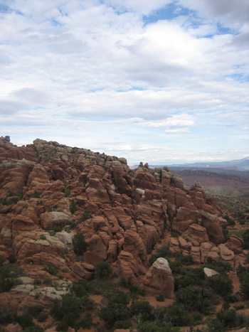
Note: I spent last week in Utah, climbing and roaming around the desert in the middle of nowhere. These posts are about the things I saw, the places I climbed, and sometimes, the drawings I made. Previous day’s journeys include climbing to Angel’s Landing, weaving through Devil’s Garden, and threading the Needles to Druid Arch.

From Thursday, June 3

Fiery Furnace Arches National Park

The Fiery Furnace

Today was my day to relax. No 1,200 foot climbs up mountains, and no 11 mile marches through the desert. I thought I might wake up early this morning to hike out to Delicate Arch at sunrise, but that was not in the cards.

I woke up a little before sunrise, as usual. On this trip, I largely went to sleep when the sun went down, and woke up when the sun came up. For this trip, my bed was the bed of my truck, I never bothered to set up a tent, I didn’t really feel a need.

I also didn’t feel a need to light a fire at night. I did on the first two nights, but then never bothered to collect or buy wood after those first nights. When the sun set, and I had eaten dinner and cleaned up my dishes, I opted to lie in the back of my truck, and watch the stars emerge up in the sky, and feel the air cool. The air cools in discrete steps out here. The air would remain one temperature for several minutes, then I would feel a distinct and sudden drop in temperature by a few degrees.

Into the Furnace

I took my time in the morning, making coffee and cooking up eggs and chorizo. Today I would head back to Arches. I had a reserved spot in a guided walk through the Fiery Furnace.

The Fiery Furnace is similar to Devil’s Garden. It is made up of tall fins of rock closely packed together, creating a maze of canyons and passages. Access to this area is limited, it can only be accessed with a Park Ranger, or with a special permit, issued to people who have been into the furnace before.

The walk itself required a bit of climbing and weaving through narrow bits of rock, at times I had to wedge myself between closely spaced walls of rock and work my way through a crack. We only hiked about 2 miles through the furnace in the 3 hours of the hike, we stopped plenty of times for the Ranger to talk about how water influences the life and architecture of the desert.

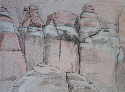
Fiery Furnace Drawing Arches National Park

Ink and Pencil Drawing of rocks in the Fiery Furnace (click to enlarge)

Interesting fact: If you need to refill your cantina, and come across a pool of water, make sure you draw water from the pool with the bugs on it, and the green algae growing at the sides. The crystal clear water probably has poison in it, that is why nothing grows at its side. The green, murky water is good enough for other life, it is probably good enough for you.

After emerging from the furnace, I plopped my down on a rock overlooking the area, and sketched up a section of the rocks that makes up the edge of the Fiery Furnace. It was hot, and the bugs were chewing on my relentlessly. The further along in the drawing I got, the faster I worked.

Afternoon at the Partition

After my morning in the Fiery Furnace, I had an afternoon to kill, and I headed back to Partition Arch. I walked by it two days ago on my way back from the Dark Angel, it is about half a mile to a mile past Landscape Arch.

Devil's Garden Fins Arches National Park

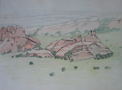
Ink and Pencil drawing of rock fins near Devil's Garden (click to enlarge)

Partition Arch sits high up on a rock mountain, and has a nice open, sloped area underneath that looks out from the edge of Devil’s Garden to an open area of flat desert. In the middle of this open area is an array of rock fins, similar to the one I climbed two days earlier in Devil’s Garden, though these sit all alone.

For some reason these fins stood out to me, and I sat under Partition Arch for the afternoon to draw them.

Drawing rocks is like drawing faces. It is easy to put the elements in place to make the face I am drawing look like a face, but it is far more difficult to make the face look like the person I am drawing. Similarly, it takes effort to make the rocks I draw look like the rocks I am looking at. It is quite easy to make the rocks look like arock, but it takes much more work to make it look like that particular rock.

As I worked I started to think — in the personifying way man is prone to do – that the rocks each had a different personality. Some are quiet and reserved, some big and loud, and some sly, and maybe untrustworthy.

Rock Fins Arches National Park

Rock Fins, on the outskirts of Devil's Garden (click to enlarge)

I know that is not true at all, but I can’t help it. I am man.

When I had enough of being bitten by flies, and I had eaten lunch, and I had finished my drawing, I headed back down the trail. On my way out, I took a small side branch that led down to the plain that the fins I had drawn sat on. I took a few pictures from the back of the fins, from down on their level (it’s possible I will do a woodblock print of these fins, in fact it’s possible I’ve already started carving the blocks).

The day slowly came to an end, the sun went down, I returned to my camp. I slept away, the last night I would spend in Utah.

Next: Walking the (Sync) Line

Dancing Through the Devil’s Garden

Tuesday, June 8th, 2010

Note: I spent last week in Utah, climbing and roaming around the desert in the middle of nowhere. These posts are about the things I saw, the places I climbed, and sometimes, the drawings I made. You can also read about climbing Angel’s Landing from the previous day.

From Tuesday, June 1

“This is the most beautiful place on earth.”

— Edward Abbey, speaking about the canyonlands of Utah, near Moab

I packed up camp Tuesday morning and started the 6 hour drive to Moab.
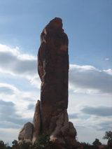
Dark Angel Arches National Park

Dark Angel, at the end of the Devil's Garden Primitive Trail loop

Moab is a small city in southeastern Utah about 3 miles from the entrance to Arches National Park. From what I can tell, the primary business is catering to people visiting Arches. There are restaurants, stores selling trinkets, and all sorts of “outdoor, adventure” themed hotels.

Just before Moab, I turned up the 128 to drive along the Colorado river and find a campground. I pulled into the first one I found, Goose Island Campground, pulled into the first available site along the river, paid my fees, dropped off a chair and tent, and headed for Arches.

By the time I got to the Park, it was late in the afternoon, about 3pm. Perfect time to start a long hike. I drove the windy road through Arches, past the paved lookout points and easy, 0.3 mile paved “trail” around Balance Rock, and finally got to the end of the road, Devil’s Garden trail head.

The first mile or so are an easy, well marked trail — essentially a developed dirt road. There may even be asphalt under the rocks, dirt, and sand along the trail. This ends at Landscape arch, and it is here that I went the primitive route.
Devil’s Garden is named for it’s fins. The rock has eroded in to leave long, narrow, and closely spaced walls of rock emerging up from the ground. This leaves tall rock walls, with deep, narrow canyons in between.

It is not unlike a pod of giant rock sharks, with huge dorsal fins, swimming impossibly close together, just underground, with only their rock fins in layers of brown, orange, red, and white sticking up above the earth.
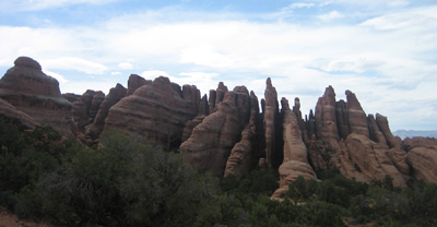
Devil's Garden Arches National Park

The outskirts of Devil's Garden

These fins captivate me in a way I can’t quite explain. I think it is a combination of their orderliness, their giant size, and their peculiarity that intrigues me.

The primitive trail followed a sandy trail away from the main trail, towards the Garden. Soon, I was coming to the outskirts of the fins, and detoured from the trail to walk up one of the fins.

The fin I climbed sloped gently from the ground, and I quickly made it to the high point on the far end. The wind was blowing hard, and I broke out my pad and pencil to sketch out the neatly spaced walls of rock that were in front of me.

I sat on top of this rock, drank some water, ate a granola bar, and worked with my pencils for half an hour or so before turning around to climb back down.
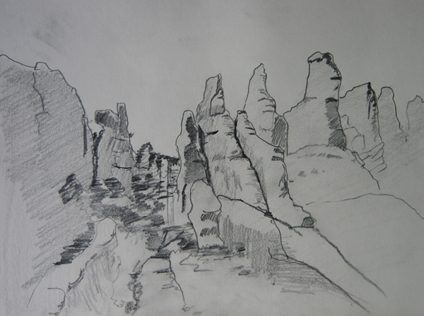
Devil's Garden Pencil Drawing

Pencil Drawing of the fins of Devil's Garden

Soon after I rejoined the trail, it led me into one of the canyons between fins, and before I knew it, I was climbing up, through valleys, over large rocks, scaling sloped rock walls, and generally working my way far back into the middle of nowhere while weaving my way through this rock garden. Climbing Angel’s Landing the previous day made me much more confident on rocks, and I leaped, climbed, scaled, and lifted my way through this magnificent Garden.

I had the trail mostly to myself, I only came across one or two other groups of folks on my way. The solitude was peaceful, and I was able to focus on my footsteps and push myself along at a reasonable pace. The Devil’s Garden trail ends at Double-O Arch, and meets the main trail out to that Arch, which I took back.

But first, I found an Angel.

The Dark Angel is a rock about half a mile past Double-O Arch. It is a tall, dark, pillar of stone that sits out alone, not part of any nearby rock formation. I got to Dark Angel around 6pm, it was time to take a break. I got out my pad and pens, to draw the angel. I figured that if anything was worthy of breaking out the ink, it is the Dark Angel.
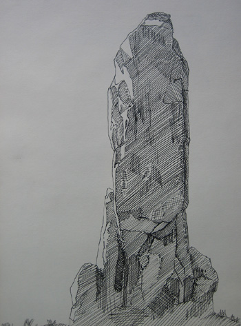
Dark Angel Ink Drawing

Ink Drawing of the Dark Angel

As I drew, flies, and other small, winged insects decided to repeatedly see how I tasted. I had to continually bat the flies from my face and arms.

Eventually, it was late, I was done drawing, and it was time to head back.

I took the main trail back from Double-O Arch, though it was about the same difficulty as the Devil’s Garden trail, just a shorter, more direct path. I made a few detours on the way, Navajo Arch, Partition Arch (which was so nice I would come back in a couple days), Pine Tree Arch, and Tunnel Arch.

As I walked back I thought about the Dark Angel, how it was so different from most of the other rocks out here. It sits apart from everything else, it is at the end of the most remote trail here. In a park of arches and fins of rock, it is a pillar, tall and erect, standing on its own.

I started to think of the Dark Angel as the mighty king of these canyonlands, and all of the Arches as his queens and concubines. I’m sure I can’t be the first to notice this obvious symbolism.

The sun was low in the sky when I got back to the trail head. I drank some water, and started the long drive back to camp. By the time I reached my camp, the sun had set, it was getting dark, and I was starved.

I made dinner in the dimming light, sausages and a can of split pea soup. By the time dinner heated up, I was using a flashlight to see what I was eating. I rolled out my mats and blankets in to the back of my truck, and went to sleep, under the stars, a dozen feet from the Colorado River.

Next: Threading the Needles
Dispatch: The Living Deadline and The Sea Of Lonely

Friday, April 23rd, 2010
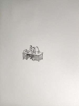
Lonely Desk

A lonely desk. Ink Drawing.

I had some time to doodle a bit in my sketch book when I got home from work last night.

Work’s been on my mind quite a bit lately. I am working under 3 deadlines for 3 different projects, I’m running at about 12 hour days. There isn’t room for much else in my mind other than work.

The Sea of Lonely

When I have deadlines like this, which isn’t often, my head goes to a certain space. Many things run on autopilot, and I just devote my brain energy to churning out the work. I know there is a lot to do, so it is a slow burn of mental energy.

Anyhow, these are last night’s doodles. When I have time, I draw for an hour or so after I get home from work. Work –> home –> draw –> sleep.

This sequence becomes an isolated process, and that was the inspiration for the drawing on the right. When I am in the office at 8pm, after everyone has left, I am in a sea of stuff, but none of it is relevant, except what is in front of me at the time. It’s a sea of loneliness, and I float through it as I work.

Focus is lonely.

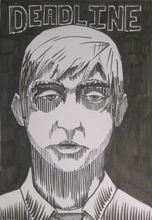
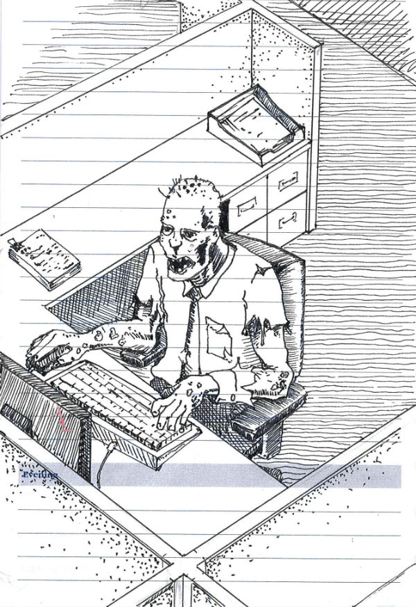
Living Deadline

zombie worker drawing

Night of the Living Deadline, Ink Drawing

As I mentioned, I am working under a few deadlines. Most of my mental energy goes towards meeting these deadlines, except for the few bits I keep in reserve for drawing and typing out these posts.

After a bit of time, I feel like my mind has been sapped, my awareness is down, and I am just lumbering through life, working to meet this deadline.

I started this drawing, not intending any zombie reference, just attempting to capture the worn out look of someone burning on both ends to meet the deadline. It ended up looking fairly zombie-like, and the “living deadline” title presented itself. I was feeling a bit like a zombie when I drew this, it was late and I was tired. I was home from my 4th 12-hour day in a row. The lines are crooked, it’s kind of jacked up. It was drawn by a zombie.

A deadline zombie.

The zombie outbreak is real, and it has been going on for decades. It is the turning of white collar workers into mindless zombies, hell-bent on one task, finishing the project to meet the deadline.

We are all zombies now.


I like this idea, I might flesh this one out.

Ha! Flesh. As in zombie flesh. Get it?

Never mind.

What Is The Difference Between Western Woodblock Printmaking and Japanese Woodblock Printmaking (Moku Hanga)?

Sunday, April 11th, 2010

Executive summary:

Western Woodblock Printmaking uses oil based inks applied to the block with a brayer (roller), and the blocks are sometimes printed with a press, and Japanese Woodblock Prints (aka Moku Hanga) are made with water-based inks applied with a brush, and are printed by rubbing a pad (baren) across the back of the paper.

Disclaimer:

Before I go on, I should make a little disclaimer: I’ve never made a Japanese Style woodblock print. Everything I know about it is from research, reading, and viewing Japanese Woodblock Prints. As a result, I might be a little irreverent.

Also, I am going to use the terms “Japanese Woodblock Printmaking” and “Moku Hanga” interchangeably. Moku Hanga translates to something like “wood pictures” or “wood graphics”, and is the Japanese name for printmaking.

Ink, Wood and Paper

Woodblock Printmaking is the art of using wood to mash ink onto paper. By carving the block of wood, you can control where ink is applied to the wood, and as a result, where it is mashed onto the paper. Sure, it gets complicated as you add detail to the image, and as you carve multiple blocks to include more colors in the print. Basically, however, it is the same principle regardless of how much detail you include. Mashing ink against paper is mashing ink against paper no matter how you spice it up.

…and no matter where in the world you do it.

There aren’t really many differences between Moku Hanga and Western Woodblock Printmaking. The biggest difference is that Japanese Woodblock Prints are, well, Japanese.

Moku Hanga

Japanese Woodblock Prints use water based ink. The water-based inks used for Japanese Woodblock prints give them a particular texture and quality that I have trouble describing, other than to say “it looks like a Japanese Woodcut”. The technique used to print in the Japanese method results in a little more texture than western methods, because the ink is applied by hand. This leads to a little variation in the density of ink throughout the print.

Speaking of “method”, it is the methods that really make a Japanese Woodblock Print what it is. Moku Hanga uses specific carving tools, which all have very specific names. Each specific tool (with its specific name) is used for a specific task.

Registration is done in a specific way, by carving very specific notches into the woodblock. Each of those notches has a specific name too (kagi and hikitsuke).

The paint is mixed in a very specific way, and applied to the block with a specific type of brush. You use a baren to press the paper against the block, to transfer the ink to the block. [Note: a “baren” is a handheld pad used to rub the paper against the block to transfer the ink] There are different barens for different uses.

Japanese Woodblock Prints are printed on a particular type of paper, called Washi, made in a particular way. This is sometimes called “rice paper”, even though it is not made of rice. It is very thin and delicate, however.

The emphasis on method and tradition is very Japanese (for lack of a better way to describe it). It reminds me of the Japanese Tea Ceremony, where everything is done in a particular way, with particular tools.

Western Woodblock Printmaking

Compare this to Western Woodblock Printing, where it seems that by comparison, anything goes. Use whatever roller you want to apply the ink. Any registration method will do, as long as it works. Press it by hand or run it through a press. It’s all good.

The ink used in western Woodblock Prints is typically oil based, though there are some modern water based inks that are designed to imitate the look and feel of the traditional oils (makes everything less messy).

Ink is applied with a brayer (ie. a roller), which results in a very even and smooth application of ink.

Washi paper is sometimes used, though other papers are also used. Rice paper is not required.

Not much difference

So, what is the difference, other than some very specific traditional ways to do things, and a difference in ink?

The answer is, “not much”.

I may sound a little irreverent about Moku Hanga, please don’t get me wrong. Japanese Woodblock Prints are some of my favorite art from throughout history, and throughout the world. This is merely my perspective from my point of view as a Western-style printmaker.

The goal of each method is to make beautiful art. The process is pretty much the same: Wood, ink, paper. Apply and transfer. Repeat.

Make beautiful art.

Christmas Comes Early

Wednesday, December 16th, 2009

…when you buy yourself gifts!

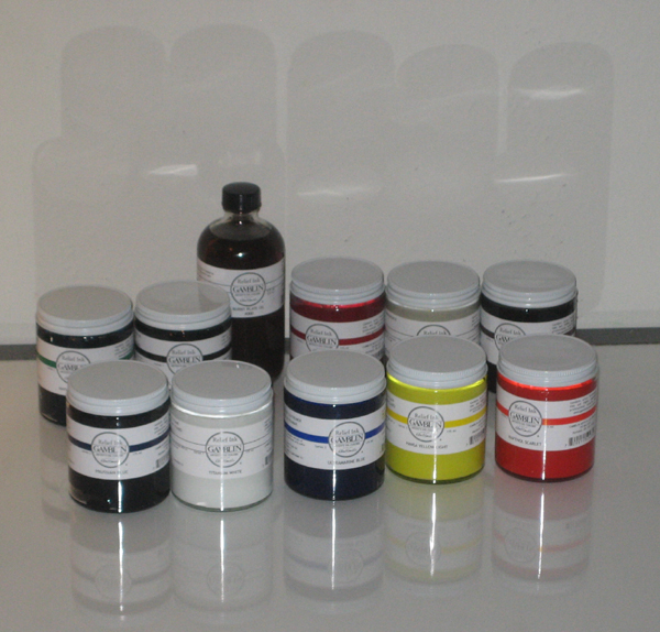
I received my order of supplies from McClain’s today. In addition to a selection of about a dozen very small woodblocks and a sample book of Washi papers, I got a set of good ink.

Gamblink Relief Inks

Gamblink Relief Inks

Getting new materials, especially new inks or paints, is hard to explain. It is a bit like getting a new car. Everything you do with them stands out as fresh and new.

I opened up the jars of ink as soon as I got home from work and got to printing. I did not have plans to print a particular run yesterday evening, but I wanted to try out these inks. They are smooth, almost runny. When I rolled out the ink and rolled it onto the block, I was surprised… these inks didn’t feel like they were mixed with oil at all! They feel like they are mixed with butter.

They roll smooth and evenly on the block, and just do what they are supposed to. This is a far cry of difference from the Speedball inks I have been using from the local art store.

I love these new inks, and I am eager to print an edition with them on nice Washi paper (once I finish the 101 Woodblock project early next year).

Quality materials are incredibly important, last night reminded me of that.

= = = = = = = =

On a side note, I highly recommend McClain’s for relief printmaking supplies. Their website is incredibly informative, easy to use and purchase from. Shipping was very fast, my order was in the mail the day after I placed it, and it arrived 2 business days after that. I will be buying a lot of stuff from them in the future.

Thinking in layers, Part 2: Order Matters

Friday, December 4th, 2009

Now I’m gonna really mess things up.

Last time I talked about how colors mix together on paper after they are printed, which increases the total number of colors you can get from any number of blocks. By overlapping the areas that blocks print, 2 blocks can print a total of 3 colors, 3 blocks can print 7 colors, and 4 blocks can print 15 colors.

The order that those blocks are printed influences what the mixed color is, as well. If one color is printed on top of another, the color created by the overlap of those two colors isn’t the same if the printing order is reversed.

This quickly ads up to a whole lot of possibilities and choices to make.

Here’s a look at this phenomenon:

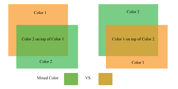
Colors mix differently with different printing orders

Colors mix differently with different printing orders

The picture above shows the same two panels of color, but on the left, the green panel is on top of the orange panel. On the right, the orange panel is on top of the green panel. The resulting color created where these two colors overlap is different depending on which color is on top.

In the above example, the mixed color can be a brownish shade of either of the colors. The trick is, it can’t be both. One of the artistic decisions of a printmaker is which order to print the blocks, and which colors will be on the print as a result.

Typically, an artist/printer will print a number of trial prints, trying out different color combinations until settling on a color combination for the final edition. These trials can be as lengthy a part of the printing process as printing the edition, but it is worth it.

The final print often benefits from this type of experimentation. Colors do not always mix the way that we intend them to in our mind, the only way to figure out how two colors will look is to mix them up and put them on paper.

Some considerations:

1. The colors will mix differently based on how transparent the colors are. In the above image, the transparency of each panel of color is set to 67%. This isn’t the exact equivalent of working with inks, but it is close enough to convey the concept. Printing inks are mostly opaque out of the tube or can, transparency is created by adding a transparent medium. I consider this transparent medium the most important can of ink that I have.

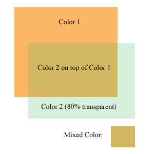
A more transparent color has less effect on the colors beneath it

A more transparent color has less effect on the colors beneath it

The more transparent medium I add to the ink, the more transparent it is (duh). The thing to keep in mind is that if a very transparent color is printed over another color, it won’t effect the color underneath much. It will show up a bit on the white of the paper, but the pigment underneath it will overpower the transparent color.

The image at the left is the same two colors as above, but the transparency is increased quite a bit on the green color. This image was created with photoshop, so it does not completely represent how inks behave when printed on paper. If this was printed on paper, the light green color would probably be more visible where printed on the white paper, but hardly perceptible where printed over the orange. If this were printed on paper, the areas where the very transparent green ink overlaps the orange would probably look more like a glossy coating over the orange than anything else.

2. Some colors print more strongly than others. The CMYK process colors (Cyan, Magenta, Yellow, blacK) are usually printed in that order. If a yellow ink is printed underneath a blue or red hued ink, it will not be very visible. The other colors printed over the yellow ink will dominate it and wash it out. Yellow is usually printed on top of the other colors to give it a fighting chance.

Yellow seems to be the weakest link amongst ink colors. Green and Orange can inherit some of this weakness as well, if those colors are created by mixing yellow ink. (Greens and oranges straight from the can or tube can be a bit stronger than home mixed versions)

Ok, enough color science for today. I’ve gotta go to work at DayJob now!

How to Print a Woodblock

Wednesday, October 14th, 2009

Here we go, part 3 of a series explaining what a woodblock print is and how it is made. Part 1 explained what a Woodblock Print is, and Part 2 discussed preparing the block and the ink.

Printing a woodblock consists of rolling ink on the block, and pressing paper against it. There are many more nuances to it though, which I’d like to explain.

To explain the printing process, I have to take a step back and explain how prints with multiple colors are made. There are a few processes that can be used; the most common is to carve a separate block for each individual color. Each block is printed separately, and the the image is created as the colors are added to the paper.

Here’s an idea of how the different blocks look that go into a multi-colored print:

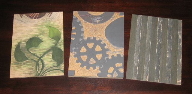
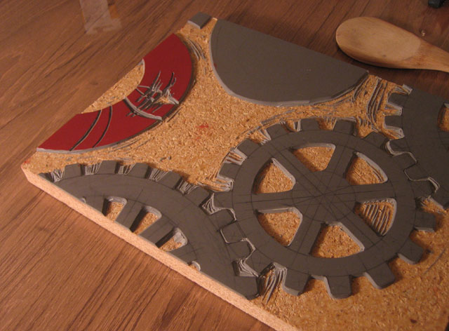
3 blocks used to print 5 different colors

3 blocks used to print 5 different colors

These 3 blocks were used to make the prints that came off the press yesterday. I had to print each block individually with a different color.

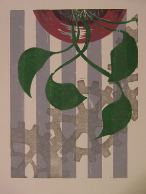
A woodblock print made from the 3 blocks shown above

A woodblock print made from the 3 blocks shown above

I did something a little tricky with two of these blocks, I used different portions of the blocks to print different colors. The two leftmost blocks in the image above had a lot of space left on the block after I finished carving the first image, so I used each of the blocks to also print part of the “vase”.

The image to the right is one of the prints made with these blocks. If you look at it closely, you will be able to see which part of which block printed which color.

You will also notice one other aspect to printmaking, which is that everything prints in reverse. When a block is printed against the page, the mirror image of what is on the block ends up on the paper.

Now that I’ve got 3 blocks with a total of 5 colors to be printed, the challenge is to align each of the blocks on the paper. This process of making sure all the blocks line up is called registration. In some way or another, I have to make sure that the blocks all register with one another.

(The question of how the blocks are carved in the first place so that all the images line up is another question for another day)

Before I do that though, I have to ink up the block! The block is inked by simply rolling the roller in the ink, and then rolling it on the block. It takes a few passes of ink on the block to (1) get enough ink on the block to print, and (2) get an even layer of ink on the block so that the color is consistent. Both of these are done by taking time and rolling the ink on the block a number of times.

The ink rolled onto a portion of the block, ready to print

The ink rolled onto a portion of the block, ready to print

I roll the ink on the block, then roll it back in the well of ink that I previously rolled out. I repeat this until their is enough ink and the thickness is consistent.

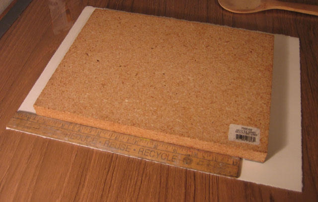
Next, I use my simple registration system – a ruler. The ruler I use is one inch wide, and luckily enough, the margins on these prints is 1 inch as well. I place the ruler along the left side of the paper, and I align the block against the edge of the ruler, with the top of the block 1-1/4 inches below the top edge of the paper.

I use a ruler to align all the blocks in the same place on the paper

I use a ruler to align all the blocks in the same place on the paper

This part of the process is delicate, because if I move the block on the paper, the ink will smear a little bit, and that does not look very nice. I’ve got one chance to lower the block directly onto the paper in the right place with the help of the ruler.

When I get around to printing the next block, I will place the ruler against the edge of the paper again, and line up the next block with the ruler. This way, I make sure that each block gets printed in the same place on each sheet, and all of the colors will line up with each other.

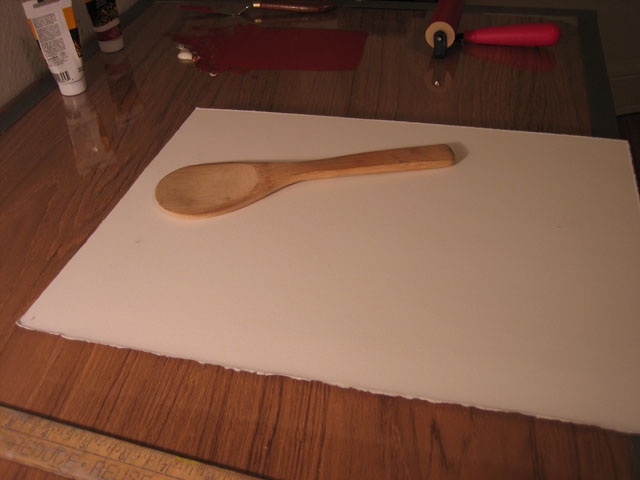
So now the inked block is lying down on the paper. I slide the paper and block off of the table, and flip them over together. I am not so fancy as to have a printing press in my little apartment, so I use a wooden spoon. The spoon in the picture was actually part of a sushi making kit that I got as a gift.

Mmmm. I love the sushi. It’s an incredible food.

The block is flipped over with the paper on top, ready to be pressed with the wooden spoon

The block is flipped over with the paper on top, ready to be pressed with the wooden spoon

This spoon, though it is made for sushi, also seems to be made for woodblock prints. It is very wide, and nearly flat, but with e slight curve to the backside. I rub the backside of the spoon over the back of the paper, pressing it against the block. This takes a few minutes of pressing, because I like to make sure that I get the ink transferred onto the paper well.

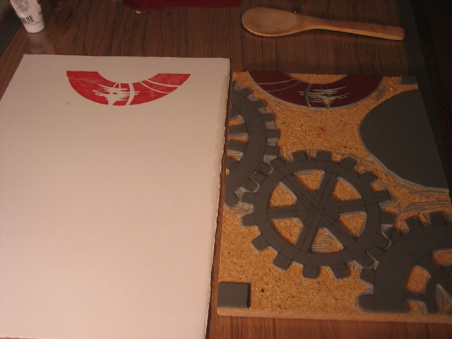
When I’m all done, I pull off the paper, and see the ink transferred over. Nice and simple!

The ink is transferred onto the paper, it will take a few more blocks to complete this image

The ink is transferred onto the paper, it will take a few more blocks to complete this image

The real joy of this process is seeing what each block adds to the image. I usually have an idea of how the finished prints will look as I am carving the block, but that vision in my mind can never compare to what I see when I pull the paper off of the block for the first time. Each time a new color is added, I get very excited that first time that I remove the paper from the block and reveal how it looks.