Posts Tagged ‘Woodblock Print’

“Sunrise” Mylar Sun Print

Sunday, April 22nd, 2012

I’ve been rattling around an idea for a while, ever since I first pulled a print on mylar.

I have been using mylar to transfer my key block onto other blocks, since the mylar, due to being plastic, doesn’t absorb ink like paper. I can print on mylar, and then press the printed mylar onto another block, to transfer the ink.

What I noticed, however, is that the mylar is translucent, and color on the back side shines through to the front. Even more, this effect is more prominent when the mylar is lit from the back.

I’ve wanted to take advantage of this for a while, and with a long weekend available, I set to work.

I came up with this: It is called “Sunrise”, it is an 8″x6″ woodblock and linoleum block print, printed on both the front side and the back side of the mylar.

Sunrise Woodblock Print on Mylar

Sunrise Woodblock Print , 8x6, on Mylar - Hanging on a wall (left), Hanging in a window (right)

The both of the images above are the same print, in the same frame. On the left, the print is against a wall, without any back lighting. On the right, the print is hanging against my window, with the sunlight coming in through the window behind it.

I am pretty happy with how these turned out. What I like the most is that the image changes depending on how it is viewed, and how it is lit. My thoughts about using mylar turned out to be true!

I’ll have these up for sale soon. Since proper presentation is an important part of this print, I want to find the best way to mat and frame these prints before putting them up in the shop.

And yeah, I want to make more sun prints.

Direction –>

Monday, December 5th, 2011

Having trouble finding direction?

Ever feel like you are pushing yourself one direction, and life is pulling you another?

Part of you is going one way, another part going another?

Because I do to. Just a part of life, I guess. Maybe. I don’t know. I’m no philosopher.

But I do feel pulled in lots of directions. Sometimes internal, sometimes external. Sometimes both.

This series of prints is about that.

Direction I Woodblock Print

Direction I, 6"x8" image on 8"x12" Hosho paper

There’s two of them. The direction is the same. And the direction is different. That’s the whole point.

This image came about to put into images something that I feel, but is hard to explain. maybe the image will let you know what I mean.

Maybe it will mean something different to you.

Direction II Woodblock Print

Direction II, 6"x8" image on 8"x12" Hosho paper

It’s a woodblock print, hand carved, hand inked, hand printed.

Let me know what you think!

Druid Arch Woodblock Print in Process

Monday, June 21st, 2010

I’m working on a new woodblock print based on my destination at the end of Elephant Canyon: Druid Arch.

I was rather struck by this arch. To get to it, I had to hike through a canyon, then finally up a rocky hill. I scrambled up and over rocks to climb a couple hundred feet up the end of the canyon, before reaching a rock plateau that looked back on the canyon.

Druid Arch

Druid Arch, at the end of Elephant Canyon

When I turned my head to the left, I saw this tall arch, standing 100 feet up in the air above this plateau. I drew this arch then, and I am printing it now.

The colors and shapes of the desert strike me the most. The rocks are large, massive, un-moving, yet arches like Druid Arch look fragile, like the slightest push could topple the entire thing. The rock edges are smooth in places, weathered by who-knows how many years of water and wind, yet in other areas the edges are sharp and hard, where the water worked its way into the rock, eventually causing it to break apart quickly and fiercely.

The rocks themselves are rich reds, oranges and whites, cut by the dark shadows against the rock edge. Most of all, the sky in the desert is blue. It is vibrant, and when I looked at the arch with the sky behind it, the blue began to vibrate and pulse with brightness and luminosity.

It is a challenge to capture the entirety of this experience in a small printed image.

This arch stands up above a rock plateau at the end of a canyon I reached 6 miles into this desert canyon. It stands about 100 feet tall.

I sketched Druid Arch while I was out there, and I am developing this woodblock print from the sketch and from photos I took.

From the Grand to the Mundane

This weekend I found myself in the middle of process hell. I haven’t written much about process hell, but it is when my work consists of carving, mixing ink, rolling and printing blocks, making sure images register, cleaning up ink (and hands, and rollers), preparing paper, and other tedious bits of the printmaking process. All my work was printmaking grunt work over the weekend.

There was a bright spot, however. As I was working, I realized I was at an interesting point in the process that illustrates how a print is planned and how the image takes shape. I took a picture of the assortment of materials I was working with to show and describe to you. The numbered descriptions below the image describe each item in the picture below.

A Woodblock Print in process

A woodblock print in process of being developed (click to enlarge)

  1. Graphite and Color Pencil Sketch – Before I touch a woodblock, I sketch the image to solidify my plan. I started with pencil to get the overall shapes correct, then added color to figure out how many blocks I would need to do what I want. My plan is to use three blocks, one for the blue of the sky, and two for the arch. One block will print the light yellow areas in the sketch, another will print the dark areas shown in the sketch. The third color, the reddish brown color will be created by overlapping the two other colors.
  2. First Carved Woodblock – When I am satisfied with my sketch, I transfer the image to the first block. To do this, I draw a heavy line around the edge of the image with a soft pencil, my 6B or 9B. I then press the sketch against the woodblock, and rub the back of the sketch, making the pencil lines transfer to the block. The blocks that define the arch will be bounded by the blue of the sky, so I carved the sky first.
  3. Mylar Transfer Paper – After the first block is carved, I transfer the image to the other blocks. This requires a more precise process than when I transferred the sketch to the block (as described above). To achieve the required precision, I print the first block on a sheet of mylar. Mylar is a plastic, and the ink largely remains on the surface of the mylar (in other words, it adsorbs instead of absorbs the ink). I take a fresh block, align it with the mylar, and rub the mylar against the block. As long as I align the mylar with the block correctly, the result is a fairly precise transfer of ink from one block to another.
  4. Woodblock with transfered image – The process I described above results in a block with the ink from the first block transferred to it. I brush the block with Talcum Powder (i.e. baby powder, makes the block smell nice too). The talc absorbs into the ink, removing the tackiness, leaving the surface of the ink dry. This keeps me from smearing the ink and making a mess as I work on the block. You can see I wrote “light” on this block, to help me keep track of which color this block will print. This block will be the lighter color of the two blocks I print to compose the arch.
  5. Partially carved Woodblock – This block will print the darker of the two colors in the arch. I have carved away the area that will be printed blue, and I will carve away more from this block before I am done, to define the areas in the arch that will not receive the darker ink. When I finish this block, I will repeat the process of printing the image on the mylar, and transfer this image onto the second block (in number 4 above). The second block will then have the image from both of the other blocks transferred on to it, and I’ll be able to finish the carving process.

More Work To Come

The process is interesting, but tedious.

The most difficult part of the carving process is carving the second and third block, because these define the arch. The first block was fairly easy to carve, since it only depends on having the boundary of the arch with the sky defined. The success of the image will depend on how well the other two blocks work together to define the structure of the arch.

After the blocks are carved, the other challenge is picking and mixing the right colors to print. I spent the last week printing an edition of another woodblock print, only to realize, at the end, that I was unhappy with the color decisions I had made. I learned from the process, however, and I will be able to apply what I learned to this print of Druid Arch.

As of this writing, I have the second block carved and ready to print, I should be proofing this print later in the week, and start editioning the print this coming weekend.

Printing the National Parks

Thursday, June 17th, 2010

I came across some vintage travel posters from early last century as I wandered through my RSS feed this morning (via lines and colors).

Zion National Park Vintage Travel Poster

Zion National Park Vintage Poster
Click to go to National Geographic's site for a larger image

It turns out that one of the posters advertises Zion National Park, and another depicts Arches National Park (though it wasn’t a national park when this was made).

It is timely that these appeared today, I am working on a woodblock print from some of the stuff I drew in Arches National Park while I was there a couple weeks ago.

What I really find fascinating about these is the visual perspective they offer, particularly, how to depict these large landscapes with just a few colors. The Arches poster has 5 colors, though it is possible that the darkest brown is created by overlapping the medium brown on top of the green. That’s how I would do it, though I am not sure how silkscreen inks behave with transparency. Silkscreen is the printing medium I have the least (read: none) experience with.

I have carved 4 blocks for the image of Arches, and I am working to create a few extra colors by using overlapping blocks.

This is one of the bigger challenges I face with a multi-block print: how to use the blocks effectively and efficiently to present the most amount of visual information with the least amount of elements. Each color added is another block added, which means hours of painstaking carving.

Arches National Park Vintage Travel Poster

Arches National Park Vintage Travel Poster
Click to go to National Geographic's website. The larger image is worth it.

When designing a print of something as large and nuanced as a gigantic rock arch rising from the desert in front of a vivid blue sky, I have to make decisions about what is important to depict. Not every detail can be shown, certain things need to be generalized, and certain details ignored, in order to create the overall picture.

Simplicity of design, and making just a few colors work to convey an image, and convey them beautifully, is one of the challenges of printmaking. This challenge is one of the reasons I enjoy printmaking so much. The process requires careful planning, then when the elements are printed together, an image slowly starts to take shape out of the jumble of colors.

These posters accomplish this requirements of using minimum elements for maximum effect masterfully. They are simple, they make use of just a few printing elements, and still convey the beauty of their subject. I hope to be able to do a fraction as well as these with my current series of blocks.

There are a number of posters on the National Geographic website. They are worth spending a minute looking at.

As for my take at printing the National Parks, I have the first two blocks printed on the first image, the prints are hanging to dry in front of my window of my apartment. I should have results to share this weekend, the 2nd and 3rd prints should roll out next week.

What Is The Difference Between Western Woodblock Printmaking and Japanese Woodblock Printmaking (Moku Hanga)?

Sunday, April 11th, 2010

Executive summary:

Western Woodblock Printmaking uses oil based inks applied to the block with a brayer (roller), and the blocks are sometimes printed with a press, and Japanese Woodblock Prints (aka Moku Hanga) are made with water-based inks applied with a brush, and are printed by rubbing a pad (baren) across the back of the paper.

Disclaimer:

Before I go on, I should make a little disclaimer: I’ve never made a Japanese Style woodblock print. Everything I know about it is from research, reading, and viewing Japanese Woodblock Prints. As a result, I might be a little irreverent.

Also, I am going to use the terms “Japanese Woodblock Printmaking” and “Moku Hanga” interchangeably. Moku Hanga translates to something like “wood pictures” or “wood graphics”, and is the Japanese name for printmaking.

Ink, Wood and Paper

Woodblock Printmaking is the art of using wood to mash ink onto paper. By carving the block of wood, you can control where ink is applied to the wood, and as a result, where it is mashed onto the paper. Sure, it gets complicated as you add detail to the image, and as you carve multiple blocks to include more colors in the print. Basically, however, it is the same principle regardless of how much detail you include. Mashing ink against paper is mashing ink against paper no matter how you spice it up.

…and no matter where in the world you do it.

There aren’t really many differences between Moku Hanga and Western Woodblock Printmaking. The biggest difference is that Japanese Woodblock Prints are, well, Japanese.

Moku Hanga

Japanese Woodblock Prints use water based ink. The water-based inks used for Japanese Woodblock prints give them a particular texture and quality that I have trouble describing, other than to say “it looks like a Japanese Woodcut”. The technique used to print in the Japanese method results in a little more texture than western methods, because the ink is applied by hand. This leads to a little variation in the density of ink throughout the print.

Speaking of “method”, it is the methods that really make a Japanese Woodblock Print what it is. Moku Hanga uses specific carving tools, which all have very specific names. Each specific tool (with its specific name) is used for a specific task.

Registration is done in a specific way, by carving very specific notches into the woodblock. Each of those notches has a specific name too (kagi and hikitsuke).

The paint is mixed in a very specific way, and applied to the block with a specific type of brush. You use a baren to press the paper against the block, to transfer the ink to the block. [Note: a “baren” is a handheld pad used to rub the paper against the block to transfer the ink] There are different barens for different uses.

Japanese Woodblock Prints are printed on a particular type of paper, called Washi, made in a particular way. This is sometimes called “rice paper”, even though it is not made of rice. It is very thin and delicate, however.

The emphasis on method and tradition is very Japanese (for lack of a better way to describe it). It reminds me of the Japanese Tea Ceremony, where everything is done in a particular way, with particular tools.

Western Woodblock Printmaking

Compare this to Western Woodblock Printing, where it seems that by comparison, anything goes. Use whatever roller you want to apply the ink. Any registration method will do, as long as it works. Press it by hand or run it through a press. It’s all good.

The ink used in western Woodblock Prints is typically oil based, though there are some modern water based inks that are designed to imitate the look and feel of the traditional oils (makes everything less messy).

Ink is applied with a brayer (ie. a roller), which results in a very even and smooth application of ink.

Washi paper is sometimes used, though other papers are also used. Rice paper is not required.

Not much difference

So, what is the difference, other than some very specific traditional ways to do things, and a difference in ink?

The answer is, “not much”.

I may sound a little irreverent about Moku Hanga, please don’t get me wrong. Japanese Woodblock Prints are some of my favorite art from throughout history, and throughout the world. This is merely my perspective from my point of view as a Western-style printmaker.

The goal of each method is to make beautiful art. The process is pretty much the same: Wood, ink, paper. Apply and transfer. Repeat.

Make beautiful art.

Skater Series Printing is Done

Sunday, March 21st, 2010

Lotsa printing yesterday.

The skater prints are all done, I just have to let the ink dry. I printed about 65 impressions yesterday. Here is my progress about 2/3 through the day:

woodblock prints hanging to dry

The Skater Series prints are all printed, and will be signed and numbered after they dry.

The black ink takes longer to dry than colored ink, these usually need a good week or so.

(Note to self: a little cobalt dryer might be appropriate next time I’m printing black and white)

These will be signed and numbered next weekend, and I should have them up for sale shortly thereafter. These are gonna be pretty low in price, so you will be able to get one without breaking the bank. I’ll probably have some sort of deal for people that want the set of all 4, but I’ll figure that out next weekend.

Note: If you are itching to buy some art, you can buy prints from the 101 Woodblock Series HERE.

Deliberate Practice. Mandatory.

Thursday, March 18th, 2010

[Hey! Before you read this post, ask yourself, “do I want to learn something today, or do I just want to look at some cool art?” If you want to learn before you look at the art, read on. If you just want to jump to some kick ass drawings, click here.]

Confession:

4 skater woodblock prints

All 4 of the Skater Series of Woodblock Prints

I haven’t been completely honest about these Skater prints I’ve been working on. These haven’t just been a quick, punk rock inspired project.

Don’t get me wrong, they are that, but they are actually about a whole lot more too.

Let me back up. The first of these was about about the punk rock and skate boards. I had been working waaaay too much in the Spice Mines (ie. in the office for my DayJob). I got home after a long weekend at the office, and whipped the first one out, because I just wanted to do something, and something quick was good enough.

I put on some punk rock, and whipped out the first skater woodblock print.

The next night, when I wanted to make another one, I realized I had an opportunity to learn and increase my skills as a woodblock printmaker.

Before I go any further, I need to dig into the concept of deliberate practice.

What is Deliberate Practice?

Deliberate practice is different from regular practice in that it is specifically designed to improve performance of a skill.

This all started when Dave sent me and Walter a link to an article about deliberate practice. I read the article, and started thinking about how to apply this to art.

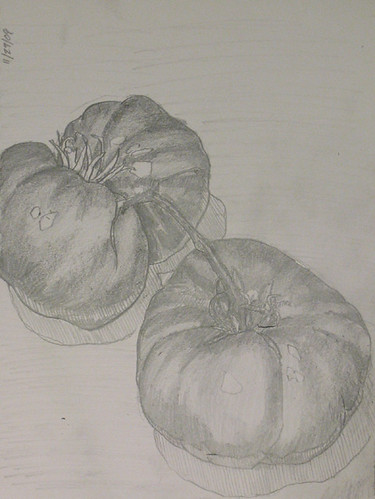
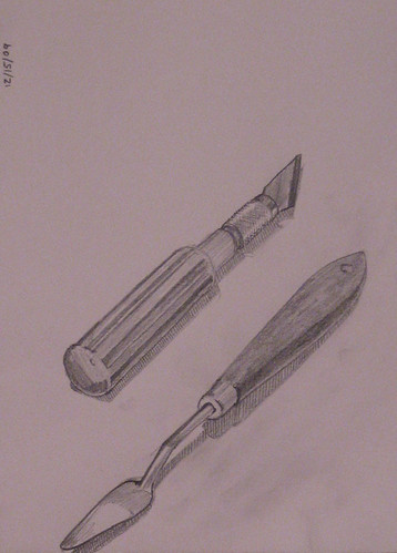
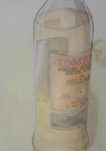
I already practiced from time to time, most commonly in my sketch book, when I draw tomatos, art tools, whisky bottles, or whatever else in front of me. I focus on seeing the thing in front of me, and making my pencil follow what my eye sees. It is practice, specifically designed to improve my drawing skill.

I decided this skater series of woodblock prints would be my chance to apply deliberate practice to woodblock printmaking. I focused on two things in particular: how the wood effects the image, and the design issues of working in black and white. I’ll expand on these in a bit.

Who wrote the book on Deliberate Practice?

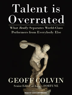
It turns out that someone did write a book about this, and fairly recently too (it’s not even out in softcover yet).

Geoff Colvin’s book, Talent is Overrated discusses specifically how deliberate practice improves performance.

Read this book.

Click the link I provided to Amazon, get the audio book from audible, or just go to your local bookstore and sit down with this book for an hour.

The characteristics of deliberate practice are:

  1. It is designed specifically to improve performance
  2. It can be repeated, a lot
  3. Feedback is continuously available
  4. It is mentally demanding
  5. Typically, it is not fun (or everyone would do it)

I’m not going to get into the nitty gritty, because the book does a good job. If you have any interest in being better at what you do, you owe it to yourself to check this book out. If nothing else, sit down at Borders or Barnes & Noble with this book for an hour, and read chapters 5, 6, and 7. Those chapters describe what deliberate practice is, how it works, and how to apply deliberate practice to your life.

Deliberate Practice applied to Woodblock Printmaking

I set out on this skater series specifically to apply these concepts of deliberate practice to my craft of woodblock printmaking. The subject matter didn’t matter much, and the whole punk rock thing actually didn’t matter much. In fact, these elements were included as an attempt to make this practice a little more fun (but you already knew that, if you only read the italics).

The actual focus of these prints was my ability to put an image onto a woodblock. I kept these images simple to accomodate this, and repeated essentially the same image over and over. I wasn’t trying to improve my craft of image creation, I was trying to improve my craft of carving wood, and working with only black and white design elements.

In particular, I focused on:

  • How fine of detail I can get out of a woodblock. There is a natural limit to how fine of a line I can carve into the wood, and have the wood hold up structurally (at least with the Shina wood and the carving tools I am using)
  • The most precise ways to carve a block. This builds upon the previous point, but I spent a lot of time carving the more detail heavy areas, like the hands and the face, to work on my ability to carve finer details. I also paid attention to the shape of blade I used, how different blades carve differently, and how the amount of pressure and the angle I hold the blade at effect the line I carve.
  • How to balance black and white on the image. A black and white woodblock print has a high contrast, and I wanted to work on creating a good balance in the image to get just the right amount of ink to make the image look best. I didn’t want it to look too sparse, or too dark.

From the points of view above, I can find half a dozen things that I did well, and half a dozen things I didn’t do well on each print (I may go through this exercise in the future).

Results of this practice

A lot of the prints in the 101 Woodblock Series were carved in linoleum, which responds differently than wood. The blocks that were carved in wood didn’t have too much detail in them. I needed this exercise to prepare for my next round of prints, which will have far more detail than what I have done previously.

As a result of this practice, I feel more confident about my ability to carve woodblocks. I know a lot more about how the wood behaves, and some more information about balance in an image.

As I prepare for my next upcoming woodblock print, I know what to realistically expect from myself, because I hae a better understanding of my skill. I will include some challenges in my next print, but not so much that I will try to do something that the medium cannot do.

I’m Not the Only One

While I’m not too sure that Jen purposefully approached her “100 heads” project as deliberate practice, it certainly seems to fit into a lot of the requirements.

What am I talking about?

After seeing a post about a bunch of students drawing 100 heads, she decided to do her own. It’s mostly her story to tell, so just click through to Jen Hiebert’s drawings and check them out. These things are seriously cool.

I met Jen through Twitter. What? Not on twitter? You are missing out on the internet’s cocktail party. Go follow Jen on Twitter here. (You can follow me too).

She mentioned this project of hers to me on Twitter, and mentioned that she learned a lot from doing this project. I had been thinking about this deliberate practice thing, so this jumped out at me. I imagine that she learned far mar by doing 100 drawings of heads than she would have if she had done 5 or 10.

Go check out this project of hers, because, well, it is cool. I like when people do cool stuff, then share it with the world.

Click here and go to her site already!

Might Be More

This Deliberate Practice vein is rich. I’m gonna be working with these concepts a bit more to figure out how to best apply them to art. I’ll probably write about it.

Be warned.

Poser Skates and Woodblock Prints

Saturday, February 27th, 2010
skateboard 1

Real skate

skateboard 2

Poser skate

You can tell how good anyone is at skating by looking at his skate(board).

If the bottom of the skate is all torn up, like the skate on the left, then they know what they’re doing. Skate’s get all torn up when they are used to grind and slide all over public curbs, handrails, stairs, etc. The bottom of the skate gets all torn up.

If the bottom of the skate is in nice, new condition, like the skate on the right, then they probably can’t skate worth a damn. If the bottom of the skate isn’t torn up, then they aren’t really skating.

So anyway, I can’t actually skate worth a damn. A dude I knew back in college working at the coffee shop gave me the deck on the left, after he had ridden it to death, and got a new one. The skate on the right is mine. Nice and shiny!

Back in Santa Cruz, I lived by a little skate park. It was little more than a bowl with a little box knocked out of one side. My roommate Luke and I would skate over to the park, and goof around. I could roll into the bowl and skate around it a bit, that’s about it.

Meanwhile, all the 10 and 11 year old kids would be tearing it up. These kids are as tall as their skateboards, and they could skate circles around me. It was always a little dis-heartening.

Oh, well. Big, 6′-2″ dudes have a whole lot further to fall before their head hits the ground.

Consolation prize

I may not be an awesome skater, but I can make decent woodblock prints. Just finished the latest one of these little things, the one I started the other day.

It came out kinda interesting:

Skater Woodblock Print 3

Woodblock Print, 4x4 inches, third in the series

Not sure what I’ll do with all of these yet, we’ll see.

Striving for Simplicity, and Skater Sketches

Friday, February 26th, 2010
Skater pencil sketches

Preliminary skater sketches

I’m one of those people that has a lot of stuff. My apartment always seems to be cluttered, I think that entropy is a little stronger than usual in my life.

Last night I reached a tilting point. I have been working late hours and not sleeping quite enough, and one of the results is that I have ignored a lot of the nuts and bolts of life. I spent last night tightening the nuts and picking up the bolts, taking care of laundry, dishes, and most of all de-cluttering my desk.

This morning I woke up to a clean desk with my computers, drawing supplies, carving tools, and the most basic of office tools. The simplicity and cleanliness breathed new life into my morning work.

A nice clean work space makes everything nicer.

New (No) Work

My emphasis on cleanliness kept me away from this series of skater prints I have been working on. I have one in progress though, so I thought I would show you how I make these things.

I start out with a few quick sketches, like you see on the right. These are little more than scribbles, to get the basic gist of the shapes, movement, and energy I am trying to get.

I think about the overall movement in the sketch first of all, then later I fill it in with the structural details of the body. It is very easy to draw figures that look stiff and sorta awkward, it takes a bit more work to make the figures look like they are moving. I don’t always completely succeed, but that is where my mind is.

Pencil Sketch

Pencil Sketch for the 3rd Skater Woodblock

Once I’m done with the quick sketches, I do a more fleshed out sketch, where I really work out how I want the print to look. Check it out on the left

I build up these sketches with darker and darker pencil lines. I start with a very hard pencil, usually a 4H, sometimes a 6H.

Quick note about pencils: Pencils are designated by how hard or soft the graphite is. Harder graphite makes a finer, lighter line, softer graphite makes a darker, “smooshier” line. The range is from 9H (the hardest), to 9B (the softest). HB is right in the middle, #2 pencils are typically HB.

Altogether, the scale is: 9B, 8B, …, 2B, B, F, HB, B, 2B, …, 8B, 9B.

So back to the sketch, I use a 4H to sketch the basic shapes. After I have gotten this fairly well determined, I use a 2H to continue to flesh out the drawing. I use the 2H until the drawing starts to take shape.

last I switch to a soft pencil, a 6B, to really nail the linework. These woodblock prints will be printed in black and white, with no grayscale. The soft pencil puts a very dark line on the paper, and it duplicates the effect that a carved block will have fairly well.

The other advantage of using a soft pencil is that they do not hold a sharp point for longer than a few lines. It is difficult to get a very fine line with the woodblocks that I am using, so using the softer pencil gives me a better idea of what I will realistically be able to carve.

Put it on Wood

Third skater block

Third skater block, carving in progress

When I’m happy with the sketch, I draw the image again in pencil on the block. I usually again start with the 4H, but have to be careful, because the pencil will scratch the block surface if I press too hard. I follow the same pattern as with the paper sketch, I switch to a 2H, then eventually a 6B. When the 6B drawing is done, I start carving.

As I carve, I continually remark the block with my 6B pencil, because the graphite smears away as I work. I also tip the pencil on the side, and rub it over the carved areas, to get an idea of how the block will look when I roll it with ink.

The carving takes a while, especially delicate areas like the hands and face. The block you see on the right is my progress after about 2 hours of carving.

The head and the left arm are carved, but that is it. This block probably has another 2 or 3 hours of carving to do.

And of course, what was I listening to when I worked on this?

  • CrucifixDehumanization
  • Operation IvyEnergy
  • Final ConflictAshes to Ashes
  • Bad Religion’80 – ‘85

It’s just punk rock.

More Punk, More Woodblock Prints

Tuesday, February 23rd, 2010

Punk rock does it again.

I had fun the night before making a silly little print, so instead of catching up on sleep (I was only up till midnight last night though), I made another print. Another skater dude print. Good times!

Woodblock Print Skater Rise Above

Rise Above, 4x4 inches, Woodblock Print

It’s pretty much the same thing as I did before, a dude with a skateboard who looks kinda excited about the fact that he has a skateboard. Who wouldn’t be excited about riding a skateboard?

Actually, all this talk makes me want to grab my skate out of the closet and start bombing down these hills I live on. Anyway, I know I can’t skate worth a darn anymore, and 6′-2″ is a long way for my head to fall before it hits the ground.

This idea is just a repeat from the night before. I don’t know why I did the same thing over again, this isn’t on my schedule or anything, I just enjoy making these things. I may make a few more of these, we’ll see. I have to deliberate with myself. It’s not like these goofy little prints require a ton of practice, they are just fun.

I only printed 4 of these last night, because I was tired by the time I got around to printing. I may carve a little more on this, I think I want to see how it will look if I carve a white line around the figure, to separate him from the lines in the background.

We’ll see. Maybe I won’t carve any more. It’s just punk rock, right? Rise above.

Important stuff

This print was brought to you by some great early 80’s hardcore:

  • T.S.O.L.T.S.O.L.
  • Agent OrangeLiving in Darkness
  • SNFUAnd No One Else Wanted To Play
  • Black FlagThe First Four Years
  • Black FlagDamaged
  • MinutemenParanoid Time
  • MinutemenThe Punch Line
  • Redd KrossBorn Innocent

I can guarantee I won’t toil away my hours tonight, I got something to do. I won’t be home. If you were hoping that I would somehow have yet another of these little prints done tomorrow, I won’t.

It’s also punk rock to skip days.