Posts Tagged ‘Woodblock Print’

All Work and No Play makes Deacon Listen to Skate Punk all Night and Make Woodblock Prints

Monday, February 22nd, 2010
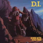
Horse Bites Dog Cries album cover

Horse Bites, Dog Cries by D.I. One of the better punk rock records ever.

I didn’t intend to stay up till 3am last night.

I’ve been in the Spice Mines (DayJob) all weekend, trying to get caught up for a deadline. This put a huge damper on my weekend, when I usually put in a lot of time working on art. I got home around 8pm last night, after a 10 hour day in the office. I packed up a few orders, and relaxed for a bit.

My mistake was to listen to “Horse Bites, Dog Cries”, quite possibly the most perfect punk rock record ever. I got fired up, and grabbed my sketch book. Then I remembered I have a bunch of small 4″x4″ woodblocks.

Before I knew it, I was sketching out an idea for a quick little woodblock print. 10 to 15 minutes later, I had a decent enough sketch on paper, so I re-drew the image on the block, and carved for a good 3 hours or so.

I rolled out some black ink, and printed up 8 copies of this silly little image. It’s not meant to be anything groundbreaking, just a funny little image of a dude on a skateboard.
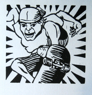
skater woodblock print

Static On The Brain, 4x4 inches, Woodblock Print

I am gonna be wiped out all day because I stayed up till 3am, and my alarm went off at 6:30.

…though it took me till 7:15 to roll out of bed.

I have been a bit frustrated lately that DayJob has required all my time, and has put printmaking on hold for a few weeks. It felt good to make a little something. Even a silly little something.

What really fired me up was listening to some awesome music. This print is brought to you by the following albums (I listened to D.I. and Suicidal twice):

  • D.I.Horse Bites, Dog Cries
  • Circle JerksGroup Sex
  • Dead KennedysIn God We Trust, Inc.
  • D.I.Team Goon
  • AdolescentsAdolescents
  • Wasted YouthReagan’s In
  • Suicidal TendenciesSuicidal Tendencies
  • 7 SecondsWalk Together, Rock Together

All albums I recommend if you want to get your early 80’s punk rock fix.

A Few Things Learned

1 – Washi paper accepts the ink on the block far better than cotton rag paper. The paper I have been using for my last project is Rives BFK, a heavy, thick paper. It is meant for lithography or intaglio, not block printing.

A few weeks ago I placed an order for a selection of Washi papers. Tonight was the first time I used these papers, and the more delicate washi takes the ink far easier than the cotton rag paper.

2 – When an ink maker calls their ink “Intense Black”, they might mean it. This stuff is a mess, and is gonna be stuck under my fingernails for a good week or so.

Oh well.

The Real Lesson

The real lesson of this whole thing is not to listen to awesome music, because it will make you do awesome stuff, and you won’t sleep. This is the danger of Punk Rock music.

I will probably end up giving these away as promotions, or selling them for a few bucks. In this case, the doing was far more important than the product.
Woodblock Prints Are Always v1.0

Wednesday, February 17th, 2010

A woodblock print, when done right, requires planning.

When I carve a chunk of wood from a woodblock, it is gone. No ink prints there. There is no ctrl+z. No undo. I can’t paint over it. There is no eraser.

Cutting wood is final, and a woodblock print requires planning.

When I print the woodblocks, it is an event, like a party I have been planning for weeks. A party is just the result of all the planning that goes into it.

When my subject matter is an array of leaves, I do not have to be exacting with my x-acto knife, I can let my hand influence the result as I carve. I don’t have to plan quite so thoroughly. In fact, I can sorta “wing it”. The art process is done as I carve the block (more on this “art process” soon).

This is the party where you run to the store, get 2 cases of beer, a handle of smirnov, O.J., cran, and some chips and salsa to throw on the table. Invite your friends and let whatever happens happen.

When making a woodblock print of a person, however, each line, each shape, and each cut is planned. Aftar all, a leaf that is a little off still looks like a leaf. A hand that is a little off looks funny, and amatuer.

I am thoroughly planning this party. I’m assembling the right guest list, arranging the seating, picking the music, and choosing the menu.

After all, this print has to be right. “Good enough” is good enough for some things, but not this print.

This planning is the artistic process. The creative and emotional decisions happen now, before I touch a block of wood. By the time I carve the blocks, the only decisions left will be aesthetics and design.

So, I’ve been drawing. The 4th version of this image is sitting next to me on my desk. The first was a small sketch, an outline of my concept (those that watch my flickr feed have seen this one). The next was a quick sketch on a larger size paper. I broke out the ruler for the third drawing to work out the space of the image (perspective, vanishing points, that sort of thing).

The current drawing puts it all together — I’m working on the breakdown of colors and on perfecting the details of the image, mostly the hands and face.

I’ve got another 2 revisions ahead of me before I put knife to wood. Since this next print will include an image of a person, I have to work and re-work the figure to get the drama and the pathos into it. Without that, the art is little more than decorative illustration.

If I were selling an ebook, or a video series, I could release version 0.5, then update everyone with versions 0.6 through 1.0 as I complete them (a good idea, with digital products).

…but I sell art. There can be only one version of every woodblock print, version 1.0. No updates are possible, no revisions are allowed once I sell you the print.

This means I have to work the image, and continue to work it, until it is ready for final release.

It’s keeping me busy.

I Finished One Hundred and One Woodblock Prints. What’s Next?

Monday, February 8th, 2010

I genuinely thought this would be easy.

Making one-hundred and one unique, all-different woodblock prints turned out to be tremendous work.

The background

In case you don’t know..

Last May (or so), I made a simple wager with Dave. I would make 101 Woodblock prints before he wrote 101 articles about WordPress.

I started printing the day before my birthday, the last day of my 30th year. I started with a couple woodblocks and a couple linoleum blocks, and along with my buddy Patrick, spent the day mashing ink against paper.

I thought I would be finished in a month or two, but I seemed to underestimate the amount of work this would take. A little over 8 months after I started, on Superbowl Sunday, I printed the last run on the last print, right around midnight.

This project was about 10 times larger than I thought it would be.

Dave won the bet many months ago, and got a thriving website as a prize.

I’ve got ink-stained hands and a stack of artwork.

What’s happening to these 101 prints?

They are for sale.

101 woodblocks print number 80

Print Number 80. This and many more like it are part of the 101 Woodblock Series. At this low price, they don't come framed though..

And dirt cheap, for the time being.

As I started to finish these prints, I decided to sell them to my email newsletter subscribers (and ONLY to my email subscribers) for the amount that my materials cost me. That’s $3.55 each, plus $5 for shipping.

Like I said, dirt cheap.

I decided to sell them for this price until I finished all one-hundred and one. Which of course, happened last night. I still need to sign, title and number these, and I need to scan each one, so the price isn’t going up yet.

On February 22, the price increases to something reasonable, $20 or $30 per print. Still cheap, but not dirt cheap.

Sign up for my newsletter, and you will be sent a link to the gallery page where you can see every print, and buy at the current “pre-release” price. Click the word “newsletter” to sign up.

Ok, sales pitch over. You know if $8.50 is a deal for a work of hand-printed art.

What’s next?

Dave was up late last night, and called when he saw my twitter post hit. He gave good advice – don’t stop, don’t take a break.

The temptation is to “take a break” and take some time away from making prints to “recharge” or some such nonsense.

As usual, however, Dave and I were on the same page. What he didn’t know is that I had already started the early work for my next woodblock print. I spent half an hour or so Saturday morning taking reference photos, I’ll do some sketches tonight, and I should be carving the first blocks by next weekend.

Time for a Change

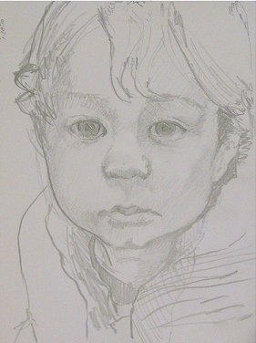
sketch of young boy

A sketch of my nephew, from a visit last December

If you’ve taken a liking to the sort of images I’ve created so far, you’re out of luck.

I’m shifting gears.

The 101 Woodblock Prints were influenced by design sensibilities. I focused as much on color, balance, shape, and other design considerations as I did on imagery.

I’ll be making a shift towards figurative woodblock prints (pictures of people). I want to convey drama, emotion, and pathos. I’m not exactly sure what shape this will take, I’ll find out.

(If I ever use the word “emo” to describe my work, however, you are free to punch me)

My plan is to produce one edition of prints each month for the rest of the year. I’m done making each print unique for the time being, I want to return to traditional printmaking, reproducing the same image a number of times.

What’s next? Lots more work.

No breaks, and no brakes.

Thinking in Layers

Wednesday, December 2nd, 2009

I’ve been working on a new block for a couple days now, and this one has been a bit of a challenge. I know that this block is going to have a companion block that goes with it, and the two will take advantage of how colors mix when they are printed in layers.

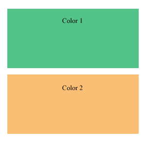
Two separate colors

Two separate colors

One block for every color

Generally, with woodblock printing, for each block, you have one color that is printed. To create a print with three colors, three blocks are needed.

You can see this to the left, in the beautiful image I whipped up to demonstrate this. It would take two woodblocks to print this beautiful work of art.

(Aren’t the colors lovely? Well, at least they demonstrate the point well)

With opaque ink, one-block-one-color is true. Each layer of ink will cover up any other layers of ink under it. With out-of-the-tube ink from your local art store, this is the sort of behavior an artist can expect from their ink.

This is a bit limiting, and luckily for us there is a way to get more from our blocks and from our color by using a little bit of transparency in the ink.

I cheat the system 

My most important ink I have is transparent. It is just ink medium, without any pigment. I add this to my other inks, which are opaque, to add some transparency. The more transparent medium I add, the more transparent the ink becomes.

This creates opportunity, and along with opportunity comes complexity.

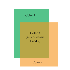
Two colors overlap to create a third color

Two colors overlap to create a third color

Transparency allows the ink to mix on the paper, so that one color will show through another color a bit. They mix to create a third color.

This neat little image on the right I whipped up in Photoshop shows how this works. When two blocks overlap, and transparent ink is used, a third color is created where they overlap. Using this technique, 2 blocks can print 3 colors.

Extending this out to more blocks, 3 blocks can print 7 colors. 4 blocks can print more colors than I care to figure out (11 15, I think, but it is early in the morning).

This hurts my head to think about

My current block is giving me quite a challenge, because I know that it will be printed with another block, and the two will interact to create a third color. When I carve the block, I have to keep in mind that some areas that I carve will be left white on the final print, and some areas will be filled in with the second block. Some areas will be defined by how the two blocks overlap, and I have to leave those areas intact, so that the two colors can print together.

It is interesting to carve a block in this way. Often, I carve blocks with a “black and white” frame of mind. Color will print on the block, except where I carve away.

With this block, I am considering the shapes that this block will print, the shapes the second block will print, the areas where they overlap, and the areas left white by the paper.

I finished carving the first of these two blocks last night (took 3 evenings). I have a busy couple of days coming up, keeping me from my art through the weekend, so I won’t get to the second block till early next week, but look for updates then.

Inside the Birth of a Block

Friday, November 6th, 2009
Sometimes it all begins with a small sketch

Sometimes it all begins with a small sketch

I like to give you an inside look at how I create woodblock prints. To that end, I present The Birth of Block 5.

Block 5 is another block used to make the 101 Woodblock Series. I number all of the blocks that I make, just because, well, I like a nice stack of numbered blocks. This block is the fifth block I’ve carved for the series of prints, with quite a few blocks left to go. Block 6 and 7 have been carved since I finished this block.

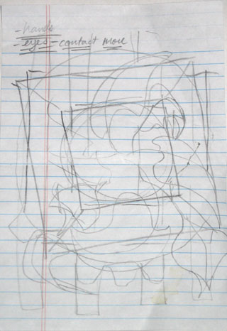
Like most of my good ideas, this one started out as a little sketch doodle on a notepad. I have a lot of note pads laying around at my desks, because I know that I have a tendency to forget stuff. Notes and lists are a vital tool for me.

I often get an idea when I am writing down notes, and doodle it down on a sheet of note paper. On the left is my original doodle for the image that I eventually carve in to Block 5.

You can see some of the notes in the corner of this sketch, I actually have no idea what these notes mean. I guess I need to take better notes…

When I do quick sketches like this, I am not too worried about detail. What I am drawing is the overall image that I have in my head. I try to get the overall feel of the image, the balance, and the major elements down on this paper.

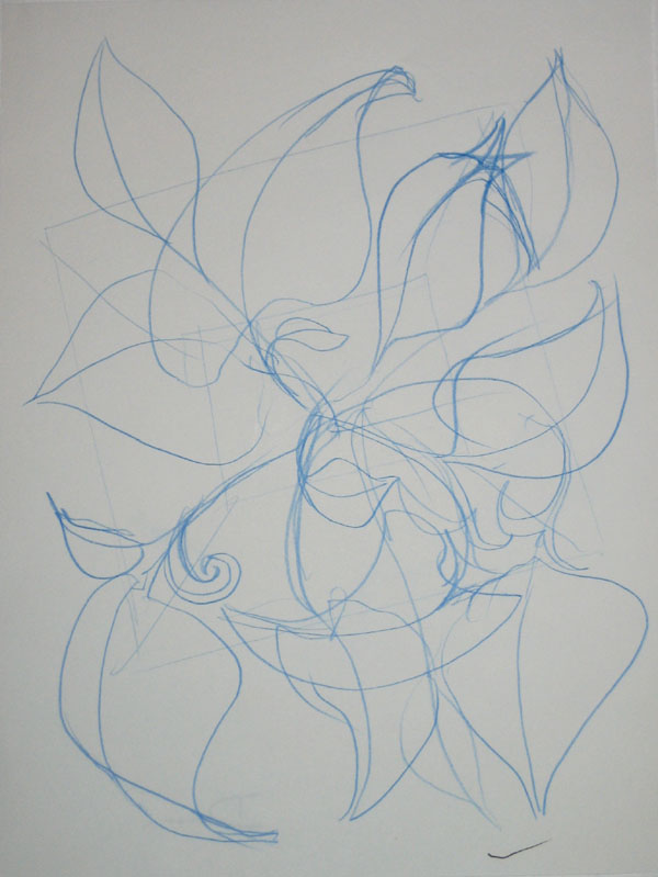
Next I graduated to a larger sketch pad, the results are below:

A larger concept sketch

A larger concept sketch

I draw in blue pencil so that I can later go over the image with a regular pencil or a pen to darken up the image. I picked up this habit from comic book illustration. The pencils for each page are often done in blue pencil. Blue pencil does not reproduce in a photocopy machine, so when the page is inked and then copied to prepare it for color, the original pencils don’t show up.

I picked up this habit of working because I like how I am able to draw a light sketchy line, which I can then ignore or reinforce with a darker line as I refine the image.

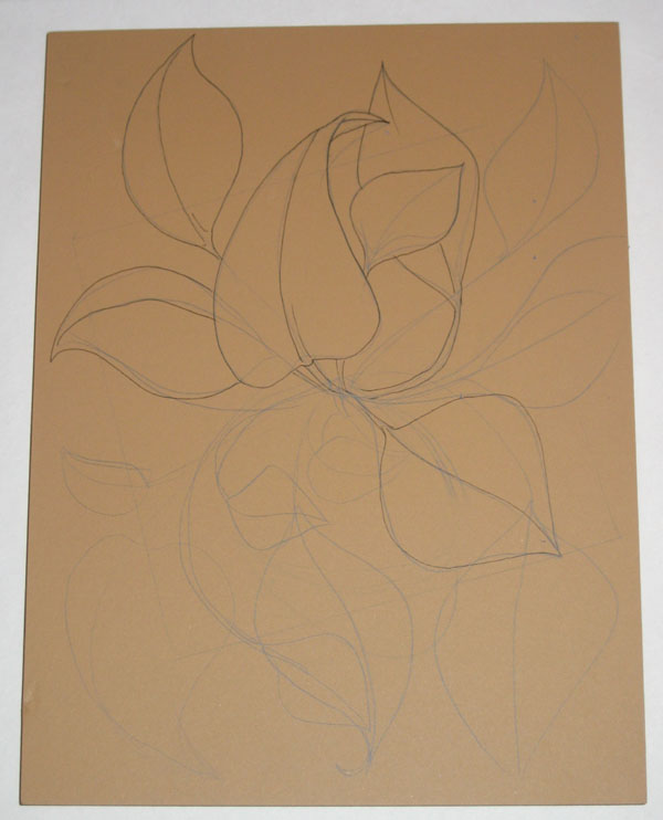
Next I got out Block 5 and drew the image on the block in blue pencil again. When I had an image that I was happy with drawn in pencil, I went over the image in ink. Here is the partially inked block, you can see both the blue pencil and the ink drawing:

The design sketched in pencil, and partly finalized in ink

The design sketched in pencil, and partly finalized in ink

As I inked the image onto the block, I realized that I like the look of the ink drawing, and decided to carve the block so that it would have the look of a line drawing when it was printed. This was a change from my previous plan, which was for this block to print the flat shapes of the leaves.

I realized that I had done that before with some of my previous prints, so I decided to do something different with this block.

Another comment on this block’s image: one of the things that I was unsatisfied with on my previous prints was the how sparse the image felt. The previous images felt rather empty to me, and I wanted to create an image that was more abundant with growth, so to speak.

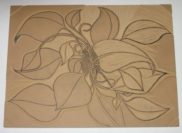
Finally, I sat down and started carving this block. Here is the partially carved block:

The block is partially carved

The block is partially carved


It turns out that carving a block so that it will replicate an ink drawing takes a long time. I spent around 10 hours carving this block. I had to be precise with my X-acto knife to follow the lines, to make sure the final carved line wasn’t too thick or too thin, and to make sure that the block was carved right.

One of the challenges of carving a linoleum block is that the material is not rigid. It is pretty flexible and soft. This makes it a little easier to carve than wood, but presents a problem of stability. I had to carve into the block at an angle, so that the linoleum base is bigger closer to the particle board that the linoleum is mounted on.

Each uncarved area of the block is like a little mountain sticking up off of the board surface. This is required to give each portion of linoleum stability, so it doesn’t get smashed and misshaped when I put pressure on it to transfer the ink from the block to the paper.

The result is that carving a block like this requires a lot of time and precision.

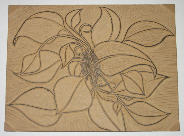
Finally, the block is finished:

The block is completely carved

The block is completely carved

10 hours and ten sore fingers later, the block is finished. At least I didn’t cut myself this time, I seem to be getting better at not doing that.

Next I’ll show how I transfer this image to other blocks, and what I carve to compliment this block.

Why Printmaking? (A Study in Polarity)

Thursday, October 29th, 2009

Why don’t I just paint, or draw, or sculpt, or something like that?

It might be easier, and less time consuming. I might be able to whip out art much quicker. I wouldn’t have to explain the difference between printmade original art and industrial produced prints of art (ie. posters).

I love printmaking because the process of creating the print is so relevant to the final product. Of course, the process of every type of art impacts the final work of art that you make. How the paint is manipulated on the canvas decides how the painting will look, how the metal or clay is moved, welded and joined decides how the sculpture will look.

With painting, drawing, and sculpture, the work done has a direct impact on the final result. Printmaking is a little more indirect. The artist carves a block of wood, which is arguably where the talent to create an image comes into play, but then that block is printed, which is more of a technical process than an artistic one.

The process of transferring the ink from a printing plate or block to paper is very technical. It requires precision and proper methods.

Printmaking requires two sides of me: the artist and the engineer.

The artist in me creates the image, decides how it will look, carves the block, decides what colors should be used, and what feeling or thought I want to put into the finished art.

The engineer takes over to figure out how to mix the inks, how transparent the ink should be, how to line up the multiple blocks so that the print registers well, how much pressure is required to transfer the ink, and how much drying time is required before the next layer of ink is applied.

Both parts of this process interest me, and engage me. In order to make a print, I have to engage my creative side, as well as my technical side, and so I feel much more balanced when creating prints.

Printmaking engages these two sides to me like no other method does. Painting, and even drawing to a degree, are much more of a purely creative endeavor for me, and my paintings tend to be more emotionally charged than my prints, because painting does not require the same balance of my different ways of thinking like printmaking does.

This makes a little more sense knowing that by day, I am an engineer. I am registered as a Professional Mechanical Engineer in California, and spend my days designing water treatment and utility systems.

My job is all technical all the time, so I need art to create that balance in my life between those two poles. As a printmaker, both of those poles have to work together to create my final product.

That’s why printmaking is such good stuff.

Lessons From Blog World Expo: Quality Content Above All

Tuesday, October 27th, 2009

I a weekend at Blog World Expo recently. The best way to describe it is as a conference and trade show for folks that create content and distribute it via the internet.

They like to call it “New Media”, but really it is just old media distributed in new ways.

There was a whole lot of talks given about how to make money by producing content on the internet, but one point was driven home more than any others: the importance of quality content.

Without quality content, readership, followers, subscribers, etc, just won’t come.

This point hit home for me, specifically as it relates to this site and my overall goals – fame, fortune, and glory through art.

Amazing content is not easy, and it does not come naturally. It takes hard work, and a lot of it.

Printing may be like riding a bike, but that first mile or so on a bike after ten years without riding is going to be a little shaky and wobbly. This is the reason for the 101 Woodblock Series.

It’s been a long time since I spent the majority of every day in the printmaking studio, knocking out lithograph after lithograph. The 101 Woodblock Series is my chance to get reacquainted with an old friend, and catch up over a long night of drinks and stories from the good ol’ days.

My goal for this series of prints is to make each one different, no two are alike. Each one requires thought and consideration to balance the image and the colors and decide what else is needed.

The result is that this series takes a lot longer than a standard woodblock edition, where each print is the same, and also that I am having that long night catching up, telling the old stories that we remember, and reacquainting ourselves with an old friendship.

In other words, I am forcing myself through a crash course of printmaking to re-learn the means and methods required to make beautiful art.

Of course, my work is your benefit, because when these are all done, I will be giving these out for a fraction of the real value. I want to celebrate this old friendship with printmaking by putting a piece of handmade artwork in your hands for less than the cost of a burger and a beer (my favorite meal).

If you’re not already signed up, head over to the 101 Woodblock Series page, and sign up for the newsletter for updates on the series, and notice of how to get one of these hotcakes into your hands.

How to Print a Woodblock

Wednesday, October 14th, 2009

Here we go, part 3 of a series explaining what a woodblock print is and how it is made. Part 1 explained what a Woodblock Print is, and Part 2 discussed preparing the block and the ink.

Printing a woodblock consists of rolling ink on the block, and pressing paper against it. There are many more nuances to it though, which I’d like to explain.

To explain the printing process, I have to take a step back and explain how prints with multiple colors are made. There are a few processes that can be used; the most common is to carve a separate block for each individual color. Each block is printed separately, and the the image is created as the colors are added to the paper.

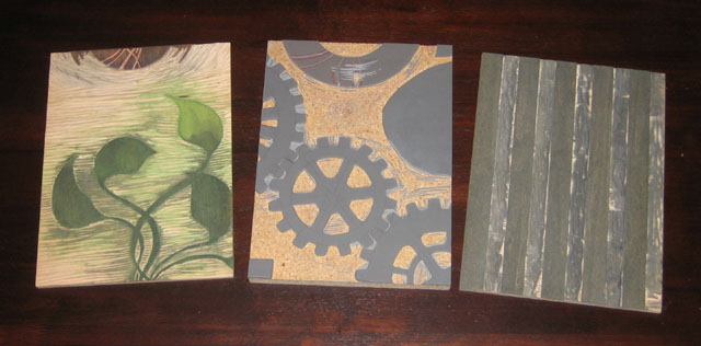
Here’s an idea of how the different blocks look that go into a multi-colored print:

3 blocks used to print 5 different colors

3 blocks used to print 5 different colors

These 3 blocks were used to make the prints that came off the press yesterday. I had to print each block individually with a different color.

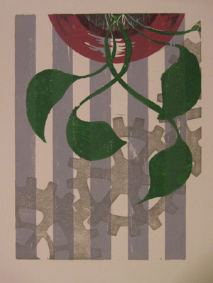
A woodblock print made from the 3 blocks shown above

A woodblock print made from the 3 blocks shown above

I did something a little tricky with two of these blocks, I used different portions of the blocks to print different colors. The two leftmost blocks in the image above had a lot of space left on the block after I finished carving the first image, so I used each of the blocks to also print part of the “vase”.

The image to the right is one of the prints made with these blocks. If you look at it closely, you will be able to see which part of which block printed which color.

You will also notice one other aspect to printmaking, which is that everything prints in reverse. When a block is printed against the page, the mirror image of what is on the block ends up on the paper.

Now that I’ve got 3 blocks with a total of 5 colors to be printed, the challenge is to align each of the blocks on the paper. This process of making sure all the blocks line up is called registration. In some way or another, I have to make sure that the blocks all register with one another.

(The question of how the blocks are carved in the first place so that all the images line up is another question for another day)

Before I do that though, I have to ink up the block! The block is inked by simply rolling the roller in the ink, and then rolling it on the block. It takes a few passes of ink on the block to (1) get enough ink on the block to print, and (2) get an even layer of ink on the block so that the color is consistent. Both of these are done by taking time and rolling the ink on the block a number of times.

The ink rolled onto a portion of the block, ready to print

The ink rolled onto a portion of the block, ready to print

I roll the ink on the block, then roll it back in the well of ink that I previously rolled out. I repeat this until their is enough ink and the thickness is consistent.

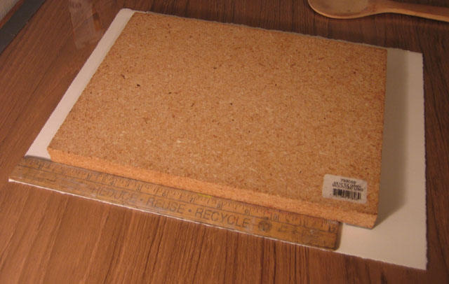
Next, I use my simple registration system – a ruler. The ruler I use is one inch wide, and luckily enough, the margins on these prints is 1 inch as well. I place the ruler along the left side of the paper, and I align the block against the edge of the ruler, with the top of the block 1-1/4 inches below the top edge of the paper.

I use a ruler to align all the blocks in the same place on the paper

I use a ruler to align all the blocks in the same place on the paper

This part of the process is delicate, because if I move the block on the paper, the ink will smear a little bit, and that does not look very nice. I’ve got one chance to lower the block directly onto the paper in the right place with the help of the ruler.

When I get around to printing the next block, I will place the ruler against the edge of the paper again, and line up the next block with the ruler. This way, I make sure that each block gets printed in the same place on each sheet, and all of the colors will line up with each other.

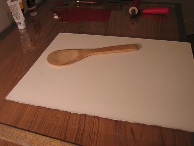
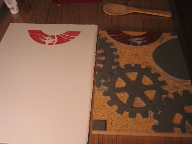
So now the inked block is lying down on the paper. I slide the paper and block off of the table, and flip them over together. I am not so fancy as to have a printing press in my little apartment, so I use a wooden spoon. The spoon in the picture was actually part of a sushi making kit that I got as a gift.

Mmmm. I love the sushi. It’s an incredible food.

The block is flipped over with the paper on top, ready to be pressed with the wooden spoon

The block is flipped over with the paper on top, ready to be pressed with the wooden spoon

This spoon, though it is made for sushi, also seems to be made for woodblock prints. It is very wide, and nearly flat, but with e slight curve to the backside. I rub the backside of the spoon over the back of the paper, pressing it against the block. This takes a few minutes of pressing, because I like to make sure that I get the ink transferred onto the paper well.

When I’m all done, I pull off the paper, and see the ink transferred over. Nice and simple!

The ink is transferred onto the paper, it will take a few more blocks to complete this image

The ink is transferred onto the paper, it will take a few more blocks to complete this image

The real joy of this process is seeing what each block adds to the image. I usually have an idea of how the finished prints will look as I am carving the block, but that vision in my mind can never compare to what I see when I pull the paper off of the block for the first time. Each time a new color is added, I get very excited that first time that I remove the paper from the block and reveal how it looks.

New Art Hot Off The Press

Monday, October 12th, 2009

I’ve got something to show for my last few days work. If you like this art and want to keep up to date on when it will be available for you to buy (for ridiculously cheap prices), then go to the 101 Woodblock Series page and sign up for the newsletter.

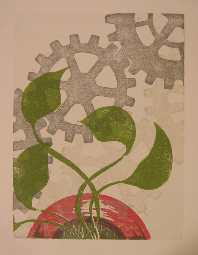
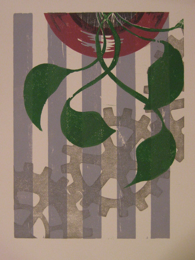
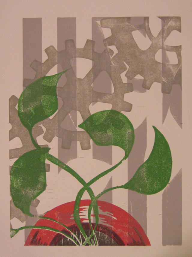
This series is all about the combination of gears, flowers, plants, and graphic design. Yeah, it’s an odd mix, and I promise to explain it some day. In the meantime, you’ll have to settle for enjoying some previews of the art.

A New Woodblock Print - Hot Off The Press!

A New Woodblock Print - Hot Off The Press!

Another 101 Woodblock Series Print

Another 101 Woodblock Series Print

One More Print from the 101 Woodblock Series

One More Print from the 101 Woodblock Series

Carving Blocks and Rolling Ink

Monday, October 12th, 2009

This is the second article about how a woodblock print is made. In the last post, I talked about the materials and tools I use to make prints. In this post I show you how I carve the block and prepare the ink.

Carving the block

I’ve lead you on a bit. I really have.

I’m sorry.

Now I have to confess something. It’s a little embarrassing, but I hope you will understand a little.

I actually… don’t use blocks of wood for all my woodblock prints. A lot of the time I actually use linoleum. The linoleum is mounted on a woodblock to keep it rigid, if that counts.

Linoleum is similar to wood, and it is a little easier to carve, because it doesn’t have the grain that wood does. The printing surface is different, so the ink has a different texture when it is printed on the paper.

Here’s the block I am going to show you today to demonstrate how the ink is printed:

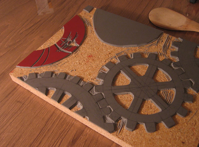
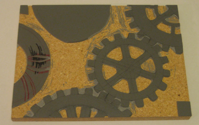
A carved linoleum block

A carved linoleum block

This block is mostly carved already. There is one little bit of carving left to do. The arc on the left is designed to be reminiscent of a vase for flowers, so I will just call that the “vase”. I used a block marker to draw the area that I want to carve away.

I’d like a highlight on the curved surface, so I need to carve away this area so that ink will not print there.

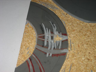
Close up on the newly carved portion

Close up on the newly carved portion

I usually draw this outline in pencil, and I do not color it in like shown above. I used the black pen to make it easier for you to see in the photograph.

I use my X-Acto knife and gouges, and carve away the area I drew in black. I am very careful when I carve delicate areas like this, to make sure that I get the detail that I want, and that I don’t slip and make mistakes. A small area like this takes me about 15 minutes to carve.

The finished block is shown at the left. I am only going to print this vase in this run, the rest of the linoleum will be printed with other colors. I left the big blob of linoleum along the top edge uncarved, because I may eventually use that part of the block to carve another pattern into. I think another gear may look nice there.

The Ink Job

Now I get started with the ink.

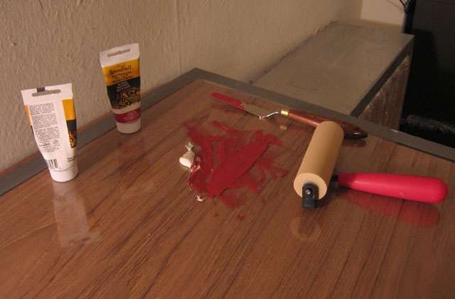
The ink is mixed and ready to roll

The ink is mixed and ready to roll

I’ve mixed up some red ink with a touch of white. The ink that I am using is basic woodblock printing ink that I got from the art store. I use oil-based ink, because I think it lasts longer and looks better. Oil-based ink takes longer to clean up, and requires nastier chemicals like paint thinner.

I use a palette knife to mix the ink together, and when it is all mixed, smear it in a line about the width of my roller. The roller itself is a soft rubber roller. In general, rollers come with either soft rubber or hard rubber surfaces. I prefer the soft, because it covers the block with ink better.

Just like it is easier to spread soft butter across a piece of toast, it is easier to get the ink spread onto the block with a soft roller. The roller conforms to the surface of the block, and accounts for the uneven surface of the block.

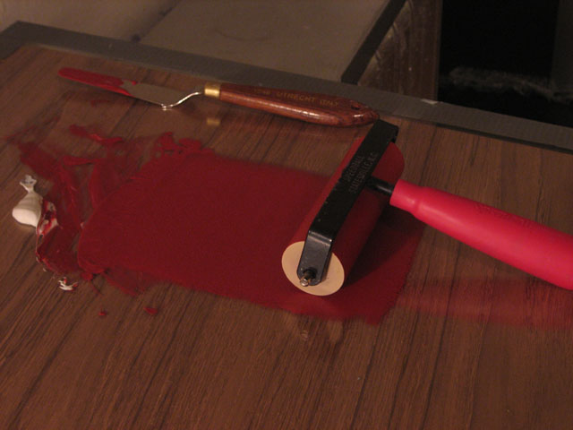
I roll out an even layer onto the glass from the fount

I roll out an even layer onto the glass from the fount

One thing you will notice in the photo above is that the roller is rested on its back. If the roller is left resting on the roller portion, a flat dent can form in the rubber itself. This isn’t such a big deal with these cheap rollers from the art store, but once I get the roller I want, it will matter quite a bit. Good rollers are made of high quality rubber, and cost well over a hundred bucks.

A quick aside – I roll out the ink on a big sheet of glass. Glass is a perfect surface to roll ink on because it is very smooth, and it is not porous, so the ink does not soak in to the surface at all. This makes it easy to scrape the ink away, and to clean it up when I am done.

Next I roll out the ink as shown above. I don’t roll out all of the ink, but just the right amount. Learning what the right amount is takes a little experience. I can’t quite explain it, because I know the right amount because of how the roller feels rolling the ink, and how it sounds.

If the ink is too thick, the print will get smooshed, and the detail will be lost. If the ink is too thin, then it won’t print dark enough, and will look thin. To continue the toast analogy, when the ink is too thin, it is like trying to cover your toast with not enough butter.

The ink across the top is called the fount. When the ink gets too thin, I dip the roller into the fount and roll it out.

Coming Attractions

Ok, I am WAY over my morning writing power hour now, and I have to go get ready for work. Next up, printing the block, lining up different colors, and a progress report.