Posts Tagged ‘Printmaking’

What Is The Difference Between Western Woodblock Printmaking and Japanese Woodblock Printmaking (Moku Hanga)?

Sunday, April 11th, 2010

Executive summary:

Western Woodblock Printmaking uses oil based inks applied to the block with a brayer (roller), and the blocks are sometimes printed with a press, and Japanese Woodblock Prints (aka Moku Hanga) are made with water-based inks applied with a brush, and are printed by rubbing a pad (baren) across the back of the paper.

Disclaimer:

Before I go on, I should make a little disclaimer: I’ve never made a Japanese Style woodblock print. Everything I know about it is from research, reading, and viewing Japanese Woodblock Prints. As a result, I might be a little irreverent.

Also, I am going to use the terms “Japanese Woodblock Printmaking” and “Moku Hanga” interchangeably. Moku Hanga translates to something like “wood pictures” or “wood graphics”, and is the Japanese name for printmaking.

Ink, Wood and Paper

Woodblock Printmaking is the art of using wood to mash ink onto paper. By carving the block of wood, you can control where ink is applied to the wood, and as a result, where it is mashed onto the paper. Sure, it gets complicated as you add detail to the image, and as you carve multiple blocks to include more colors in the print. Basically, however, it is the same principle regardless of how much detail you include. Mashing ink against paper is mashing ink against paper no matter how you spice it up.

…and no matter where in the world you do it.

There aren’t really many differences between Moku Hanga and Western Woodblock Printmaking. The biggest difference is that Japanese Woodblock Prints are, well, Japanese.

Moku Hanga

Japanese Woodblock Prints use water based ink. The water-based inks used for Japanese Woodblock prints give them a particular texture and quality that I have trouble describing, other than to say “it looks like a Japanese Woodcut”. The technique used to print in the Japanese method results in a little more texture than western methods, because the ink is applied by hand. This leads to a little variation in the density of ink throughout the print.

Speaking of “method”, it is the methods that really make a Japanese Woodblock Print what it is. Moku Hanga uses specific carving tools, which all have very specific names. Each specific tool (with its specific name) is used for a specific task.

Registration is done in a specific way, by carving very specific notches into the woodblock. Each of those notches has a specific name too (kagi and hikitsuke).

The paint is mixed in a very specific way, and applied to the block with a specific type of brush. You use a baren to press the paper against the block, to transfer the ink to the block. [Note: a “baren” is a handheld pad used to rub the paper against the block to transfer the ink] There are different barens for different uses.

Japanese Woodblock Prints are printed on a particular type of paper, called Washi, made in a particular way. This is sometimes called “rice paper”, even though it is not made of rice. It is very thin and delicate, however.

The emphasis on method and tradition is very Japanese (for lack of a better way to describe it). It reminds me of the Japanese Tea Ceremony, where everything is done in a particular way, with particular tools.

Western Woodblock Printmaking

Compare this to Western Woodblock Printing, where it seems that by comparison, anything goes. Use whatever roller you want to apply the ink. Any registration method will do, as long as it works. Press it by hand or run it through a press. It’s all good.

The ink used in western Woodblock Prints is typically oil based, though there are some modern water based inks that are designed to imitate the look and feel of the traditional oils (makes everything less messy).

Ink is applied with a brayer (ie. a roller), which results in a very even and smooth application of ink.

Washi paper is sometimes used, though other papers are also used. Rice paper is not required.

Not much difference

So, what is the difference, other than some very specific traditional ways to do things, and a difference in ink?

The answer is, “not much”.

I may sound a little irreverent about Moku Hanga, please don’t get me wrong. Japanese Woodblock Prints are some of my favorite art from throughout history, and throughout the world. This is merely my perspective from my point of view as a Western-style printmaker.

The goal of each method is to make beautiful art. The process is pretty much the same: Wood, ink, paper. Apply and transfer. Repeat.

Make beautiful art.
I’m a Printmaker, Not an Artist

Friday, March 26th, 2010

Artists get show horned together, as if we are all the same.

It doesn’t matter what subject or what medium, society thinks we are pretty much all the same thing.

Painter, sculpture, illustrator, printer, photographer, all the same.

Luckily I don’t remember specifically who I am going to pick on next, it was someone in Blogistan, or on the Twitter Show. This person was pimping out their “art training”, and from what I could see, all artists got the same training.

We’re not the same though. The skillz required to create a great painting are quite different from the skills required to make a great sculpture. Illustration, yet other skillz. Printmaking? Forgeddaboudit.

There are some basic skills that each of these different types of artists must have, but after those skills are worked out, the skills become wildly different.

I got to thinking that an artists medium is sorta like being a specific type of engineer. Nobody would offer the same training to both a Mechanical Engineer and a Structural Engineer.

A little digress, In the Spice Mines (my term of affection for my DayJob), I am an Engineer. A Mechanical Engineer in fact. I work with Electrical Engineers, Structural Engineers, Civil Engineers, and Architects (sigh) on a regular basis.

We all had the same foundation training in math and science, but the details of what we know are very different. I know enough about each of these to get by (480 volt 3 phase! #5 @ 12″ on center!), but the specialization between fields of engineering is rather different.

Electrical Engineers are concerned with voltages, power, and signal; Mechanical engineers concern themselves with pressure loss and heat gain; Structural Engineers think about shear stress and moments; architects concern themselves with getting their latte right.

Nobody would offer the same training to each of these types of engineers.

Why, as artists, are we offered the same training, wrapped as “artist training”?

I think it is because we think of ourselves as artists first, and our medium second. Contrast this with engineers, who think of them self as an Electrical or Mechanical Engineer first, and an engineer in general second.

I’d like to see artists identify with their medium first, and as an artist second.

“Artist” has too much stigma. Too much baggage.

“Artist” doesn’t capture the very different skills required to produce very different art.

I am a printmaker. I am a painter. Sometimes, an illustrator. I am not a sculpture, or a photographer.

Does this make me an artist? I guess, but after the above, that is just a trifle.

New Work Table = Productivity and Quality of Life Increase

Thursday, February 4th, 2010

Out with the old, in with the new!

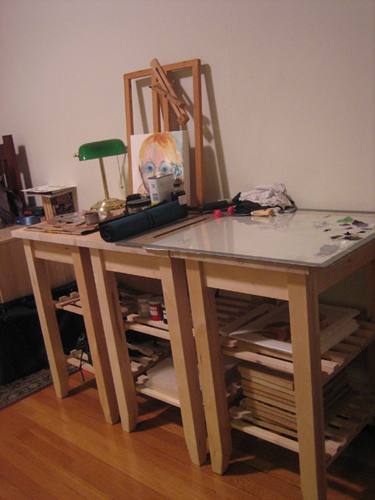
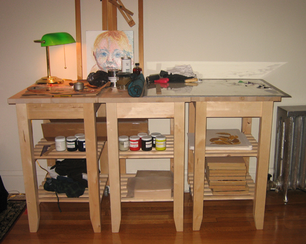
I replaced the dinky folding table I was using as a printmaking work station with a new, improved, modular station of might:

3-part printmaking and painting work area

This work area gives me plenty of room to work, and a lot of storage for my materials. Check out the in progress painting! It's a portrait of a small child.

My new station is made up of three tall work surfaces (ie. kitchen carts) that sit side by side. The tricky thing about finding good furniture was height. Desks are made for sitting at, not standing at, and shelves tend to not be deep enough to give a good work area. Kitchen is made to be used standing up, and addressed both these problems.

This work surface is actually 3 separate carts that can be individually be easily moved. When I was shopping, I thought I was making a concession by buying 3 of these and setting them next to each other, rather than buy one large work table, but I was wrong to think that.

The modular nature of this work area is a benefit. I can move one of them around as needed to use as a stand to paint on (or do anything else, I guess). I am not confined to working along a particular wall.

Instant Upgrade

The effect on my workspace was immediate, and two-fold: I have a nicer work area, and this is a far better tool than my previous work surface (a small folding table).

work station in apartment

The new work station fits well into my small apartment.

I do all of my work in my small studio apartment, so I have to live with my work area. This looks nicer, and already is keeping me more organized, both of which make my living space more enjoyable.

The real advantage of this work area is it will be easier to work at. It is taller than my previous work table, so I won’t be bending over for hours at a time when I am printing. I can move the painting section around my apartment as needed, I have been freed up to work where I would like.

As soon as I got this station set up, I knew I made the right decision to upgrade. This work area feels more professional, and I will be able to make more professional work here.

Invest in Yourself

The quality of our work areas effects our performance, I am a firm believer of this. When I have a messy desk, it is harder for me to get to work at my computer. Any impedance to our ability to work will make it harder to get stuff done.

It is always worth the time and expense to upgrade a work area. My upgrade has already made me more productive (and I haven’t even used it yet), since I was able to move all of my painting supplies off of my desk (my other work area) and onto a cart.

If you have been thinking about upgrading to a better work area, or getting better work furniture, do it. You will be happy you did.

Thinking in layers, Part 2: Order Matters

Friday, December 4th, 2009

Now I’m gonna really mess things up.

Last time I talked about how colors mix together on paper after they are printed, which increases the total number of colors you can get from any number of blocks. By overlapping the areas that blocks print, 2 blocks can print a total of 3 colors, 3 blocks can print 7 colors, and 4 blocks can print 15 colors.

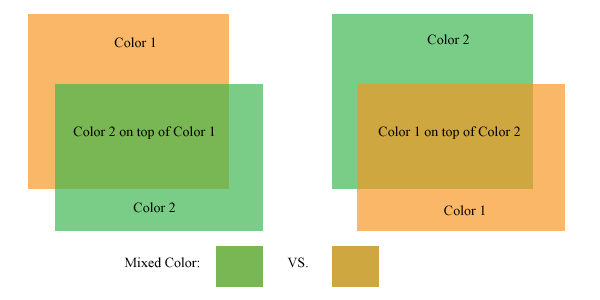
The order that those blocks are printed influences what the mixed color is, as well. If one color is printed on top of another, the color created by the overlap of those two colors isn’t the same if the printing order is reversed.

This quickly ads up to a whole lot of possibilities and choices to make.

Here’s a look at this phenomenon:

Colors mix differently with different printing orders

Colors mix differently with different printing orders

The picture above shows the same two panels of color, but on the left, the green panel is on top of the orange panel. On the right, the orange panel is on top of the green panel. The resulting color created where these two colors overlap is different depending on which color is on top.

In the above example, the mixed color can be a brownish shade of either of the colors. The trick is, it can’t be both. One of the artistic decisions of a printmaker is which order to print the blocks, and which colors will be on the print as a result.

Typically, an artist/printer will print a number of trial prints, trying out different color combinations until settling on a color combination for the final edition. These trials can be as lengthy a part of the printing process as printing the edition, but it is worth it.

The final print often benefits from this type of experimentation. Colors do not always mix the way that we intend them to in our mind, the only way to figure out how two colors will look is to mix them up and put them on paper.

Some considerations:

1. The colors will mix differently based on how transparent the colors are. In the above image, the transparency of each panel of color is set to 67%. This isn’t the exact equivalent of working with inks, but it is close enough to convey the concept. Printing inks are mostly opaque out of the tube or can, transparency is created by adding a transparent medium. I consider this transparent medium the most important can of ink that I have.

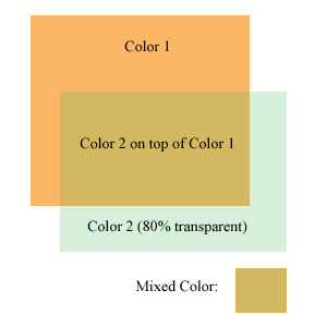
A more transparent color has less effect on the colors beneath it

A more transparent color has less effect on the colors beneath it

The more transparent medium I add to the ink, the more transparent it is (duh). The thing to keep in mind is that if a very transparent color is printed over another color, it won’t effect the color underneath much. It will show up a bit on the white of the paper, but the pigment underneath it will overpower the transparent color.

The image at the left is the same two colors as above, but the transparency is increased quite a bit on the green color. This image was created with photoshop, so it does not completely represent how inks behave when printed on paper. If this was printed on paper, the light green color would probably be more visible where printed on the white paper, but hardly perceptible where printed over the orange. If this were printed on paper, the areas where the very transparent green ink overlaps the orange would probably look more like a glossy coating over the orange than anything else.

2. Some colors print more strongly than others. The CMYK process colors (Cyan, Magenta, Yellow, blacK) are usually printed in that order. If a yellow ink is printed underneath a blue or red hued ink, it will not be very visible. The other colors printed over the yellow ink will dominate it and wash it out. Yellow is usually printed on top of the other colors to give it a fighting chance.

Yellow seems to be the weakest link amongst ink colors. Green and Orange can inherit some of this weakness as well, if those colors are created by mixing yellow ink. (Greens and oranges straight from the can or tube can be a bit stronger than home mixed versions)

Ok, enough color science for today. I’ve gotta go to work at DayJob now!

The continuing saga of Block 5

Monday, November 9th, 2009

I’ve noticed something about a lot of my blog posts. At the end of the posts, I say I am gonna continue in the next posts and write about the next part of the subject. Then I never really write that next post. I’m kinda flaky like that.

But not today!

It’s a beautiful Monday morning, I’ve got some delicious white plums cut up, trucks are falling off the bay bridge, and my cup of coffee is almost done brewing. Time to continue the saga of Block 5, the coolest linoleum block ever to be made!

So I finished up the start of the story of Block 5 with the block completely carved. As I was carving the block, I realized that I would like another block to print to add some color to this block. This requires transferring the image from Block 5, the line art, to another block.

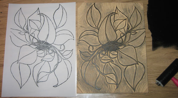
To do this, I printed block 5 on a sheet of mylar, as shown below:

The block is printed on mylar to transfer the image

The block is printed on mylar to transfer the image

Mylar is a thin, but rigid plastic material. The ink prints onto the mylar well, because it has a little roughness to the surface, but it does not soak in to the mylar, like ink does on paper. This is perfect for transferring images from one block to another, because the ink does not dry, and stays right on the surface.

I take the sheet of mylar, and press it against the surface of block 6 to transfer the image.

Using the mylar, the image is transfered to a fresh block, Block 6

Using the mylar, the image is transfered to a fresh block, Block 6

Since prints print backwards, I have to go through these two steps to get the image on tho the final block correctly. When I first printed block 5, it came out backwards on the mylar. When I press the mylar on block 6, it transfers the image backwards again. Double backwards, is, of course, forwards.

Printmaking Aside: This is pretty much what biog, industrial lithograph machines do, the kind that print magazines, newspapers, etc. The panel that is printed is on one roller, than there is another roller that the image gets printed on. This second roller then prints that ink on to the paper. By transferring the image twice, rather than once, the image comes out the way it looks on the block.

Back to block 6, now I have lines to use as a guide, and I carve up the block to print a flat color behind the line art. Here is block 6 after it has been carved and the ink cleaned up:

Block 6 is carved and ready to print

Block 6 is carved and ready to print

So now I’ve got these two blocks. What to do with them. What to do…

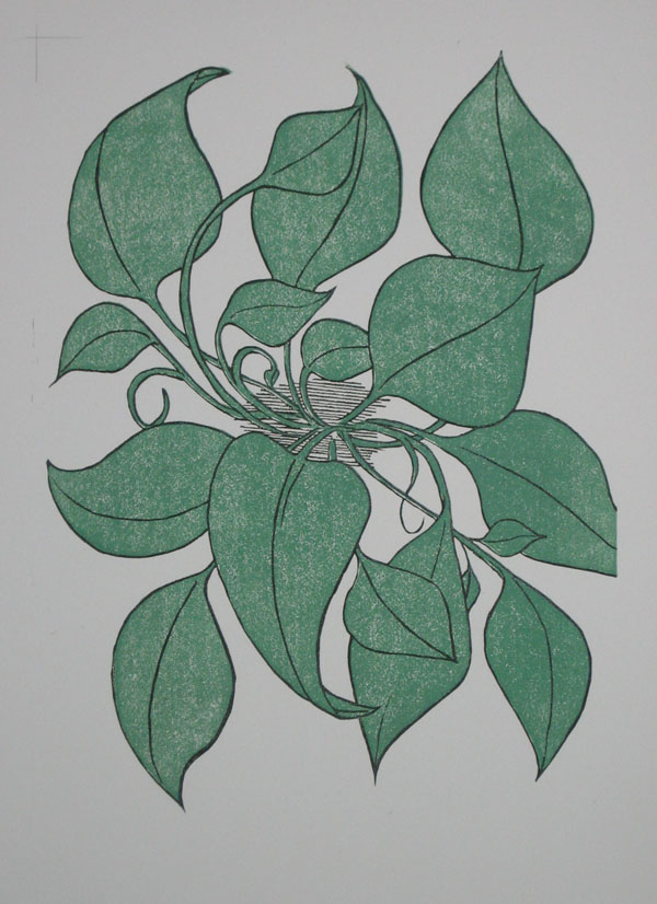
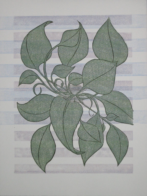
Here’s how Block 5 and Block 6 look printed together:

Block 5 and 6 printed (click for larger)

Block 5 and 6 printed (click for larger)

In the top left corner you will notice some pencil marks. I drew these on the block when I was printing the first block on the paper so that I would know where to line up the second block. It is a pretty crude system, but it worked fairly well. I only lost one print over the weekend to poor print alignment.

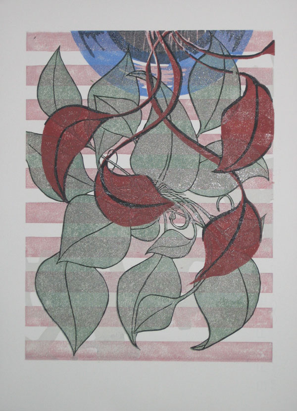
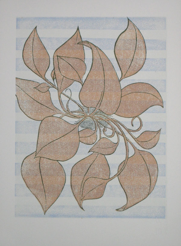
Now the fun begins. I combine this block with some of my other blocks to make some woodblock prints. Here’s a few of the completed prints I finished this weekend that involve Block 5 and Block 6:

Block 5 and 6 were used as background for a previous block in this print (click for larger)

Block 5 and 6 were used as background for a previous block in this print (click for larger)

I like how the blue horizontal bands extend beyond the image area (click for larger)

I like how the blue horizontal bands extend beyond the image area (click for larger)

Since it is autumn (supposedly), here's something in brown (click for larger)

Since it is autumn (supposedly), here's something in brown (click for larger)

If you want on the inside list for the release of these prints, sign up for the Bad Deacon Design newsletter by clicking here.

Inside the Birth of a Block

Friday, November 6th, 2009
Sometimes it all begins with a small sketch

Sometimes it all begins with a small sketch

I like to give you an inside look at how I create woodblock prints. To that end, I present The Birth of Block 5.

Block 5 is another block used to make the 101 Woodblock Series. I number all of the blocks that I make, just because, well, I like a nice stack of numbered blocks. This block is the fifth block I’ve carved for the series of prints, with quite a few blocks left to go. Block 6 and 7 have been carved since I finished this block.

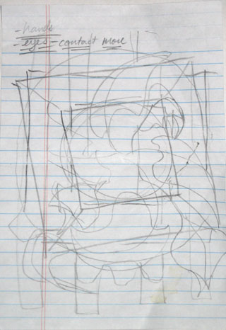
Like most of my good ideas, this one started out as a little sketch doodle on a notepad. I have a lot of note pads laying around at my desks, because I know that I have a tendency to forget stuff. Notes and lists are a vital tool for me.

I often get an idea when I am writing down notes, and doodle it down on a sheet of note paper. On the left is my original doodle for the image that I eventually carve in to Block 5.

You can see some of the notes in the corner of this sketch, I actually have no idea what these notes mean. I guess I need to take better notes…

When I do quick sketches like this, I am not too worried about detail. What I am drawing is the overall image that I have in my head. I try to get the overall feel of the image, the balance, and the major elements down on this paper.

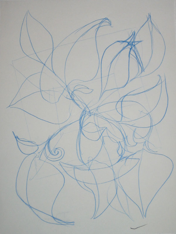
Next I graduated to a larger sketch pad, the results are below:

A larger concept sketch

A larger concept sketch

I draw in blue pencil so that I can later go over the image with a regular pencil or a pen to darken up the image. I picked up this habit from comic book illustration. The pencils for each page are often done in blue pencil. Blue pencil does not reproduce in a photocopy machine, so when the page is inked and then copied to prepare it for color, the original pencils don’t show up.

I picked up this habit of working because I like how I am able to draw a light sketchy line, which I can then ignore or reinforce with a darker line as I refine the image.

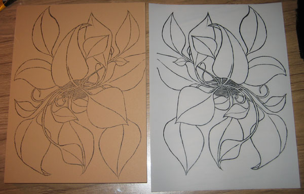
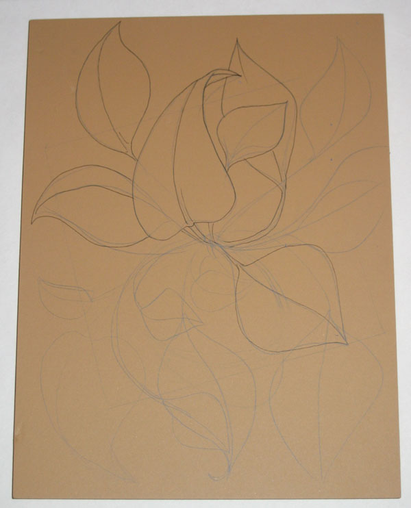
Next I got out Block 5 and drew the image on the block in blue pencil again. When I had an image that I was happy with drawn in pencil, I went over the image in ink. Here is the partially inked block, you can see both the blue pencil and the ink drawing:

The design sketched in pencil, and partly finalized in ink

The design sketched in pencil, and partly finalized in ink

As I inked the image onto the block, I realized that I like the look of the ink drawing, and decided to carve the block so that it would have the look of a line drawing when it was printed. This was a change from my previous plan, which was for this block to print the flat shapes of the leaves.

I realized that I had done that before with some of my previous prints, so I decided to do something different with this block.

Another comment on this block’s image: one of the things that I was unsatisfied with on my previous prints was the how sparse the image felt. The previous images felt rather empty to me, and I wanted to create an image that was more abundant with growth, so to speak.

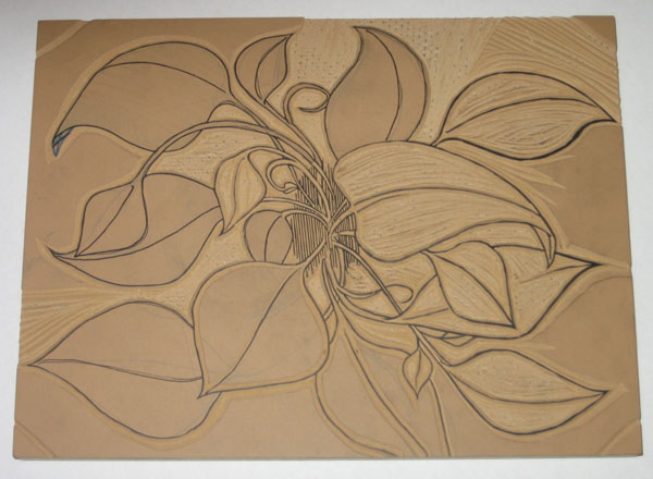
Finally, I sat down and started carving this block. Here is the partially carved block:

The block is partially carved

The block is partially carved


It turns out that carving a block so that it will replicate an ink drawing takes a long time. I spent around 10 hours carving this block. I had to be precise with my X-acto knife to follow the lines, to make sure the final carved line wasn’t too thick or too thin, and to make sure that the block was carved right.

One of the challenges of carving a linoleum block is that the material is not rigid. It is pretty flexible and soft. This makes it a little easier to carve than wood, but presents a problem of stability. I had to carve into the block at an angle, so that the linoleum base is bigger closer to the particle board that the linoleum is mounted on.

Each uncarved area of the block is like a little mountain sticking up off of the board surface. This is required to give each portion of linoleum stability, so it doesn’t get smashed and misshaped when I put pressure on it to transfer the ink from the block to the paper.

The result is that carving a block like this requires a lot of time and precision.

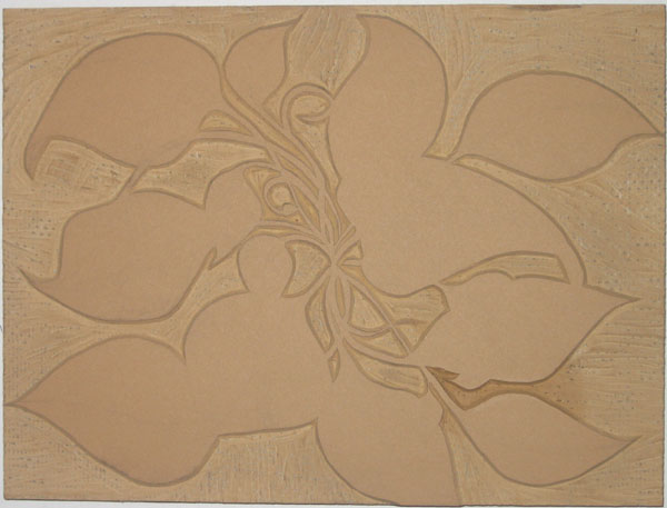
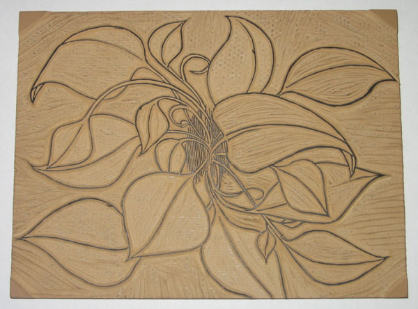
Finally, the block is finished:

The block is completely carved

The block is completely carved

10 hours and ten sore fingers later, the block is finished. At least I didn’t cut myself this time, I seem to be getting better at not doing that.

Next I’ll show how I transfer this image to other blocks, and what I carve to compliment this block.

Why Printmaking? (A Study in Polarity)

Thursday, October 29th, 2009

Why don’t I just paint, or draw, or sculpt, or something like that?

It might be easier, and less time consuming. I might be able to whip out art much quicker. I wouldn’t have to explain the difference between printmade original art and industrial produced prints of art (ie. posters).

I love printmaking because the process of creating the print is so relevant to the final product. Of course, the process of every type of art impacts the final work of art that you make. How the paint is manipulated on the canvas decides how the painting will look, how the metal or clay is moved, welded and joined decides how the sculpture will look.

With painting, drawing, and sculpture, the work done has a direct impact on the final result. Printmaking is a little more indirect. The artist carves a block of wood, which is arguably where the talent to create an image comes into play, but then that block is printed, which is more of a technical process than an artistic one.

The process of transferring the ink from a printing plate or block to paper is very technical. It requires precision and proper methods.

Printmaking requires two sides of me: the artist and the engineer.

The artist in me creates the image, decides how it will look, carves the block, decides what colors should be used, and what feeling or thought I want to put into the finished art.

The engineer takes over to figure out how to mix the inks, how transparent the ink should be, how to line up the multiple blocks so that the print registers well, how much pressure is required to transfer the ink, and how much drying time is required before the next layer of ink is applied.

Both parts of this process interest me, and engage me. In order to make a print, I have to engage my creative side, as well as my technical side, and so I feel much more balanced when creating prints.

Printmaking engages these two sides to me like no other method does. Painting, and even drawing to a degree, are much more of a purely creative endeavor for me, and my paintings tend to be more emotionally charged than my prints, because painting does not require the same balance of my different ways of thinking like printmaking does.

This makes a little more sense knowing that by day, I am an engineer. I am registered as a Professional Mechanical Engineer in California, and spend my days designing water treatment and utility systems.

My job is all technical all the time, so I need art to create that balance in my life between those two poles. As a printmaker, both of those poles have to work together to create my final product.

That’s why printmaking is such good stuff.

Lessons From Blog World Expo: Quality Content Above All

Tuesday, October 27th, 2009

I a weekend at Blog World Expo recently. The best way to describe it is as a conference and trade show for folks that create content and distribute it via the internet.

They like to call it “New Media”, but really it is just old media distributed in new ways.

There was a whole lot of talks given about how to make money by producing content on the internet, but one point was driven home more than any others: the importance of quality content.

Without quality content, readership, followers, subscribers, etc, just won’t come.

This point hit home for me, specifically as it relates to this site and my overall goals – fame, fortune, and glory through art.

Amazing content is not easy, and it does not come naturally. It takes hard work, and a lot of it.

Printing may be like riding a bike, but that first mile or so on a bike after ten years without riding is going to be a little shaky and wobbly. This is the reason for the 101 Woodblock Series.

It’s been a long time since I spent the majority of every day in the printmaking studio, knocking out lithograph after lithograph. The 101 Woodblock Series is my chance to get reacquainted with an old friend, and catch up over a long night of drinks and stories from the good ol’ days.

My goal for this series of prints is to make each one different, no two are alike. Each one requires thought and consideration to balance the image and the colors and decide what else is needed.

The result is that this series takes a lot longer than a standard woodblock edition, where each print is the same, and also that I am having that long night catching up, telling the old stories that we remember, and reacquainting ourselves with an old friendship.

In other words, I am forcing myself through a crash course of printmaking to re-learn the means and methods required to make beautiful art.
Of course, my work is your benefit, because when these are all done, I will be giving these out for a fraction of the real value. I want to celebrate this old friendship with printmaking by putting a piece of handmade artwork in your hands for less than the cost of a burger and a beer (my favorite meal).

If you’re not already signed up, head over to the 101 Woodblock Series page, and sign up for the newsletter for updates on the series, and notice of how to get one of these hotcakes into your hands.

How to Print a Woodblock

Wednesday, October 14th, 2009

Here we go, part 3 of a series explaining what a woodblock print is and how it is made. Part 1 explained what a Woodblock Print is, and Part 2 discussed preparing the block and the ink.

Printing a woodblock consists of rolling ink on the block, and pressing paper against it. There are many more nuances to it though, which I’d like to explain.

To explain the printing process, I have to take a step back and explain how prints with multiple colors are made. There are a few processes that can be used; the most common is to carve a separate block for each individual color. Each block is printed separately, and the the image is created as the colors are added to the paper.

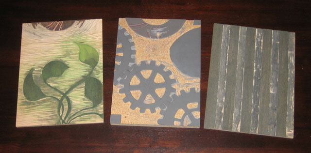
Here’s an idea of how the different blocks look that go into a multi-colored print:

3 blocks used to print 5 different colors

3 blocks used to print 5 different colors

These 3 blocks were used to make the prints that came off the press yesterday. I had to print each block individually with a different color.

A woodblock print made from the 3 blocks shown above

A woodblock print made from the 3 blocks shown above

I did something a little tricky with two of these blocks, I used different portions of the blocks to print different colors. The two leftmost blocks in the image above had a lot of space left on the block after I finished carving the first image, so I used each of the blocks to also print part of the “vase”.

The image to the right is one of the prints made with these blocks. If you look at it closely, you will be able to see which part of which block printed which color.

You will also notice one other aspect to printmaking, which is that everything prints in reverse. When a block is printed against the page, the mirror image of what is on the block ends up on the paper.

Now that I’ve got 3 blocks with a total of 5 colors to be printed, the challenge is to align each of the blocks on the paper. This process of making sure all the blocks line up is called registration. In some way or another, I have to make sure that the blocks all register with one another.

(The question of how the blocks are carved in the first place so that all the images line up is another question for another day)

Before I do that though, I have to ink up the block! The block is inked by simply rolling the roller in the ink, and then rolling it on the block. It takes a few passes of ink on the block to (1) get enough ink on the block to print, and (2) get an even layer of ink on the block so that the color is consistent. Both of these are done by taking time and rolling the ink on the block a number of times.

The ink rolled onto a portion of the block, ready to print

The ink rolled onto a portion of the block, ready to print

I roll the ink on the block, then roll it back in the well of ink that I previously rolled out. I repeat this until their is enough ink and the thickness is consistent.

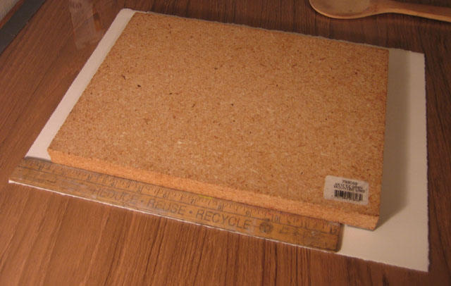
Next, I use my simple registration system – a ruler. The ruler I use is one inch wide, and luckily enough, the margins on these prints is 1 inch as well. I place the ruler along the left side of the paper, and I align the block against the edge of the ruler, with the top of the block 1-1/4 inches below the top edge of the paper.

I use a ruler to align all the blocks in the same place on the paper

I use a ruler to align all the blocks in the same place on the paper

This part of the process is delicate, because if I move the block on the paper, the ink will smear a little bit, and that does not look very nice. I’ve got one chance to lower the block directly onto the paper in the right place with the help of the ruler.

When I get around to printing the next block, I will place the ruler against the edge of the paper again, and line up the next block with the ruler. This way, I make sure that each block gets printed in the same place on each sheet, and all of the colors will line up with each other.

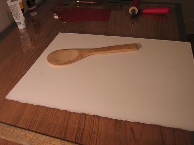
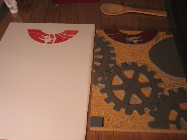
So now the inked block is lying down on the paper. I slide the paper and block off of the table, and flip them over together. I am not so fancy as to have a printing press in my little apartment, so I use a wooden spoon. The spoon in the picture was actually part of a sushi making kit that I got as a gift.

Mmmm. I love the sushi. It’s an incredible food.

The block is flipped over with the paper on top, ready to be pressed with the wooden spoon

The block is flipped over with the paper on top, ready to be pressed with the wooden spoon

This spoon, though it is made for sushi, also seems to be made for woodblock prints. It is very wide, and nearly flat, but with e slight curve to the backside. I rub the backside of the spoon over the back of the paper, pressing it against the block. This takes a few minutes of pressing, because I like to make sure that I get the ink transferred onto the paper well.

When I’m all done, I pull off the paper, and see the ink transferred over. Nice and simple!

The ink is transferred onto the paper, it will take a few more blocks to complete this image

The ink is transferred onto the paper, it will take a few more blocks to complete this image

The real joy of this process is seeing what each block adds to the image. I usually have an idea of how the finished prints will look as I am carving the block, but that vision in my mind can never compare to what I see when I pull the paper off of the block for the first time. Each time a new color is added, I get very excited that first time that I remove the paper from the block and reveal how it looks.

What is a woodblock print?

Thursday, October 8th, 2009

Did you make a potato print back in elementary school? You cut the potato in half so there is a flat edge, then carve some sort of shape in to it, a heart or a star, then you dipped it in poster paints, and pressed it against paper. You essentially made a stamp out of a potato.

A woodblock print is no different. It is printed from a flat piece of wood that has portions carved away, so that the ink doesn’t print there.

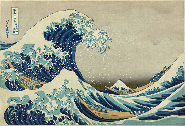
Woodblock prints are not very common in Art History, but the most famous woodblock prints were made in Japan. You probably recognize the image below, it is a woodblock print by the artist Hokusai from 19th century Japan. This print is titles The Great Wave off Kanagawa (Kanagawa Oki Nami Ura is the Japanese title). This print was the first in a series called 36 Views of Mount Fuji. You can see Mount Fuji in the background of the image, in the dip between the waves. Hokusai’s prints are an inspiration for and influence on my own woodblock prints.

The Great Wave Off Kanagawa by Hokusai

The Great Wave Off Kanagawa by Hokusai

The Wood Makes the Print

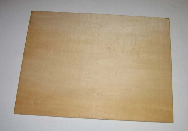
Woodblock for a woodblock print

Woodblock for a woodblock print

To make a woodblock print, I start out with a smooth, flat piece of wood (or sometimes linoleum as a substitute). I have to have some sort of image in mind when I start. I determined that the imagery for the 101 Woodblock Series is going to be gears, flowers, and plants, so I know what I am trying to accomplish image wise.

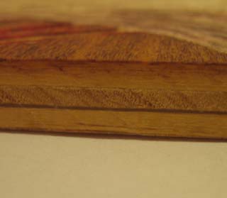
Section of Wood

Section of Wood

The wood is special made for prints. I have actually had the block you see above for a very long time. I got this block about 10 years ago, but only recently put it to use. I believe that this block was made in Japan. The block itself is made of 5 plys (layers). The middle 3 plys are about 1/8-inch thick. The ply on the top and bottom are extremely fine. They are about 1/100-inch thick! I used my scale to measure the thickness, and it was too small to measure, even with my scale that measures in 1/60-inch increments! The direction of the grain alternates on each layer, creating a very sturdy block.

The next step is to carve the block. A woodblock is printed by rolling ink on a roller on to the woodblock. Every part of the wood that I do not carve away gets ink rolled on to it. The portions of the block that are carved away do not get ink, because the roller rolls on the flat, untouched portion of the block, missing the “valleys” that I have carved in.

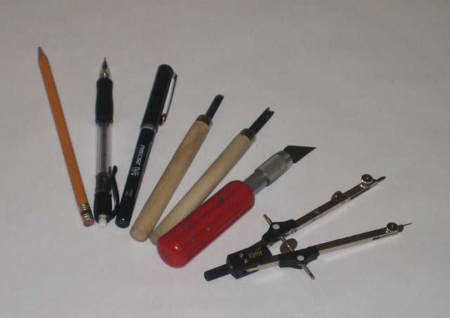
Tools of the trade

Woodblock Print Tools

Woodblock Print Tools

Here’s a list of the tools I use and why and how I use them. From right to left in the picture above:

  • Compass: A lot of the imagery I like involves circles. I have a number of compasses that range in size to help me carve perfect circles. The compass shown is one of the larger compasses I use.
  • X-Acto Knife: I have a nice set of X-Acto knifes with a wide selection of blades. This set was a gift many years ago (thank you Uncle David and Aunt Kathy!), and is extremely useful. The knife shown is what I most often use for woodblocks. It is the largest of the set, and I can get the most leverage out of it. Unfortunately, this also means that it cuts me the deepest when I slip. If you don’t bleed a little for your art though…
  • Gouges: I have a set of cheap gouges that I use to remove large portions of the block. The X-Acto knife does the fine work, but these gouges do rough work. These can remove a lot of material from the woodblock quickly. The gouges I have are pretty low quality, I will have to upgrade soon.
  • Pens and Pencils: I use these to draw the image on the block before I start carving. The nice thing about a block is that unlike paper, I can draw without worrying about mistakes. In the end, the block will be carved and ink will be rolled on it, so any pencil and pen marks will not show up.

Coming Attractions

I’m out of time in my morning writing hour, so check back tomorrow for a follow up. I’ll be covering carving the block and rolling out ink. I’ll finish up with a post about printing the block and registering multiple blocks (what does that even mean?), and all the other stuff that goes in to making a woodblock print.