Archive for the ‘Printmaking’ Category

Inside the Birth of a Block

Friday, November 6th, 2009
Sometimes it all begins with a small sketch

Sometimes it all begins with a small sketch

I like to give you an inside look at how I create woodblock prints. To that end, I present The Birth of Block 5.

Block 5 is another block used to make the 101 Woodblock Series. I number all of the blocks that I make, just because, well, I like a nice stack of numbered blocks. This block is the fifth block I’ve carved for the series of prints, with quite a few blocks left to go. Block 6 and 7 have been carved since I finished this block.

Like most of my good ideas, this one started out as a little sketch doodle on a notepad. I have a lot of note pads laying around at my desks, because I know that I have a tendency to forget stuff. Notes and lists are a vital tool for me.

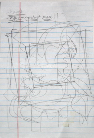
I often get an idea when I am writing down notes, and doodle it down on a sheet of note paper. On the left is my original doodle for the image that I eventually carve in to Block 5.

You can see some of the notes in the corner of this sketch, I actually have no idea what these notes mean. I guess I need to take better notes…

When I do quick sketches like this, I am not too worried about detail. What I am drawing is the overall image that I have in my head. I try to get the overall feel of the image, the balance, and the major elements down on this paper.

Next I graduated to a larger sketch pad, the results are below:
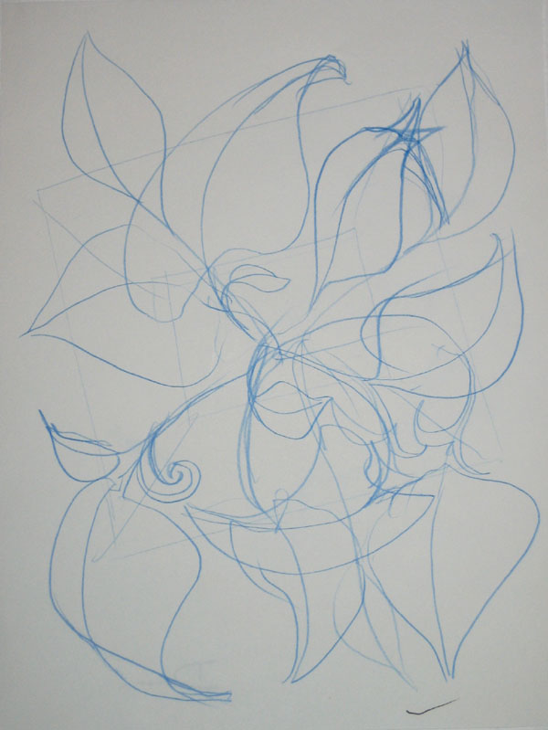
A larger concept sketch

A larger concept sketch

I draw in blue pencil so that I can later go over the image with a regular pencil or a pen to darken up the image. I picked up this habit from comic book illustration. The pencils for each page are often done in blue pencil. Blue pencil does not reproduce in a photocopy machine, so when the page is inked and then copied to prepare it for color, the original pencils don’t show up.

I picked up this habit of working because I like how I am able to draw a light sketchy line, which I can then ignore or reinforce with a darker line as I refine the image.

Next I got out Block 5 and drew the image on the block in blue pencil again. When I had an image that I was happy with drawn in pencil, I went over the image in ink. Here is the partially inked block, you can see both the blue pencil and the ink drawing:
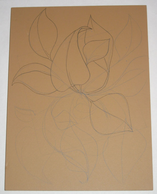
The design sketched in pencil, and partly finalized in ink

The design sketched in pencil, and partly finalized in ink

As I inked the image onto the block, I realized that I like the look of the ink drawing, and decided to carve the block so that it would have the look of a line drawing when it was printed. This was a change from my previous plan, which was for this block to print the flat shapes of the leaves.

I realized that I had done that before with some of my previous prints, so I decided to do something different with this block.

Another comment on this block’s image: one of the things that I was unsatisfied with on my previous prints was the how sparse the image felt. The previous images felt rather empty to me, and I wanted to create an image that was more abundant with growth, so to speak.

Finally, I sat down and started carving this block. Here is the partially carved block:
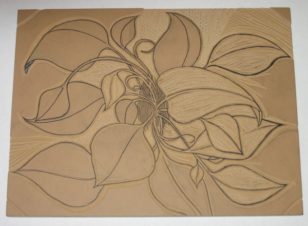
The block is partially carved

The block is partially carved


It turns out that carving a block so that it will replicate an ink drawing takes a long time. I spent around 10 hours carving this block. I had to be precise with my X-acto knife to follow the lines, to make sure the final carved line wasn’t too thick or too thin, and to make sure that the block was carved right.

One of the challenges of carving a linoleum block is that the material is not rigid. It is pretty flexible and soft. This makes it a little easier to carve than wood, but presents a problem of stability. I had to carve into the block at an angle, so that the linoleum base is bigger closer to the particle board that the linoleum is mounted on.

Each uncarved area of the block is like a little mountain sticking up off of the board surface. This is required to give each portion of linoleum stability, so it doesn’t get smashed and misshaped when I put pressure on it to transfer the ink from the block to the paper.

The result is that carving a block like this requires a lot of time and precision.

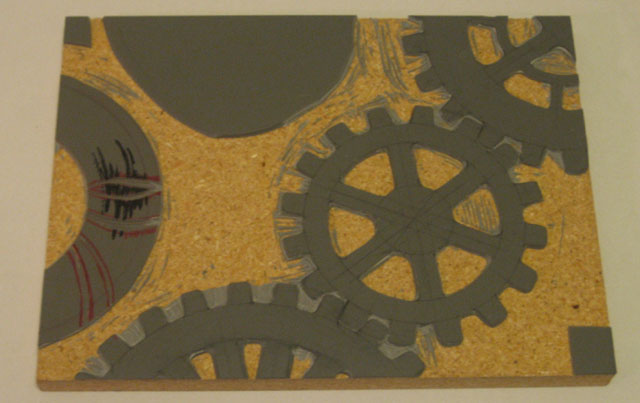
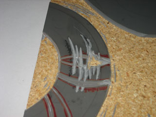
Finally, the block is finished:
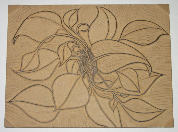
The block is completely carved

The block is completely carved

10 hours and ten sore fingers later, the block is finished. At least I didn’t cut myself this time, I seem to be getting better at not doing that.

Next I’ll show how I transfer this image to other blocks, and what I carve to compliment this block.
Why Printmaking? (A Study in Polarity)

Thursday, October 29th, 2009

Why don’t I just paint, or draw, or sculpt, or something like that?

It might be easier, and less time consuming. I might be able to whip out art much quicker. I wouldn’t have to explain the difference between printmade original art and industrial produced prints of art (ie. posters).

I love printmaking because the process of creating the print is so relevant to the final product. Of course, the process of every type of art impacts the final work of art that you make. How the paint is manipulated on the canvas decides how the painting will look, how the metal or clay is moved, welded and joined decides how the sculpture will look.

With painting, drawing, and sculpture, the work done has a direct impact on the final result. Printmaking is a little more indirect. The artist carves a block of wood, which is arguably where the talent to create an image comes into play, but then that block is printed, which is more of a technical process than an artistic one.

The process of transferring the ink from a printing plate or block to paper is very technical. It requires precision and proper methods.

Printmaking requires two sides of me: the artist and the engineer.

The artist in me creates the image, decides how it will look, carves the block, decides what colors should be used, and what feeling or thought I want to put into the finished art.

The engineer takes over to figure out how to mix the inks, how transparent the ink should be, how to line up the multiple blocks so that the print registers well, how much pressure is required to transfer the ink, and how much drying time is required before the next layer of ink is applied.

Both parts of this process interest me, and engage me. In order to make a print, I have to engage my creative side, as well as my technical side, and so I feel much more balanced when creating prints.

Printmaking engages these two sides to me like no other method does. Painting, and even drawing to a degree, are much more of a purely creative endeavor for me, and my paintings tend to be more emotionally charged than my prints, because painting does not require the same balance of my different ways of thinking like printmaking does.

This makes a little more sense knowing that by day, I am an engineer. I am registered as a Professional Mechanical Engineer in California, and spend my days designing water treatment and utility systems.

My job is all technical all the time, so I need art to create that balance in my life between those two poles. As a printmaker, both of those poles have to work together to create my final product.

That’s why printmaking is such good stuff.

How to Print a Woodblock

Wednesday, October 14th, 2009

Here we go, part 3 of a series explaining what a woodblock print is and how it is made. Part 1 explained what a Woodblock Print is, and Part 2 discussed preparing the block and the ink.

Printing a woodblock consists of rolling ink on the block, and pressing paper against it. There are many more nuances to it though, which I’d like to explain.

To explain the printing process, I have to take a step back and explain how prints with multiple colors are made. There are a few processes that can be used; the most common is to carve a separate block for each individual color. Each block is printed separately, and the the image is created as the colors are added to the paper.

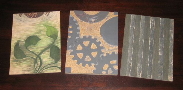
Here’s an idea of how the different blocks look that go into a multi-colored print:

3 blocks used to print 5 different colors

3 blocks used to print 5 different colors

These 3 blocks were used to make the prints that came off the press yesterday. I had to print each block individually with a different color.

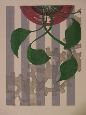
A woodblock print made from the 3 blocks shown above

A woodblock print made from the 3 blocks shown above

I did something a little tricky with two of these blocks, I used different portions of the blocks to print different colors. The two leftmost blocks in the image above had a lot of space left on the block after I finished carving the first image, so I used each of the blocks to also print part of the “vase”.

The image to the right is one of the prints made with these blocks. If you look at it closely, you will be able to see which part of which block printed which color.

You will also notice one other aspect to printmaking, which is that everything prints in reverse. When a block is printed against the page, the mirror image of what is on the block ends up on the paper.

Now that I’ve got 3 blocks with a total of 5 colors to be printed, the challenge is to align each of the blocks on the paper. This process of making sure all the blocks line up is called registration. In some way or another, I have to make sure that the blocks all register with one another.

(The question of how the blocks are carved in the first place so that all the images line up is another question for another day)

Before I do that though, I have to ink up the block! The block is inked by simply rolling the roller in the ink, and then rolling it on the block. It takes a few passes of ink on the block to (1) get enough ink on the block to print, and (2) get an even layer of ink on the block so that the color is consistent. Both of these are done by taking time and rolling the ink on the block a number of times.

The ink rolled onto a portion of the block, ready to print

The ink rolled onto a portion of the block, ready to print

I roll the ink on the block, then roll it back in the well of ink that I previously rolled out. I repeat this until their is enough ink and the thickness is consistent.

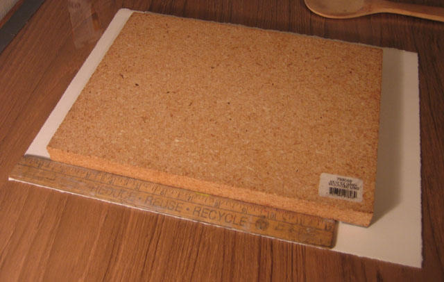
Next, I use my simple registration system – a ruler. The ruler I use is one inch wide, and luckily enough, the margins on these prints is 1 inch as well. I place the ruler along the left side of the paper, and I align the block against the edge of the ruler, with the top of the block 1-1/4 inches below the top edge of the paper.

I use a ruler to align all the blocks in the same place on the paper

I use a ruler to align all the blocks in the same place on the paper

This part of the process is delicate, because if I move the block on the paper, the ink will smear a little bit, and that does not look very nice. I’ve got one chance to lower the block directly onto the paper in the right place with the help of the ruler.

When I get around to printing the next block, I will place the ruler against the edge of the paper again, and line up the next block with the ruler. This way, I make sure that each block gets printed in the same place on each sheet, and all of the colors will line up with each other.

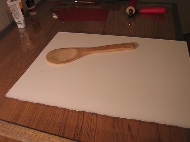
So now the inked block is lying down on the paper. I slide the paper and block off of the table, and flip them over together. I am not so fancy as to have a printing press in my little apartment, so I use a wooden spoon. The spoon in the picture was actually part of a sushi making kit that I got as a gift.

Mmmm. I love the sushi. It’s an incredible food.

The block is flipped over with the paper on top, ready to be pressed with the wooden spoon

The block is flipped over with the paper on top, ready to be pressed with the wooden spoon

This spoon, though it is made for sushi, also seems to be made for woodblock prints. It is very wide, and nearly flat, but with e slight curve to the backside. I rub the backside of the spoon over the back of the paper, pressing it against the block. This takes a few minutes of pressing, because I like to make sure that I get the ink transferred onto the paper well.

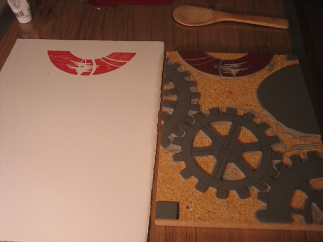
When I’m all done, I pull off the paper, and see the ink transferred over. Nice and simple!

The ink is transferred onto the paper, it will take a few more blocks to complete this image

The ink is transferred onto the paper, it will take a few more blocks to complete this image

The real joy of this process is seeing what each block adds to the image. I usually have an idea of how the finished prints will look as I am carving the block, but that vision in my mind can never compare to what I see when I pull the paper off of the block for the first time. Each time a new color is added, I get very excited that first time that I remove the paper from the block and reveal how it looks.

New Art Hot Off The Press

Monday, October 12th, 2009

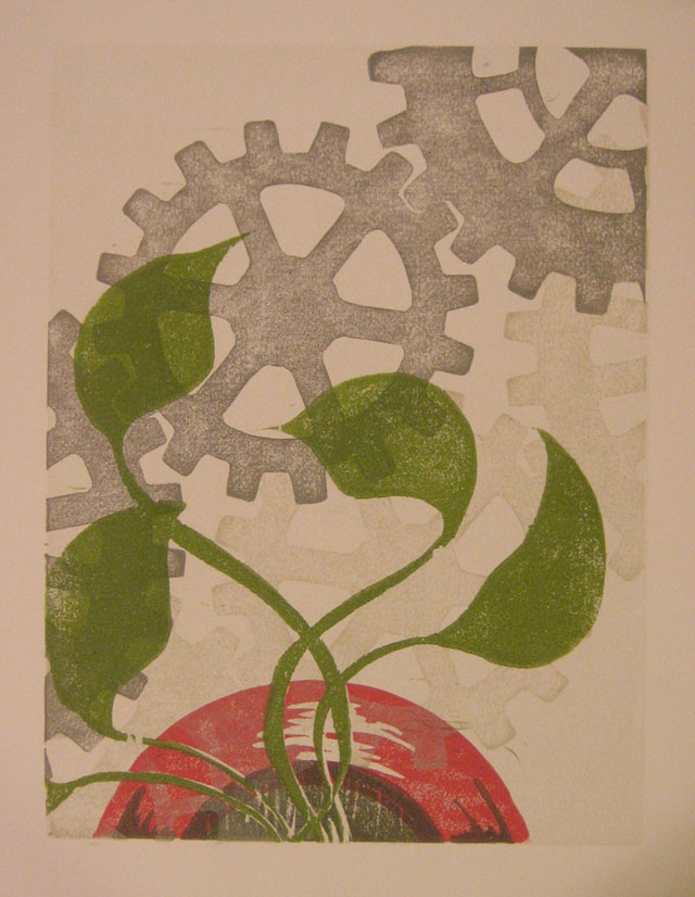
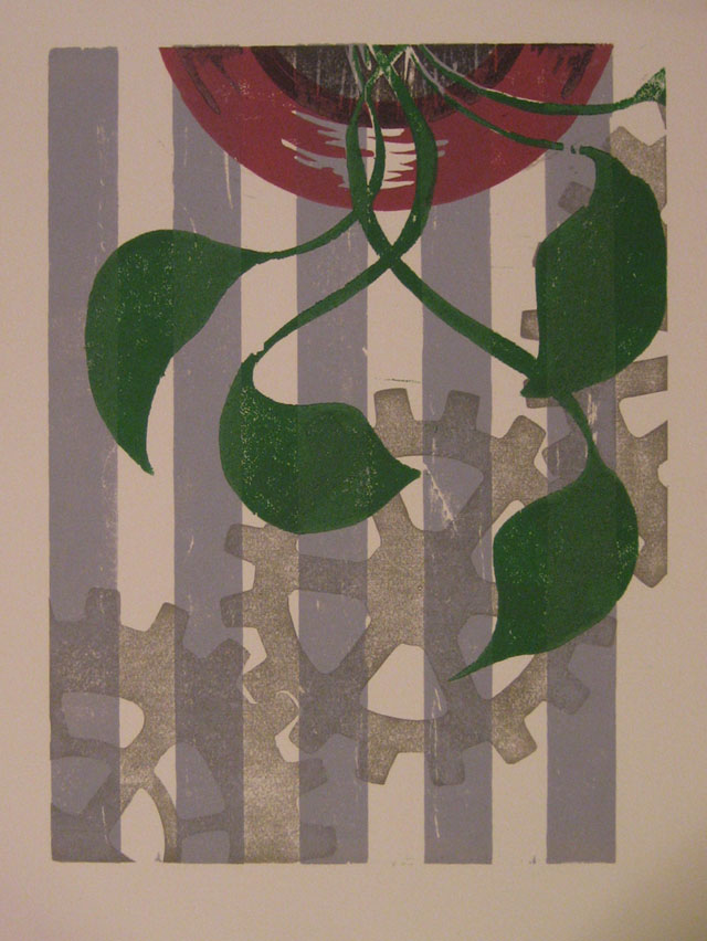
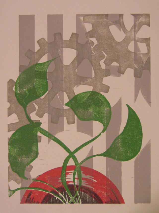
I’ve got something to show for my last few days work. If you like this art and want to keep up to date on when it will be available for you to buy (for ridiculously cheap prices), then go to the 101 Woodblock Series page and sign up for the newsletter.

This series is all about the combination of gears, flowers, plants, and graphic design. Yeah, it’s an odd mix, and I promise to explain it some day. In the meantime, you’ll have to settle for enjoying some previews of the art.

A New Woodblock Print - Hot Off The Press!

A New Woodblock Print - Hot Off The Press!

Another 101 Woodblock Series Print

Another 101 Woodblock Series Print

One More Print from the 101 Woodblock Series

One More Print from the 101 Woodblock Series

Carving Blocks and Rolling Ink

Monday, October 12th, 2009

This is the second article about how a woodblock print is made. In the last post, I talked about the materials and tools I use to make prints. In this post I show you how I carve the block and prepare the ink.

Carving the block

I’ve lead you on a bit. I really have.

I’m sorry.

Now I have to confess something. It’s a little embarrassing, but I hope you will understand a little.

I actually… don’t use blocks of wood for all my woodblock prints. A lot of the time I actually use linoleum. The linoleum is mounted on a woodblock to keep it rigid, if that counts.

Linoleum is similar to wood, and it is a little easier to carve, because it doesn’t have the grain that wood does. The printing surface is different, so the ink has a different texture when it is printed on the paper.

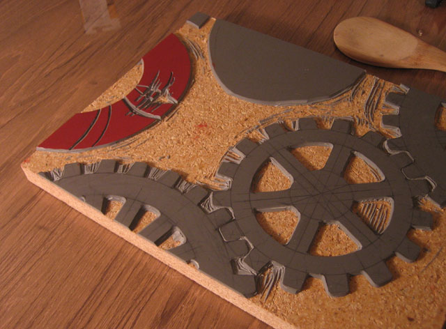
Here’s the block I am going to show you today to demonstrate how the ink is printed:

A carved linoleum block

A carved linoleum block

This block is mostly carved already. There is one little bit of carving left to do. The arc on the left is designed to be reminiscent of a vase for flowers, so I will just call that the “vase”. I used a block marker to draw the area that I want to carve away.

I’d like a highlight on the curved surface, so I need to carve away this area so that ink will not print there.

Close up on the newly carved portion

Close up on the newly carved portion

I usually draw this outline in pencil, and I do not color it in like shown above. I used the black pen to make it easier for you to see in the photograph.

I use my X-Acto knife and gouges, and carve away the area I drew in black. I am very careful when I carve delicate areas like this, to make sure that I get the detail that I want, and that I don’t slip and make mistakes. A small area like this takes me about 15 minutes to carve.

The finished block is shown at the left. I am only going to print this vase in this run, the rest of the linoleum will be printed with other colors. I left the big blob of linoleum along the top edge uncarved, because I may eventually use that part of the block to carve another pattern into. I think another gear may look nice there.

The Ink Job

Now I get started with the ink.

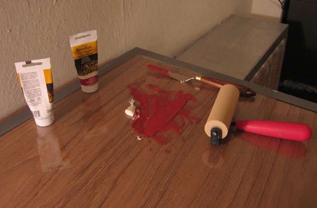
The ink is mixed and ready to roll

The ink is mixed and ready to roll

I’ve mixed up some red ink with a touch of white. The ink that I am using is basic woodblock printing ink that I got from the art store. I use oil-based ink, because I think it lasts longer and looks better. Oil-based ink takes longer to clean up, and requires nastier chemicals like paint thinner.

I use a palette knife to mix the ink together, and when it is all mixed, smear it in a line about the width of my roller. The roller itself is a soft rubber roller. In general, rollers come with either soft rubber or hard rubber surfaces. I prefer the soft, because it covers the block with ink better.

Just like it is easier to spread soft butter across a piece of toast, it is easier to get the ink spread onto the block with a soft roller. The roller conforms to the surface of the block, and accounts for the uneven surface of the block.

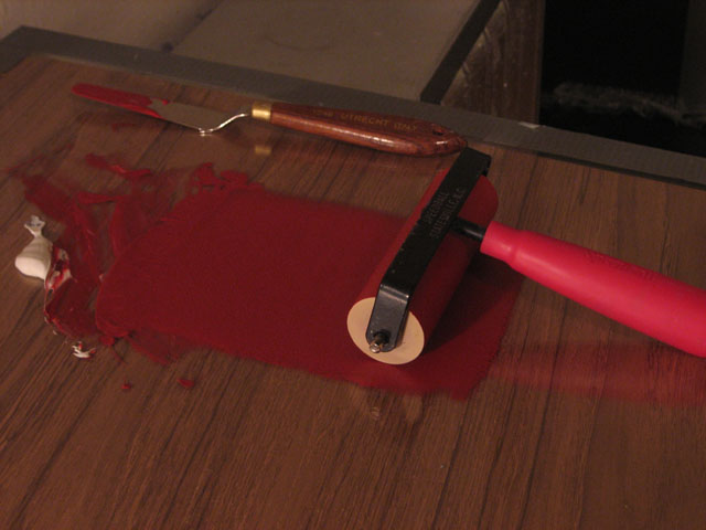
I roll out an even layer onto the glass from the fount

I roll out an even layer onto the glass from the fount

One thing you will notice in the photo above is that the roller is rested on its back. If the roller is left resting on the roller portion, a flat dent can form in the rubber itself. This isn’t such a big deal with these cheap rollers from the art store, but once I get the roller I want, it will matter quite a bit. Good rollers are made of high quality rubber, and cost well over a hundred bucks.

A quick aside – I roll out the ink on a big sheet of glass. Glass is a perfect surface to roll ink on because it is very smooth, and it is not porous, so the ink does not soak in to the surface at all. This makes it easy to scrape the ink away, and to clean it up when I am done.

Next I roll out the ink as shown above. I don’t roll out all of the ink, but just the right amount. Learning what the right amount is takes a little experience. I can’t quite explain it, because I know the right amount because of how the roller feels rolling the ink, and how it sounds.

If the ink is too thick, the print will get smooshed, and the detail will be lost. If the ink is too thin, then it won’t print dark enough, and will look thin. To continue the toast analogy, when the ink is too thin, it is like trying to cover your toast with not enough butter.

The ink across the top is called the fount. When the ink gets too thin, I dip the roller into the fount and roll it out.

Coming Attractions

Ok, I am WAY over my morning writing power hour now, and I have to go get ready for work. Next up, printing the block, lining up different colors, and a progress report.

What is a woodblock print?

Thursday, October 8th, 2009

Did you make a potato print back in elementary school? You cut the potato in half so there is a flat edge, then carve some sort of shape in to it, a heart or a star, then you dipped it in poster paints, and pressed it against paper. You essentially made a stamp out of a potato.

A woodblock print is no different. It is printed from a flat piece of wood that has portions carved away, so that the ink doesn’t print there.

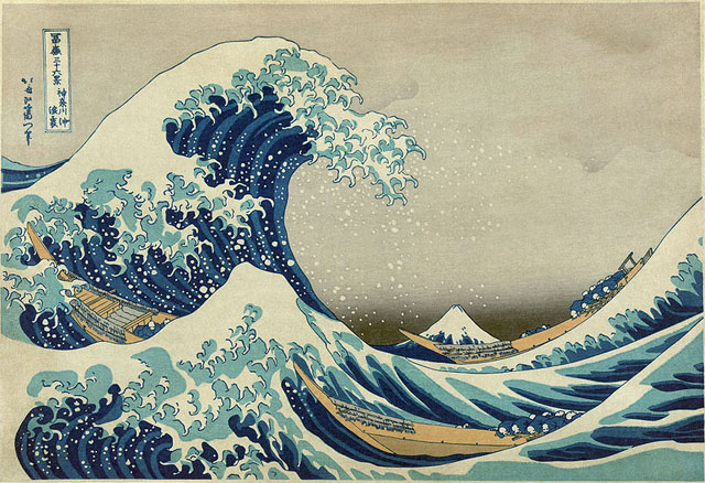
Woodblock prints are not very common in Art History, but the most famous woodblock prints were made in Japan. You probably recognize the image below, it is a woodblock print by the artist Hokusai from 19th century Japan. This print is titles The Great Wave off Kanagawa (Kanagawa Oki Nami Ura is the Japanese title). This print was the first in a series called 36 Views of Mount Fuji. You can see Mount Fuji in the background of the image, in the dip between the waves. Hokusai’s prints are an inspiration for and influence on my own woodblock prints.

The Great Wave Off Kanagawa by Hokusai

The Great Wave Off Kanagawa by Hokusai

The Wood Makes the Print

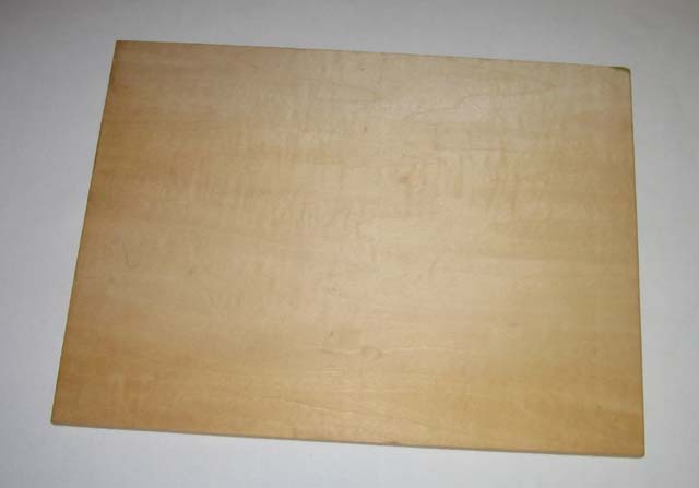
Woodblock for a woodblock print

Woodblock for a woodblock print

To make a woodblock print, I start out with a smooth, flat piece of wood (or sometimes linoleum as a substitute). I have to have some sort of image in mind when I start. I determined that the imagery for the 101 Woodblock Series is going to be gears, flowers, and plants, so I know what I am trying to accomplish image wise.

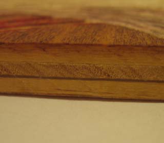
Section of Wood

Section of Wood

The wood is special made for prints. I have actually had the block you see above for a very long time. I got this block about 10 years ago, but only recently put it to use. I believe that this block was made in Japan. The block itself is made of 5 plys (layers). The middle 3 plys are about 1/8-inch thick. The ply on the top and bottom are extremely fine. They are about 1/100-inch thick! I used my scale to measure the thickness, and it was too small to measure, even with my scale that measures in 1/60-inch increments! The direction of the grain alternates on each layer, creating a very sturdy block.

The next step is to carve the block. A woodblock is printed by rolling ink on a roller on to the woodblock. Every part of the wood that I do not carve away gets ink rolled on to it. The portions of the block that are carved away do not get ink, because the roller rolls on the flat, untouched portion of the block, missing the “valleys” that I have carved in.

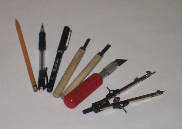
Tools of the trade

Woodblock Print Tools

Woodblock Print Tools

Here’s a list of the tools I use and why and how I use them. From right to left in the picture above:

  • Compass: A lot of the imagery I like involves circles. I have a number of compasses that range in size to help me carve perfect circles. The compass shown is one of the larger compasses I use.
  • X-Acto Knife: I have a nice set of X-Acto knifes with a wide selection of blades. This set was a gift many years ago (thank you Uncle David and Aunt Kathy!), and is extremely useful. The knife shown is what I most often use for woodblocks. It is the largest of the set, and I can get the most leverage out of it. Unfortunately, this also means that it cuts me the deepest when I slip. If you don’t bleed a little for your art though…
  • Gouges: I have a set of cheap gouges that I use to remove large portions of the block. The X-Acto knife does the fine work, but these gouges do rough work. These can remove a lot of material from the woodblock quickly. The gouges I have are pretty low quality, I will have to upgrade soon.
  • Pens and Pencils: I use these to draw the image on the block before I start carving. The nice thing about a block is that unlike paper, I can draw without worrying about mistakes. In the end, the block will be carved and ink will be rolled on it, so any pencil and pen marks will not show up.

Coming Attractions

I’m out of time in my morning writing hour, so check back tomorrow for a follow up. I’ll be covering carving the block and rolling out ink. I’ll finish up with a post about printing the block and registering multiple blocks (what does that even mean?), and all the other stuff that goes in to making a woodblock print.

What is an Edition of Prints?

Wednesday, October 7th, 2009

Editioning is the process of preparing a set of prints. The prints must be signed, numbered, and gone through to make sure they are all the same.

Traditionally, when a print is made, the printing elements are prepared (the blocks, metal plates, or whatever else the artist creates to print off of), then numerous copies of the print are made.

The set of identical prints is called an edition. Most fine art prints are made in editions, and when I was in college, this is how I made my prints.

There are a few conventions to prints in an edition, I’d like to explain to you.

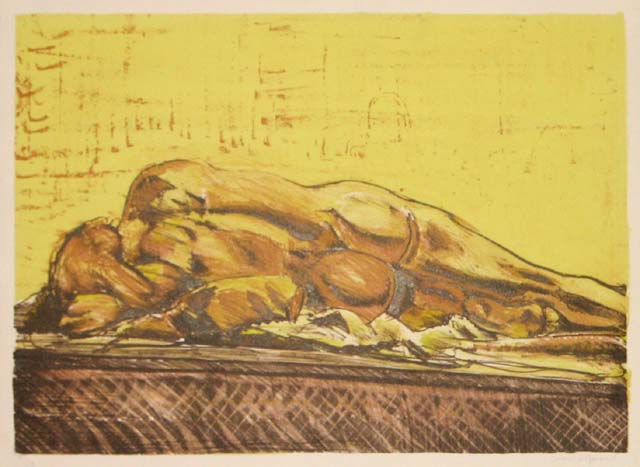
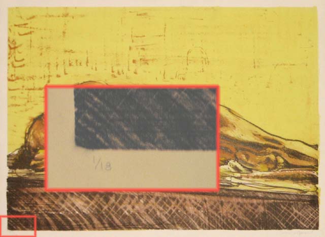
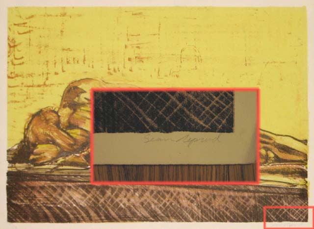
I’m going to use this lithograph of mine to explain. This is the first thing I could find in my easily accessible portfolio. Most of my stuff is stored under my bed!

A lithograph of a female figure

I did this drawing on a lithographic stone during a figure drawing session. I liked it enough to work up a couple of color plates and make an edition out of it.

Edition Number

In any edition, each print has a number. The number is given as a fraction, indicating which number print you are looking at, and how many prints were made total.

Edition number goes in the bottom left corner

In this case, the “1/18” indicates that is print number 1 from the edition, and 18 total prints were made in this edition.

If all you see is the fraction, then each one of the prints in the series should be exactly the same. The goal of an edition, after all, is to make an identical set of prints.

You may sometimes see the letters “E.V.” after the number. This means “Edition Varie” (edition very-AY). This means that not every print is exactly the same. The artist has created variety in the set on purpose. The most common variety found is the colors. The artist may print form the same block, but use different colors each time, so that even though the image is the same, the colors are different from print to print.

The other thing you may see on a print is the letters “A.P.” instead of a number. This means “Artist’s Proof”. It is a completed print, but is not part of the edition. Artist’s Proofs do not get numbers.

When a fine art print is released by a print studio, the number in the edition, and the number of artists prints is included in the solicitation. They may release an announcement like, “An edition of 25 prints with 5 Artist’s Proofs”.

Artist’s Signature and Title

The edition number is the most complicated part of the print to explain. The rest is easy. The next thing to notice is the signature. The signature is usually in the bottom right corner of the print, as you see below.

Signature goes in the bottom right corner

A print, after all, should be signed!

Last of all is the title. I don’t have a picture to show you of the title of this lithograph, because, well, I never titled it.

Yes! It’s embarrassing! I never titles this print. If I had, however, the title would have been written smack dab in the middle of the print, right underneath the image. The title of this print probably would have been something boring like Figure Drawing III.

A Light Touch

The last thing that you will notice is that signed and numbered this print in pencil instead of pen. This is common, and you will most likely find prints signed and numbered in pencil. The reason for this is that pencil has a softer color, and a lighter touch than a pen. Or so I imagine.

It could very well be that when editioning of prints had started, pens weren’t invented yet (probably not though).

Either way, the information about the print is written in pencil so that it is lighter in color and does not draw attention away from the print. THe title, number, and signature should be able to be seen if you want to , but should not distract you when you look at the print from a few feet away.

= = = = = = =

There you go, a quick crash course in editioning prints!

Next up, I’ll let you know why I am throwing this convention out the window for my 101 Woodblock Series.

My Art is About Gears, Plants, and Flowers

Thursday, October 1st, 2009

I have been asked recently what kind of art I make.

When people ask me this, they aren’t asking the medium that I use (which is relief block printing), they are asking what kind of imagery I draw.

Simply put, right now, I draw gears, flowers, and plants.

Yes, that is correct, there is a gear in there.

The usual word that some art critic might use with their wacky vocabulary is “juxtaposition” to describe this, but really, I think of it in a much more simple way – I just combine them together.

I am interested in machines, how they work, how they transmit power from one place to another, and how they can be designed in rather clever ways.

Maybe this is how I ended up as a Mechanical Engineer…

I really like flowers and plants also. I see the lush green of the plants that seem to swirl and unfold out, dotted with bright points of brilliant red, white, yellow, purple, and orange of the flowers.

In a way, things that grow are a bit of the opposite of machines. One is made by nature, organic, smooth, random. The other is made by man, manufactured, rigid, exact.

My art is not a statement about society, or man, or nature, or the environment. It is about myself in one way or another. For some reason, this combination of elements fascinates me.

It is obvious to me to combine these two subjects together.

My hope is that you will find something that you find interestign amongst the images I make. Maybe one of them will jump out to you, and it will make sense to you.

The reason why may not be clear, and it may not be obvious, but in that moment when you see something you like amongst the art I am making, I feel like I have shared a little of myself with you, and you have warmly received it.

= = =

If you haven’t yet heard about the 101 Woodblock Series, it’s time to fix that! I am working on a series of woodblock prints that is a crash course through means and methods of relief printmaking.

At the end of this project, I will have 101 unique pieces of art, each of which has been printed from some combination of wood and linoleum blocks.

I want my crash course to be your benefit, so the results of this project are going to be sold to you for only the amount to cover my shipping costs and the cost of materials.

In other words, dirt cheap original, unique art.

The subject of this series is exactly what I talked abotu above, gears, plants, flowers, plus some good old fashioned design thrown in to hold it all together.

If you have started to think, “yes, that is something I am interested in”, sign up for my newsletter, and you will get updates about the project, first notice when the prints have gone on sale, and behind the scenes looks at the creative process.

Click on “101 Woodblock Series” on the left to sign up for the newsletter.

101 Project: Returning to Art

Monday, August 24th, 2009

A few months ago I reflected on my time at UCSC and the art department. Working in the printmaking studio was the most productive and enjoyable time in my life. I loved the work I was doing, and it felt right to be doing it.

In order to get back a little of that breath of life, I have committed to a project: creating 101 prints. Each one will be a unique and individual work of art, using relief printing as the primary medium, with some other mixed media as well.

When I’m done, these prints will go on sale for just a few dollars each, as a shameless self-promotional stunt. The money I will be charging will be no more than I need to pay for shipping costs, my material costs, plus a buck to go towards a nice, expensive brayer for the next round of 100.

I have always been drawn to imagery that combines organic and natural imagery along with images of mechanics and technology. The juxtaposition between these two is the theme of this series.

The other theme of this series is “Sean makes art again”, which is the more important result of this project.

As a special, get my butt in gear bonus, I entered a little competition with my friend, Dr. WordPress. His site, Website In A Weekend, is all about how you can, over a weekend, not only start your blog, but get it firing on all cylinders.

Doc decided that he would write 101 articles on his website, and now we are having a competition to see who can finish first. He’s got a head start on me, but I’ve got a lot of time to spend on this in the next few weeks, and I think I might catch up.

I have 45 of my 101 started, and will finish about 20 of them this week. Next week I hope to get another 25 done, and another 30 the week after. It’s time to crank things up!

When it is all said and done, I will be releasing these on my website, BadDeacon Design. I’ve got a series of articles running on the blog over there about the web as a medium for art. I’m proud of this set of articles, check it out!

Memory Lane: UCSC Printmaking

Wednesday, May 27th, 2009
Myself and my Art were one

Myself and my Art were one

I decided to get going with an art project yesterday, and it starts with printmaking.  I pulled out my boxes of stuff from my printmaking at UCSC days (I was an art major with an emphasis in Printmaking).  I have a stash of paper, the good stuff — Rives BFK — sitting in my print storage boxes along with all the stuff I made while in school.

It was a trip down memory lane, and a reminder that my time at UCSC were my most creative, wacky, diligent, and fun years.

My fellow studio mates and I managed to put out some fantastic work.  Part of the fun of opening up my box is to go through and look at all the stuff I was given or traded to get from my classmates.

It also reminded me of how much I enjoyed working in that studio, and even more so, how right it felt to work there.  And I worked like a dog.

I spent hours and hours there, I remember at one time going two weeks on about 4 to 5 hours of sleep a night because I was spending late, late nights in the printmaking studio.  The best times there always happened at night too.

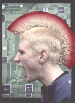
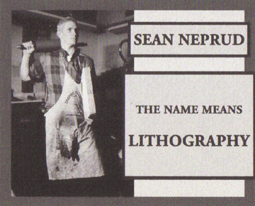
I found a stack of little printouts, stuff that either I or one of my friends put together, these are the images I attached to this post.  One of my friends took a picture of me posing in front of one of my lithographs, you see this above.  We spent a while to get it just right, and what you see is a photo, not something photoshopped together.

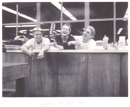
One night, me, Rachel, and Luke decided to see if we could all fit in the big sink in the studio.  Turns out we did, and we took a photo as proof.  Good times.  It was crammed as can be, and below the line of the sink I am bent and contortioned completely out of shape.  Luke and Rachel had to do pretty much the same.  The wackiness was well worth it though.

Luke, Rachel, and myself just hanging out in the sink late at night

Luke, Rachel, and myself just hanging out in the sink late at night

I spent so much time in this studio because I loved what I was doing.  It was more than just fun, I took it very seriously.  It felt like the right thing to be doing.  More than any other time in my life, I felt like I was doing what I was supposed to.

I could write a whole post about Lithography, and what it means to me.  The reason I like lithography correlates almost exactly with the reason I like web design.  It also explains why I think that engineering and art are very closely related, despite common belief.

...or it means Punk Beyotch, it got confusing sometimes

...or it means Punk Beyotch, it got confusing sometimes

The above was my monitor card, a placard that hung on a weekly schedule indicating who was the person in charge at in the studio during non-school hours.

One of my class mates thought I was being a little presumptuous, and crossed out Lithography in the above card and replaced it with “punk beyotch”.  After that it changed back and forth a bit to all sorts of things, good times.

Looking through all of this stuff reminds me of what is really missing from my life right now, which is creating things.  I have done a bit with web design lately, but nothing as tangible as what I produced back in the days of UCSC Printmaking.

I’m hoping that this project I’ll be starting in the next couple days will help set this right.