Archive for the ‘Printmaking’ Category

“Sunrise” Mylar Sun Print

Sunday, April 22nd, 2012

I’ve been rattling around an idea for a while, ever since I first pulled a print on mylar.

I have been using mylar to transfer my key block onto other blocks, since the mylar, due to being plastic, doesn’t absorb ink like paper. I can print on mylar, and then press the printed mylar onto another block, to transfer the ink.

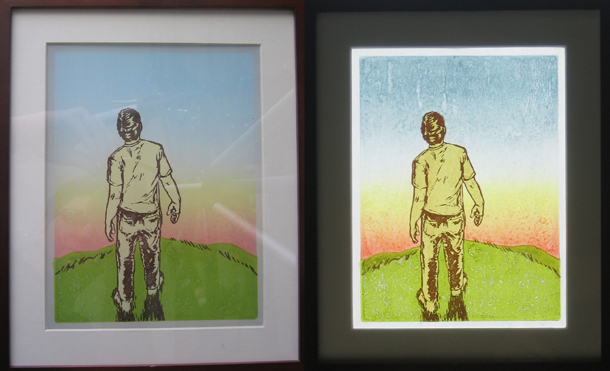
What I noticed, however, is that the mylar is translucent, and color on the back side shines through to the front. Even more, this effect is more prominent when the mylar is lit from the back.

I’ve wanted to take advantage of this for a while, and with a long weekend available, I set to work.

I came up with this: It is called “Sunrise”, it is an 8″x6″ woodblock and linoleum block print, printed on both the front side and the back side of the mylar.

Sunrise Woodblock Print on Mylar

Sunrise Woodblock Print , 8x6, on Mylar - Hanging on a wall (left), Hanging in a window (right)

The both of the images above are the same print, in the same frame. On the left, the print is against a wall, without any back lighting. On the right, the print is hanging against my window, with the sunlight coming in through the window behind it.

I am pretty happy with how these turned out. What I like the most is that the image changes depending on how it is viewed, and how it is lit. My thoughts about using mylar turned out to be true!

I’ll have these up for sale soon. Since proper presentation is an important part of this print, I want to find the best way to mat and frame these prints before putting them up in the shop.

And yeah, I want to make more sun prints.

Direction III

Tuesday, December 13th, 2011

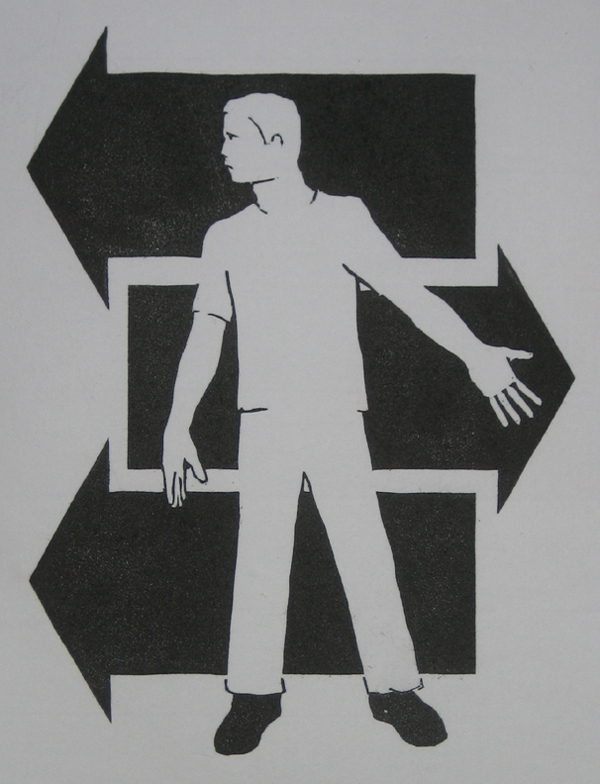
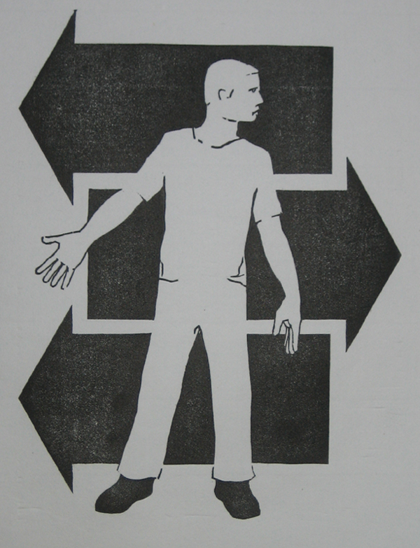
Last week’s woodblock print, Direction III:
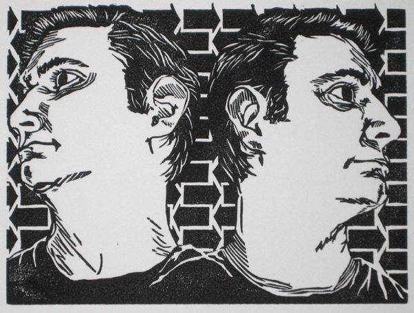
Direction III Woodblock Print

Direction III, Woodblock Print, 8"x6" image on 10"x10" Rives BFK

The alternate title for this print is “Who is that handsome men?”

Another in the Direction series of prints, which are all black and white, 6″x8″ prints. The direction series is about finding direction, or needing direction, or having conflicting direction, or something along those lines.

Honestly, a lot of time I don’t really know what the images I make are really about. Not exactly, at least. I have some feeling or notion that I can’t quite put into words, and so it ends up as an image.

I’ve been thinking about this notion of “direction”. I should have direction, I want to have direction. It doesn’t seem to always work out. This image is about wanting to move in a certain direction, the notion that things seem to halt moving in that direction, and that sometimes those things that put the breaks on a direction are external, and sometimes they come from myself.

got to self portraiting, not out of vanity, but because I was the only person here to use as a model for this one. Self portraits out of necessity.

A few technical notes

I was happy with the style in this print, I like how I was able to transfer illustration to the woodblock in a way that felt like I was still using my illustration style, and also using the nature of the woodblock.

When I draw, I usually use pencil, and end up with a softer line, and sometimes thin lines. That doesn’t transfer to woodblock, there are no soft lines, just the edge between the portion of the block that was carved, and the portion of the block that was not. This is a sharp line no matter how you carve it.

Also, the grain of the wood does not support a very thin line. The actual structural support of the wood I use breaks down with very thin lines, and when the line becomes thin enough, there isn’t enough wood left to keep the top layer of wood that accepts the ink in place.

I like how I was able to balance some line work with the needs of the wood to have a thicker line in this print. I may try to do some more like this.

A few production notes

This block took about 10 hours to carve, though this time may have gone quicker if I wasn’t having a bit of a James Bond marathon as I was carving this one. Carving the blocks is the least fun, most grueling part of this process, I usually have some sort of media going when I carve to entertain myself. I just got the last Ultimate Edition box set of James Bond movies, and decided it was the perfect time to work my way through them.

I was cleaning my apartment last weekend and found a stash of Rives BFK paper that I didn’t know I had. Rives is a heavyweight, bright white, cotton rag paper. It is really suited for lithography and etching, but I decided to use it for this print anyway.

After I tore the paper into the correct size, I put half of it in a damp pack (a stack of paper with dampened newsprint in between the sheets that is put under pressure to evenly dampen the paper). The dampened paper printed better, of course, as it usually does.

Ultimately, however, I think I need a press if I am going to keep this up. Right now I am printing by rubbing the back of the paper against the block with a large flat wooden spoon. It takes a lot of effort, and I still don’t get the ink transfer I want. I think a press would help with that, and speed up the printing process immensely.

For this week, I’ll be whipping out another of these “Direction Series” prints, don’t quite know what it will be yet. I need some time to sit down with my sketch pad and think it through.
Direction –>

Monday, December 5th, 2011

Having trouble finding direction?

Ever feel like you are pushing yourself one direction, and life is pulling you another?

Part of you is going one way, another part going another?

Because I do to. Just a part of life, I guess. Maybe. I don’t know. I’m no philosopher.

But I do feel pulled in lots of directions. Sometimes internal, sometimes external. Sometimes both.

This series of prints is about that.

Direction I Woodblock Print

Direction I, 6"x8" image on 8"x12" Hosho paper

There’s two of them. The direction is the same. And the direction is different. That’s the whole point.

This image came about to put into images something that I feel, but is hard to explain. maybe the image will let you know what I mean.

Maybe it will mean something different to you.

Direction II Woodblock Print

Direction II, 6"x8" image on 8"x12" Hosho paper

It’s a woodblock print, hand carved, hand inked, hand printed.

Let me know what you think!

More Drive/Driven Variant madness!

Monday, November 7th, 2011

Have I gone crazy?!

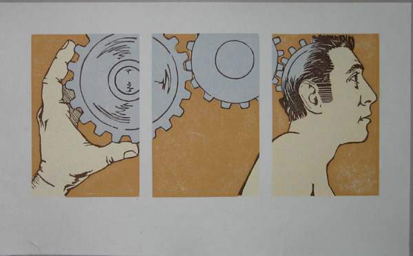
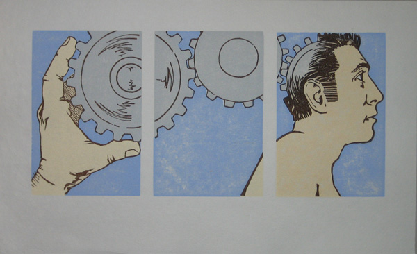
I have gone crazy with variants to this series of Drive/Driven prints. Here’s a few more.

The orange variant:

Drive(n) woodblock print by Sean Neprud, orange variant

Drive/Driven woodblock print, 13x6, orange variant (click to enlarge)

and the cool blue variant:

Drive(n) woodblock print by Sean Neprud, blue variant

Drive/Driven woodblock print, 13x6, blue variant (click to enlarge)

This is the end of the line for this series, it’s all done, no more prints, no more variants.

Drive/Driven off the presses

Wednesday, November 2nd, 2011

Finished this one up last night.

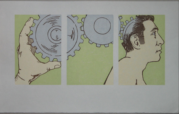
Drive(r)(n)

Drive/Driven, 13x6 Woodblock print (click to enlarge)

This is the last in this series, kinda the “put it all together” print. Literally, I guess.

This print took quite a while to print. This required 10 blocks to print.

More on this one coming soon, plus variants!

Limited Edition Variants of Driven and Drive Woodblock Prints

Monday, October 31st, 2011

Not only are my woodblock prints limited editions, but my limited editions have limited variants!

Oh, heck yeah!

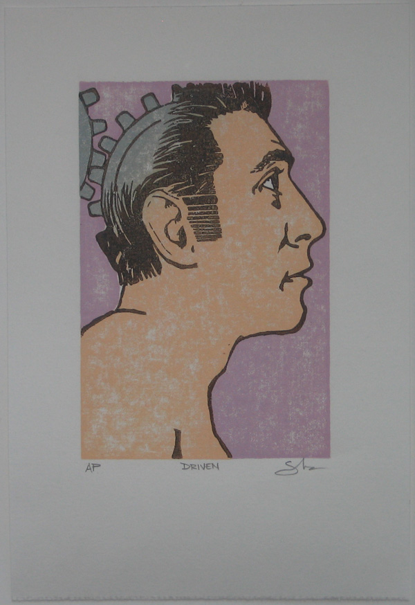
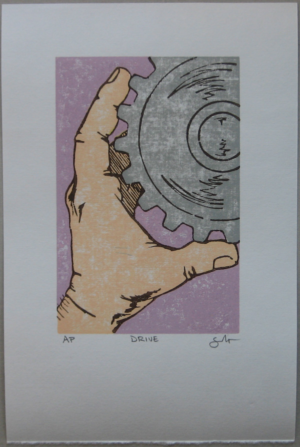
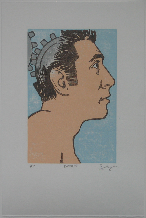
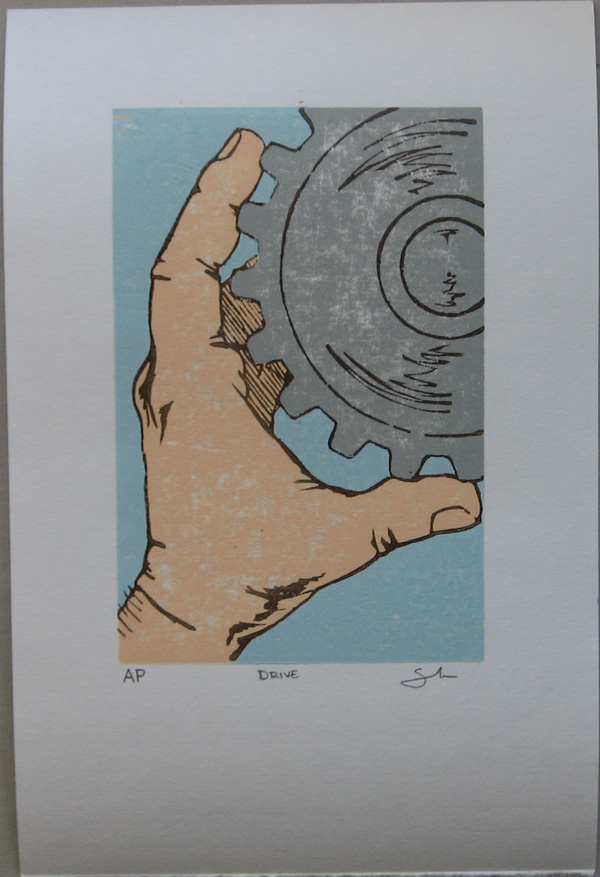
Both the Drive and Driven prints that I finished over the last couple days each have two variants.

Powerful Pink Variants

One fourth (numbers 9 through 12) of each edition of prints is the Powerful Pink variant:

Driven Woodblock Print Powerful Pink Variant

Driven Woodblock Print, 4x6, Powerful Pink Variant


Drive Woodblock Print Powerful Pink Variant

Drive Woodblock Print, 4x6, Powerful Pink Variant

Cool Blue Variants

One fourth (numbers 13 through 16) of each edition of prints is the Cool Blue variant:

Driven Woodblock Print Cool Blue Variant

Driven Woodblock Print, 4x6, Cool Blue Variant


Drive Woodblock Print Cool Blue Variant

Drive Woodblock Print, 4x6, Cool Blue Variant

New Print: Drive

Sunday, October 30th, 2011

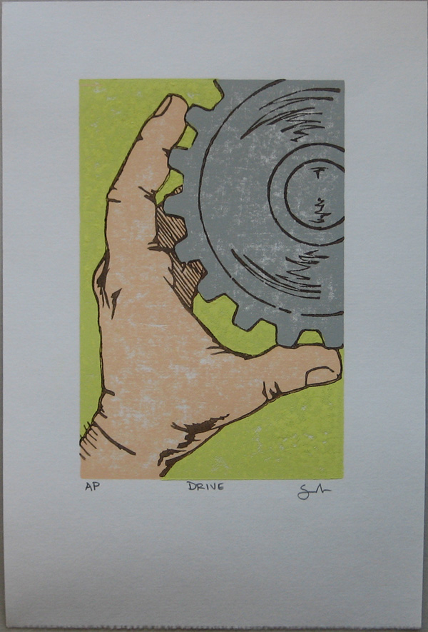
Operation: Night Fire continues. Here’s the latest print, nice and complete:

Drive, 4x6 woodblock print

Drive, 4x6 woodblock print

This series started with a single print that I carved months ago, but I have been adding to the idea, following through, completing the drive train.

Coming up, did I mention the limited variants?!?!

New Print: Driven, and Operation: Night Fire.

Wednesday, October 26th, 2011

Hot off the press (ie. my work station) is this brand new print. Or brand old print, if you’ve been keeping tabs here.

Anyway, I printed the edition, and have a nice new stack of prints. They look delightful!

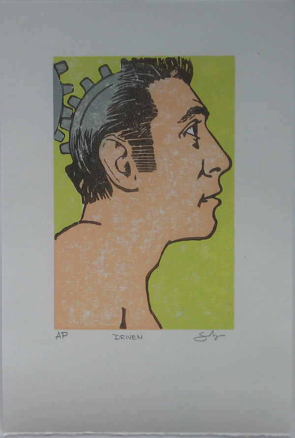
Here’s the regular version:

Driven, 4x6 woodblock print

Driven, 4x6 woodblock print

The name of the print is Driven. I tried to make this image a reflection of how it feels to be compelled by something that you don’t quite feel like you have control over. Or it is a cool picture of a dude with a gear instead of a brain. Or maybe it is a comment on our modern times, except replace “modern times” with “industrial revolution”.

That’s the thing with art. You get to decide what it means to you, I just get to be the supplier.

Speaking of supply and demand and commerce and all things great about America, these will be on sale! Soon.

I just want to finish up this series of prints first.

This also means that this print is the first in a series of related prints. I started printing the next one yesterday, plan to finish it up this week.

I decided that I like working in series, so a lot of the work for Operation: Night Fire is being done as a series.

Operation: Night Fire

I function pretty much in binary. I’m either doing nothing, or scheming. Operation: Night Fire is my latest scheme. And it’s a good one. Ambitious. Waaaaay too much work. But, hey, it’s either that or do nothing. Like I said, binary.

I can’t quite tell you what Operation: Night Fire is quite yet, because I’ve learned not to explain my schemes until they’re already complete.

(You’d think I would have learned this from Ozymandias all those years ago when I first read Watchmen, but I didn’t)

So, clearly I let slip that Operation: Night Fire exists, the time isn’t right to fill you in on the details though. I need to finish it first.

I’ll tell you this, it’s gonna be freakin’ cool.

Druid Arch Woodblock Print in Process

Monday, June 21st, 2010

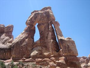
I’m working on a new woodblock print based on my destination at the end of Elephant Canyon: Druid Arch.

I was rather struck by this arch. To get to it, I had to hike through a canyon, then finally up a rocky hill. I scrambled up and over rocks to climb a couple hundred feet up the end of the canyon, before reaching a rock plateau that looked back on the canyon.

Druid Arch

Druid Arch, at the end of Elephant Canyon

When I turned my head to the left, I saw this tall arch, standing 100 feet up in the air above this plateau. I drew this arch then, and I am printing it now.

The colors and shapes of the desert strike me the most. The rocks are large, massive, un-moving, yet arches like Druid Arch look fragile, like the slightest push could topple the entire thing. The rock edges are smooth in places, weathered by who-knows how many years of water and wind, yet in other areas the edges are sharp and hard, where the water worked its way into the rock, eventually causing it to break apart quickly and fiercely.

The rocks themselves are rich reds, oranges and whites, cut by the dark shadows against the rock edge. Most of all, the sky in the desert is blue. It is vibrant, and when I looked at the arch with the sky behind it, the blue began to vibrate and pulse with brightness and luminosity.

It is a challenge to capture the entirety of this experience in a small printed image.

This arch stands up above a rock plateau at the end of a canyon I reached 6 miles into this desert canyon. It stands about 100 feet tall.

I sketched Druid Arch while I was out there, and I am developing this woodblock print from the sketch and from photos I took.

From the Grand to the Mundane

This weekend I found myself in the middle of process hell. I haven’t written much about process hell, but it is when my work consists of carving, mixing ink, rolling and printing blocks, making sure images register, cleaning up ink (and hands, and rollers), preparing paper, and other tedious bits of the printmaking process. All my work was printmaking grunt work over the weekend.

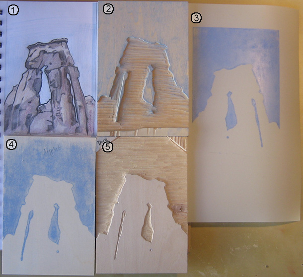
There was a bright spot, however. As I was working, I realized I was at an interesting point in the process that illustrates how a print is planned and how the image takes shape. I took a picture of the assortment of materials I was working with to show and describe to you. The numbered descriptions below the image describe each item in the picture below.

A Woodblock Print in process

A woodblock print in process of being developed (click to enlarge)

  1. Graphite and Color Pencil Sketch – Before I touch a woodblock, I sketch the image to solidify my plan. I started with pencil to get the overall shapes correct, then added color to figure out how many blocks I would need to do what I want. My plan is to use three blocks, one for the blue of the sky, and two for the arch. One block will print the light yellow areas in the sketch, another will print the dark areas shown in the sketch. The third color, the reddish brown color will be created by overlapping the two other colors.
  2. First Carved Woodblock – When I am satisfied with my sketch, I transfer the image to the first block. To do this, I draw a heavy line around the edge of the image with a soft pencil, my 6B or 9B. I then press the sketch against the woodblock, and rub the back of the sketch, making the pencil lines transfer to the block. The blocks that define the arch will be bounded by the blue of the sky, so I carved the sky first.
  3. Mylar Transfer Paper – After the first block is carved, I transfer the image to the other blocks. This requires a more precise process than when I transferred the sketch to the block (as described above). To achieve the required precision, I print the first block on a sheet of mylar. Mylar is a plastic, and the ink largely remains on the surface of the mylar (in other words, it adsorbs instead of absorbs the ink). I take a fresh block, align it with the mylar, and rub the mylar against the block. As long as I align the mylar with the block correctly, the result is a fairly precise transfer of ink from one block to another.
  4. Woodblock with transfered image – The process I described above results in a block with the ink from the first block transferred to it. I brush the block with Talcum Powder (i.e. baby powder, makes the block smell nice too). The talc absorbs into the ink, removing the tackiness, leaving the surface of the ink dry. This keeps me from smearing the ink and making a mess as I work on the block. You can see I wrote “light” on this block, to help me keep track of which color this block will print. This block will be the lighter color of the two blocks I print to compose the arch.
  5. Partially carved Woodblock – This block will print the darker of the two colors in the arch. I have carved away the area that will be printed blue, and I will carve away more from this block before I am done, to define the areas in the arch that will not receive the darker ink. When I finish this block, I will repeat the process of printing the image on the mylar, and transfer this image onto the second block (in number 4 above). The second block will then have the image from both of the other blocks transferred on to it, and I’ll be able to finish the carving process.

More Work To Come

The process is interesting, but tedious.

The most difficult part of the carving process is carving the second and third block, because these define the arch. The first block was fairly easy to carve, since it only depends on having the boundary of the arch with the sky defined. The success of the image will depend on how well the other two blocks work together to define the structure of the arch.

After the blocks are carved, the other challenge is picking and mixing the right colors to print. I spent the last week printing an edition of another woodblock print, only to realize, at the end, that I was unhappy with the color decisions I had made. I learned from the process, however, and I will be able to apply what I learned to this print of Druid Arch.

As of this writing, I have the second block carved and ready to print, I should be proofing this print later in the week, and start editioning the print this coming weekend.

Printing the National Parks

Thursday, June 17th, 2010

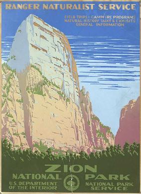
I came across some vintage travel posters from early last century as I wandered through my RSS feed this morning (via lines and colors).

Zion National Park Vintage Travel Poster

Zion National Park Vintage Poster
Click to go to National Geographic's site for a larger image

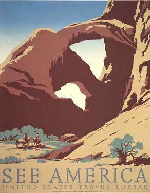
It turns out that one of the posters advertises Zion National Park, and another depicts Arches National Park (though it wasn’t a national park when this was made).

It is timely that these appeared today, I am working on a woodblock print from some of the stuff I drew in Arches National Park while I was there a couple weeks ago.

What I really find fascinating about these is the visual perspective they offer, particularly, how to depict these large landscapes with just a few colors. The Arches poster has 5 colors, though it is possible that the darkest brown is created by overlapping the medium brown on top of the green. That’s how I would do it, though I am not sure how silkscreen inks behave with transparency. Silkscreen is the printing medium I have the least (read: none) experience with.

I have carved 4 blocks for the image of Arches, and I am working to create a few extra colors by using overlapping blocks.

This is one of the bigger challenges I face with a multi-block print: how to use the blocks effectively and efficiently to present the most amount of visual information with the least amount of elements. Each color added is another block added, which means hours of painstaking carving.

Arches National Park Vintage Travel Poster

Arches National Park Vintage Travel Poster
Click to go to National Geographic's website. The larger image is worth it.

When designing a print of something as large and nuanced as a gigantic rock arch rising from the desert in front of a vivid blue sky, I have to make decisions about what is important to depict. Not every detail can be shown, certain things need to be generalized, and certain details ignored, in order to create the overall picture.

Simplicity of design, and making just a few colors work to convey an image, and convey them beautifully, is one of the challenges of printmaking. This challenge is one of the reasons I enjoy printmaking so much. The process requires careful planning, then when the elements are printed together, an image slowly starts to take shape out of the jumble of colors.

These posters accomplish this requirements of using minimum elements for maximum effect masterfully. They are simple, they make use of just a few printing elements, and still convey the beauty of their subject. I hope to be able to do a fraction as well as these with my current series of blocks.

There are a number of posters on the National Geographic website. They are worth spending a minute looking at.

As for my take at printing the National Parks, I have the first two blocks printed on the first image, the prints are hanging to dry in front of my window of my apartment. I should have results to share this weekend, the 2nd and 3rd prints should roll out next week.