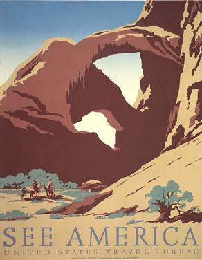
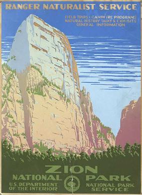
I came across some vintage travel posters from early last century as I wandered through my RSS feed this morning (via lines and colors).
It turns out that one of the posters advertises Zion National Park, and another depicts Arches National Park (though it wasn’t a national park when this was made).
It is timely that these appeared today, I am working on a woodblock print from some of the stuff I drew in Arches National Park while I was there a couple weeks ago.
What I really find fascinating about these is the visual perspective they offer, particularly, how to depict these large landscapes with just a few colors. The Arches poster has 5 colors, though it is possible that the darkest brown is created by overlapping the medium brown on top of the green. That’s how I would do it, though I am not sure how silkscreen inks behave with transparency. Silkscreen is the printing medium I have the least (read: none) experience with.
I have carved 4 blocks for the image of Arches, and I am working to create a few extra colors by using overlapping blocks.
This is one of the bigger challenges I face with a multi-block print: how to use the blocks effectively and efficiently to present the most amount of visual information with the least amount of elements. Each color added is another block added, which means hours of painstaking carving.

Arches National Park Vintage Travel Poster
Click to go to National Geographic's website. The larger image is worth it.
When designing a print of something as large and nuanced as a gigantic rock arch rising from the desert in front of a vivid blue sky, I have to make decisions about what is important to depict. Not every detail can be shown, certain things need to be generalized, and certain details ignored, in order to create the overall picture.
Simplicity of design, and making just a few colors work to convey an image, and convey them beautifully, is one of the challenges of printmaking. This challenge is one of the reasons I enjoy printmaking so much. The process requires careful planning, then when the elements are printed together, an image slowly starts to take shape out of the jumble of colors.
These posters accomplish this requirements of using minimum elements for maximum effect masterfully. They are simple, they make use of just a few printing elements, and still convey the beauty of their subject. I hope to be able to do a fraction as well as these with my current series of blocks.
There are a number of posters on the National Geographic website. They are worth spending a minute looking at.
As for my take at printing the National Parks, I have the first two blocks printed on the first image, the prints are hanging to dry in front of my window of my apartment. I should have results to share this weekend, the 2nd and 3rd prints should roll out next week.
Tags: Arches National Park, silkscreen, Woodblock Print, Zion

Looking forward to seeing what you come up with!
.-= Dave Doolin´s last blog post ..SEO Anchor Text SEO Anchor Text SEO Anchor Text SEO Anchor Text =-.