I’ve been working on a new block for a couple days now, and this one has been a bit of a challenge. I know that this block is going to have a companion block that goes with it, and the two will take advantage of how colors mix when they are printed in layers.

Two separate colors
One block for every color
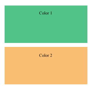
Generally, with woodblock printing, for each block, you have one color that is printed. To create a print with three colors, three blocks are needed.
You can see this to the left, in the beautiful image I whipped up to demonstrate this. It would take two woodblocks to print this beautiful work of art.
(Aren’t the colors lovely? Well, at least they demonstrate the point well)
With opaque ink, one-block-one-color is true. Each layer of ink will cover up any other layers of ink under it. With out-of-the-tube ink from your local art store, this is the sort of behavior an artist can expect from their ink.
This is a bit limiting, and luckily for us there is a way to get more from our blocks and from our color by using a little bit of transparency in the ink.
I cheat the system
My most important ink I have is transparent. It is just ink medium, without any pigment. I add this to my other inks, which are opaque, to add some transparency. The more transparent medium I add, the more transparent the ink becomes.
This creates opportunity, and along with opportunity comes complexity.

Two colors overlap to create a third color
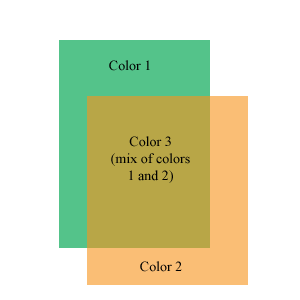
Transparency allows the ink to mix on the paper, so that one color will show through another color a bit. They mix to create a third color.
This neat little image on the right I whipped up in Photoshop shows how this works. When two blocks overlap, and transparent ink is used, a third color is created where they overlap. Using this technique, 2 blocks can print 3 colors.
Extending this out to more blocks, 3 blocks can print 7 colors. 4 blocks can print more colors than I care to figure out (11 15, I think, but it is early in the morning).
This hurts my head to think about
My current block is giving me quite a challenge, because I know that it will be printed with another block, and the two will interact to create a third color. When I carve the block, I have to keep in mind that some areas that I carve will be left white on the final print, and some areas will be filled in with the second block. Some areas will be defined by how the two blocks overlap, and I have to leave those areas intact, so that the two colors can print together.
It is interesting to carve a block in this way. Often, I carve blocks with a “black and white” frame of mind. Color will print on the block, except where I carve away.
With this block, I am considering the shapes that this block will print, the shapes the second block will print, the areas where they overlap, and the areas left white by the paper.
I finished carving the first of these two blocks last night (took 3 evenings). I have a busy couple of days coming up, keeping me from my art through the weekend, so I won’t get to the second block till early next week, but look for updates then.
Tags: 101, Color, Woodblock Print
Combinatorial complexity.
.-= Dave Doolin´s last blog post ..DIY WordPress: Creating Sidebars On-the-Fly in WordPress =-.
I have a hard enough time keeping track of one thing.
I am not made for multitasking.
.-= Deacon´s last blog post ..Inspiration, Perspiration, Motivation, and Grueling it out =-.