Now I’m gonna really mess things up.
Last time I talked about how colors mix together on paper after they are printed, which increases the total number of colors you can get from any number of blocks. By overlapping the areas that blocks print, 2 blocks can print a total of 3 colors, 3 blocks can print 7 colors, and 4 blocks can print 15 colors.
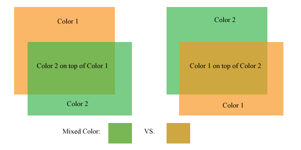
The order that those blocks are printed influences what the mixed color is, as well. If one color is printed on top of another, the color created by the overlap of those two colors isn’t the same if the printing order is reversed.
This quickly ads up to a whole lot of possibilities and choices to make.
Here’s a look at this phenomenon:

Colors mix differently with different printing orders
The picture above shows the same two panels of color, but on the left, the green panel is on top of the orange panel. On the right, the orange panel is on top of the green panel. The resulting color created where these two colors overlap is different depending on which color is on top.
In the above example, the mixed color can be a brownish shade of either of the colors. The trick is, it can’t be both. One of the artistic decisions of a printmaker is which order to print the blocks, and which colors will be on the print as a result.
Typically, an artist/printer will print a number of trial prints, trying out different color combinations until settling on a color combination for the final edition. These trials can be as lengthy a part of the printing process as printing the edition, but it is worth it.
The final print often benefits from this type of experimentation. Colors do not always mix the way that we intend them to in our mind, the only way to figure out how two colors will look is to mix them up and put them on paper.
Some considerations:
1. The colors will mix differently based on how transparent the colors are. In the above image, the transparency of each panel of color is set to 67%. This isn’t the exact equivalent of working with inks, but it is close enough to convey the concept. Printing inks are mostly opaque out of the tube or can, transparency is created by adding a transparent medium. I consider this transparent medium the most important can of ink that I have.

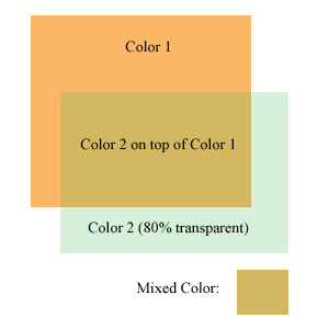
A more transparent color has less effect on the colors beneath it
The more transparent medium I add to the ink, the more transparent it is (duh). The thing to keep in mind is that if a very transparent color is printed over another color, it won’t effect the color underneath much. It will show up a bit on the white of the paper, but the pigment underneath it will overpower the transparent color.
The image at the left is the same two colors as above, but the transparency is increased quite a bit on the green color. This image was created with photoshop, so it does not completely represent how inks behave when printed on paper. If this was printed on paper, the light green color would probably be more visible where printed on the white paper, but hardly perceptible where printed over the orange. If this were printed on paper, the areas where the very transparent green ink overlaps the orange would probably look more like a glossy coating over the orange than anything else.
2. Some colors print more strongly than others. The CMYK process colors (Cyan, Magenta, Yellow, blacK) are usually printed in that order. If a yellow ink is printed underneath a blue or red hued ink, it will not be very visible. The other colors printed over the yellow ink will dominate it and wash it out. Yellow is usually printed on top of the other colors to give it a fighting chance.
Yellow seems to be the weakest link amongst ink colors. Green and Orange can inherit some of this weakness as well, if those colors are created by mixing yellow ink. (Greens and oranges straight from the can or tube can be a bit stronger than home mixed versions)
Ok, enough color science for today. I’ve gotta go to work at DayJob now!
Tags: Color, Ink, Printmaking
My head is spinning.
.-= Dave Doolin´s last blog post ..How Learning to Blog is Like Exploring Caves =-.
My head was spinning all morning as I was putting this post together.