A Free Monoprint Available (a mono-what?)

Yes, I have a free print to give away to somebody, just read to the end [update, 11:38am, Jason claimed the print, thanks for giving it a good home!].

It’s a weird abstract thing. Hope you like it.

But first, a short journey into the studio…

Take one big mess…

After a weekend of printing, my ink palette looks like this:
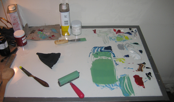
My Ink Palette

After a weekend of printing, I have bits of various colors, all partially used.

I have dabs of ink everywhere, and I keep a dollop of every color mixed, in case I use it again. The ink is left out overnight from Saturday to Sunday, 1 day isn’t enough for the ink to dry. It usually takes at least 2 days for the ink to develop a skin.

When I finish printing on Sunday, I scrape off all the unused ink and throw it away, because it will have started to harden by Wednesday, the next day I have any time to print.

Usually, quite a bit of ink gets thrown in the can.

Nothing wasted. Kinda..

I found 1 last use for this ink however.

I masked off the edges of a sheet of paper with painters tape, like so:
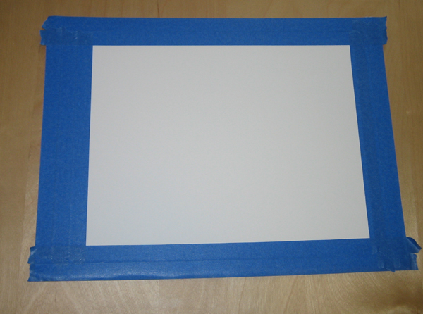
Masked Paper

The tape protects the margins of the paper from the ink

Lesson learned: painters tape isn’t the best choice when working with this paper (Rives BFK). The tape sticks a bit to the cotton rag, and roughs up the paper when the tape is removed.

Next, roll out all of the ink left on my palette to one big flat mess, and plop the masked paper down on it.

Rub the back of the paper to transfer the ink, then removed the paper from the palette:
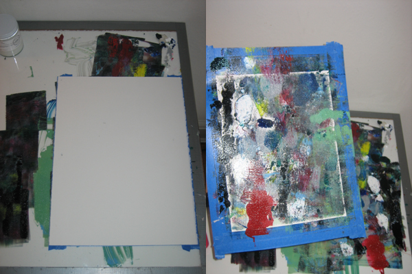
The paper is pressed against the ink

Left: the paper is pressed against the ink palette; Right: the paper, after it is removed from the ink surface

The ink left on my palette is a huge mess! This ended up taking more time to clean up than usual.

Moving on, I remove the tape masking the edges of the paper, and end up with an interesting monoprint:

Palette-made Monoprint

Palette-17 Jan, monoprint, paper size: 11x15, image size approximately 9x12

A Monowhat?

A monoprint is made by painting ink on a plate of some sort. Glass and metal plates are commonly used, but a flat plate of any material will work.

The plate, with the hand applied ink, is pressed against paper to transfer the image. Usually, only one print is made from each design painted on a plate. Most of the ink transfers to the paper, and needs to be re-applied by hand.

Each monoprint is unique. They are usually labeled as 1/1 in the bottom left corner, meaning it is the first print out of a total of 1 made, an edition of 1.

Monoprinting is a method “in between” painting and printing. All printmaking processes have two characteristics in common:

  • Ink is applied to an element of some sort (metal plate, woodblock, limestone, silkscreen, etc), then transferred to the paper
  • The process is repeatable, allowing identical images to be made

Monoprinting has one of these characteristics, the ink is applied to a plate, and transferred to the paper, but not the other. Since the ink is applied by hand, without mechanical control of where the ink is applied, each iteration cannot be duplicated.

It borrows from both painting and printmaking to form a new, unique medium.

Free Monoprint (only 1 available)

This print was an experiment, and a way to have some fun after a long weekend of printing. The resulting abstract print speaks for itself — however it is up to you to interpret what it says.
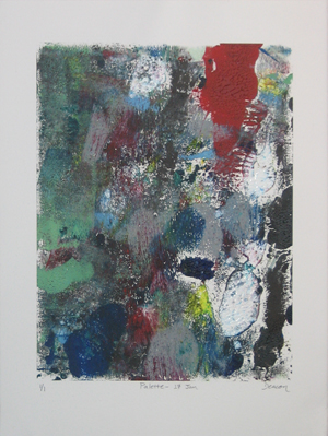
Palette made Monoprint

Only 1 available

I played with the ink, and asked myself what will happen when I mix all my leftover colors, and is more a product of chance than of forethought.

This print documents a weekend of work on the 101 Woodblock Print Project, and is a companion piece (of sorts) to the larger project. For me, the “meaning” in this print is the history and documentation of the work I am doing on the larger overall project.

Do you like the image? I’ll put this in an envelope and send it to the first person that sends me an email requesting it and includes their address. I’ll pay for shipping. All you have to do is make the request. To make this easier, I’ve got a contact page.

I’ve only got one of these, so it is first come, first serve.

[Update: Jason beat you to the punch! The print has been claimed]

My Artist’s Cerebral Struggles

This isn’t the kind of artwork I usually make, which is why I am giving it away. This monoprint is the result of following a process largely relying on chance, not on forethought into the design and composition of the image.

The art I usually make is well-planned and thought out. I don’t rely on chance and randomness. Even when I take chances and take risks, they are calculated risks.

Many artists create art closer to the method I followed with this print, allowing chance and the nuances of a process to influence the artwork. The art is more of a document of a process than a composed image.

Both methods are valid, and of those methods, I feel compelled to make composed, planned art. It is difficult for me to allow chance to have a large roll in the final product.

What do you think? Do you mind art that relies more on chance than on composition? What do you think of the method I used to make this monoprint, randomly rolling out my unused ink?

Leave a comment and let me know!

Fine Art also loses Round 2; Balance is a Sucker’s Bet

I lost last week’s productivity to DayJob. I have been busy as an engineer, solving the drinking water problems of California.

I thought I would be able to catch up last week, and be on track this week. Turns out this isn’t the case. I was busy again this week, partly with work, partly with important personal business.

The real difficulty I am running into is the so called “balance” between my DayJob and my ambition to create and sell art.

I like doing a good job at work. That takes time, and it takes energy. DayJob requires about 10-1/2 hours per day, from when I get dressed in the morning till I get home and change out of my slacks and tie.

On top of the time, I am mentally drained after a day of work. This is why I started to dedicate an hour every morning to writing (at least, when I am not leaving early to work, as I have the last couple weeks).

I am freshest in the morning, so I give an hour of my best time to myself, before I give 8 hours to BossMan.

Balance is a Myth

There is a common meme around the internet (and in real life) that it is good to “balance” work life with hobbies and other activities. “Balance” is a healthy way to accomplish the things you want to do, and still maintain a decent day job.

They are wrong. The problem isn’t to “balance” the day job with art.

The truth is, the “balance” to a hard day’s work is relaxing at home, eating a good dinner, drinking a beer or a glass of wine (or 3), and relaxing with your family/girlfriend/whatever.

If I didn’t have ambition, I’d be “balancing” out this long work week by drinking beer, playing Call of Duty on my Xbox, and maybe hanging out with a girlfriend that suited the bill.

Irrational Drive is the real kick

I rely on irrational drive to convince me to get up at 6am every day to write, to work every other Friday night instead of going out, and to work on art every night after crunching through problems all day at work.

Balance does nothing to compell me to keep working.

Irrational Drive is what keeps me pushing to work what is essentially 2 full time jobs, in search of fortune and glory.

The trick is to develop my irrational drive into a monster, a force of nature, that compels me to continue to work, beyond when the “balanced” person does.

DayJob v ArtJob, Round 1 goes to DayJob

I’ve been busy at work. 12 to 15 hours a day busy.

I hope that it will mellow out today, and I will be able to get back on schedule.

I have an ambitious schedule of art production after all. I paint on Monday and Tuesday, draw on Wednesday and Thursday, and work on print projects all weekend.

The impact on my “night” schedule when I am this busy at work are two-fold:

  1. I spend many hours at work, hours I planned to spend creating art. I was at work till 10 pm last night, but my schedule has me painting from 7-10 on Tuesday nights. No painting got done.
  2. After 12 hours at work, I am too tired to get anything done at home, even basic stuff like clean up. Last weekend, after working over 12 hours on Wednesday, Thursday, and Friday, I had to spend most of saturday doing chores like laundry, dishes, running errands and cleaning my apartment. I didn’t get to spend 4 hours with the brayers and blocks, making prints, as I had planned.

When I have to spend my nights working at DayJob, not only does it displace the time I scheduled that night to work on art, but it displaces time afterwards that I have to spend catching up.

It has been a conundrum, and not how I planned to start the year. I set a rigorous schedule of art production for myself so I could start strong, right out of the gate. Instead I got put in another race.

It’s not necessarily bad, because the work I am doing at DayJob right now is decent, and I have gotten some assignments that I am interested in, and bestow me with greater responsibilities.

When I come home from work however, I see my art supplies waiting for me, and I see my calendar listing out what I planned to accomplish that night, and I know that it is too late, and I am too tired, to get it done.

When I get set back liek this, and I get tired like this, it has a toll on my emotions. I feel dissappointed, and I end up feeling sluggish. My energy levels go down.

What I am learning is that some days, and some weeks, I will have to put art on the side, so I can do a good job at DayJob, bring home the bacon, and pay the bills. It may set me back a week or two, but it is what will create success for me in the art field.

The trick is to realize that I have not gotten behind, but have just spent my time in other ways. I don’t focus on what I didn’t do in the past, but what I will do in the future.

New Year’s Painting Goal Has Visible Results

What are you doing in 2010?

2010 is the year for doing stuff. If you are not doing or making something, you are wasting your time.

My plans for 2010 are rather ambitious. To follow through on them, I am going to have to do ridiculous amounts of work.

I’m Ok with that.

One of these plans is to do 50 paintings this year. One a week.

How to get ‘er done

Self Portrait, Oil on Canvas, 12x12.  First painting of 2010.

Self Portrait, Oil on Canvas, 12x12. First painting of 2010.

The structure I have set up for myself is pretty simple. I paint on Monday night and Tuesday night, starting around 7pm. I work till 10 or 11 pm. The painting is finished when I go to sleep Tuesday night, even if it isn’t complete.

The results of my first week’s work are sitting up here on my left. (I paint myself a lot because I am always a willing model)

This painting is not complete, but it is finished. This is as much as I got done on Monday and Tuesday night. I may work on it again a little bit this weekend when I have some free time, but then again, maybe not.

I imagine that this painting requires about 6 more hours of work to complete — it is about half done right now. The major shapes and areas are defined, but everything needs more work to flesh it out and make it complete.

Why half finish a painting?

When I was getting my art degree, I made a decision to pursue printmaking as my emphasis rather than painting. This had more to do with the school than my interests.

UC Santa Cruz had a marvelous printmaking facilites and equipment, and a marvelous lithography instructor. I had the oppurtunity to get a deep understanding of printmaking.

I also knew that if I studied painting, all that I would get was a lot of time to paint. This had to do with the school and the instructors. There was very little actual instruction beyond the introductory courses. Most of the advanced courses that I would have been in were little more than a lot of time to spend painting.

I put off painting, because I realized that I could get a lot of time to paint on my own, and learn nearly as much on my own as I would have in school.

I set this “painting a week” plan to get that year of painting that I put off in school. This is mostly about regaining my painting chops than producing finished work.

I’ll make paintings that you can buy for thousands of dollars next year.

Where’s Waldo Proves I Have Tech Cred

There is a walkway between the contemporary art gallery and the rooftop garden terrace at the SF Museum of Modern Art (MoMA), and it overlooks some of the adjacent rooftops across the street. The view is pretty boring, unless you are a mechanical engineer, then all of the rooftop equipment you can see from this walkway is fairly interesting.

Every time I cross this walkway, I stop and look at all the equipment across the street.

Last time I was at the MoMA, I noticed a couple stopped in the walkway, taking a photo of the rooftop across the street. I was a little surprised, because I thought I was the only person who looked at the rooftop air conditioning equipment installed on the adjacent roof. “Must be another engineer”, I thought to myself.

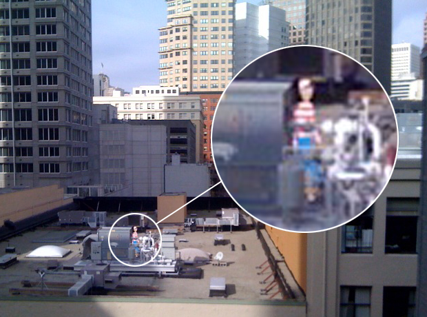
It turns out that I still am the only person that checks out A/C equipment. They were only interested in Waldo:

Where's Waldo? Hiding behind that supply duct fromt hat packaged rooftop A/C unit!

Where's Waldo? Hiding behind the boiler water piping from the water side heating system!

That equipment that Waldo is hiding behind is probably a boiler, supplying hot water to a hydraunic heating system or something like that. The hot water from the boiler gets pumped through pipes to coils that sit in the airstream, heating up the supply air, keeping the people inside warm.

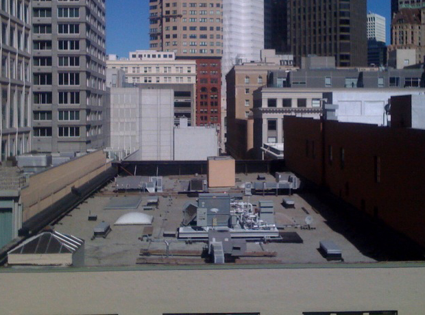
I know this because this is the kind of stuff I design at DayJob. I design a lot of Air Conditioning, Ventilation, and Heating systems. In fact, I took this photo last time I was at MoMA, because I thought all of that rooftop A/C equipment looked pretty interesting.

I was all over that rooftop before Waldo ever showed up

I was all over that rooftop before Waldo ever showed up

This is the blessing and the curse of being an Engineer. I can’t help but notice examples of the type of equipment that I design. Plumbing vents? Cool. Fire Protection system risers? Fascinating. Rooftop equipment? Stops me in my tracks.

Anyway, I took a picture of that rooftop long before Waldo showed up, making anyone else care about this roof.

That, my friends, is street cred.

At least for technical nerds.

Prints in Progress: Color Choice and Resolution

I have to think about color extensively as I am working on a print.

Yesterday’s post about color choice is continued in this post today. In yesterday’s post I mentioned how color can be used to resolve other colors together, and make them work well and look good together.

Examples of Prints in Progress

This print can easily be resolved with a darker green

This print can easily be resolved with a darker green

I have a few prints that are in various stages of completion, one of them has an obvious resolution, one is still making me think. In this section I am going to discuss how I think about color in these prints, and what I think is needed to resolve the colors I have printed so far.

The print on the left is waiting for 1 last color to be printed, and I think that it is pretty clear what that color should be. I plan to print a slightly dulled down (ie. less saturated), transparent forest green color. That color should make this image pop together.

The trick to this image is going to to find a color that is rich enough, but not so rich that it overpowers the other colors already on the page. The 3 colors on the paper so far are not strong in value and saturation, so a very saturated color might visually dominate these colors, and make them appear weaker, and lose definition. A strong color would draw all the attention, and the other colors would appear very gray in comparison.

A color without enough saturation, on the other hand, will make the entire image appear bland, and the definition will be lost because nothing will stand out. If the 4th color is as dull and grayed out as the first 3 colors, then the entire image will appear to be a dull gray mess, and nothing will catch the eye. Everything will blend together, nothing will be interesting.

A quick aside

I wasn’t going to discuss this in this post, but it came up as I was thinking about the above print, because I noticed another completed print that seems to contradict what I said above.

The vibrant dark green works because it is used sparingly

The vibrant dark green works because it is used sparingly

Interestingly, the issue of matching the value of the other colors is more and more of a problem when the area that ink will cover becomes larger and larger. In the previous example, the 4th block will cover a large portion of the paper with ink. This makes the color choice much more important.

If the block applied a smaller area of ink to the paper, then a color with a much stronger value could be used. The color will not overpower the others because there is less of that color on the paper.

The print on the left demonstrates how a stronger color can be used when used sparingly. The first four colors that were printed are all very close to gray, their value is all very low. A strong color could easily overpower all of these subtle colors.

I printed the final block, the little bits of definition of the leaves, with a very saturated green color, straight out of the ink can. I didn’t thin the ink or mix in other colors to tone down the vibrancy of the color.

This choice worked well for this image, and the small, vibrant bits of color make the image come to life in a way that it didn’t before this vibrant color was printed. If the final color covered more of the paper, however, this strong green color would start to overpower the rest of the colors because it would become too dominant.

The fact that there are just very small bits of this color allow me to use a color so vibrant.

Back to the Regular Program

The last block I have to discuss today is another print that is in progress, and that I have created a bit of a problem with.

These two colors will be difficult to resolve

These two colors will be difficult to resolve

The block on the right has only the first 2 blocks printed, but I used 2 very different colors on this print so far. The light blue, and the dirty orange color do not look very good together as they are. A third color is needed to tie everything together, and visually connect these two colors.

Even though these two colors are not that saturated, they look more saturated than they are when placed together. The blue and the orange are compliments (opposite on the color wheel), so they make each other look brighter. Because of this, I will have to mix a color that is a little more saturated than I might guess, because I have to match the apparent saturation of these colors, rather than the actual saturation.

I’m not sure exactly which color I will print on this block next, but it will probably be in the brown family. The trick is going to be to pick the right shade of brown to make these two colors come together. It would be just as easy to mix the wrong color brown as it would be to mix a color that makes the blue and the orange look good.

Last Thoughts

It turns out that I think about color a LOT. Color choice is usually the most difficult part of the printmaking process for me.

If you missed yesterday’s post, click here to check it out. Leave a comment below and let me know if this was interesting, confusing, or anything alse.

Case Study: Saturation, Value, and Matching Colors

I create a lot of problems for myself that I later have to fix.

A lot of those problems have to do with color.

The 101 Woodblock Series project is largely a design project. I formulated the idea for this project when I was still thinking a lot about design, rather than art. That influence has found its way into this project. Most of the thinking and artistic consideration that goes in to each print has to do with balancing color and shape in a way to make a pleasing image.

Most of the prints have 4 or 5 colors printed on them, which requires mixing a lot of colors, especially considering that each of the 101 prints is different.

The trick is to get all of the colors to work together.

Sometimes, everything works out, and the image just comes together. The colors work together well, and the resulting image is rather… pleasing.

Much more frequently, I create a bit of a “challenge” with the first 2 or 3 blocks, and have to figure out how to fix this “challenge”.

In the challenging prints, the colors don’t quite go together, and the image does not look complete. Often a final color is required to make the disparate colors come together and look good. I think of this as “resolution” of the colors, with “resolution” used in the sense of “resolving” things.

Resolution explained with Music

In Music Theory, Resolution refers to the part of the music that brings everything together, and makes the piece of music feel like it is complete. It is the final note that makes the piece of music complete.

Technically, Resolution is a change within the music from dissonance (sounds that don’t sound good together) to consonance (sounds that do sound good together).

The parallels to printmaking are that I often have to find a color that makes all the previous colors – which don’t quite look good together – fall in to place and look good.

Before going on, I want to show you, with music, what resolution sounds like. I picked part of The Four Seasons, by Vivaldi, to demonstrate Resolution.

This audio file has the very last chord edited out, so that it is unresolved. Take a listen.

Vivaldi Unresolved:


Without the final note in the piece, it feels like everything is left hanging, it is unfinished.

Compare the above to the following audio clip, which is the same music, but with the ending chord left in.

Vivaldi Resolved:


The last chord completes the music, and makes it sound finished. Everything that came before it works together as an overall piece of music, when the last note is added at the end to resolve the music.

Resolution applied to color

I often find myself in situations where I have to pick the right color to visually resolve the colors I previously printed. The colors on the paper up to that point don’t quite work, don’t feel complete. I have to think about what color will tie all the others together, just like the last note in The Four Seasons ties that piece of music together.

I’d like to take you through a brief color imagination experiment:

Imagine something purple. Not bad.

Now add some orange next to it. Not good.

Orange and purple have a natural dissonance them. They don’t look good together. It is difficult to find a 3rd color you can add to these 2 and make the combination look good. It can be done, but it is a challenge (hint: the color that can do this begins with “green” – click to read why*).

Now imagine green and blue together. These colors usually look pretty good together, because they are close in hue. Another color is needed though to make these two colors really pop, other wise they may look fairly drab together. Because they are so similar, the combination of the two can be boring. A small bit of red, or a red-orange color may make those colors really look good together. A neutral color, like brown or gray, can also bring these colors together. Since blue and green naturally work well together, they are easier colors to resolve with a 3rd color.

Examples from Complete Prints

I recently finished a batch of prints, some of them resolved well, some of them did not. In this section I will explain which I think resolved well, which did not, and why.


The challenge is to find a color to match the warm oranges and reds

The challenge is to find a color to counter the warm oranges and reds

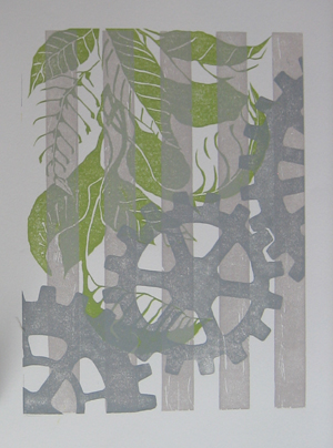
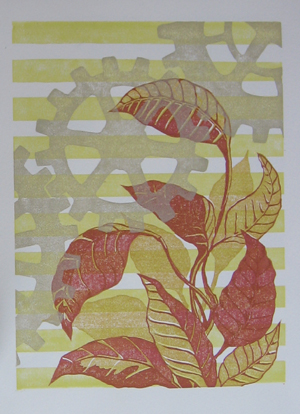
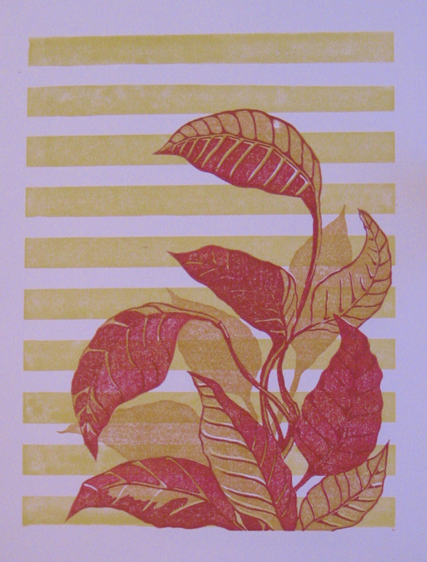
The print on the left surprised me. I started by printing the horizontal stripes, and then the 2 blocks for the leaves. The result was a very vibrant image full of warm colors, yellow, orange, and red. I like the vibrancy of these colors, but I knew that I needed something else to counter the warmth.

Without something to cool down the image a little bit and pull back the warm colors, this image could be too vibrant, to the point that it is difficult to look at. In fact, you can see the print as it looked with just the 3 vibrant warm colors in this post: Weekend Printing Results.

The warm colors in this print are similar in value and hue, and the image gets lost in a sea of orange. This image required a 4th color to resolve the previous 3.

My first thought was to put a cool color, like a blue or a green in there, but after thinking about this, I thought that a cool fourth color would stick out too much, and the image would be a visual game of “one of these things is not like the other”. I took a gamble with the gray color I printed the gears with, and I think it worked out well.

The gray color I printed has a touch of yellow and green to it, and has almost a “cool golden” color to it. The touch of cool that the image needed was added, but with a toned down, grayish hue, so that the value of the cool color did not contrast too much with the overall warmth of the image. The warm vibrancy of this image is something I like about it, and I did not want to counteract that, I just wanted to cool it down a little so that it wasn’t overpoweringly vibrant.

The same color used before did not resolve the colors in this image

The same color used before did not resolve the colors in this image


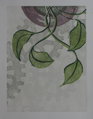
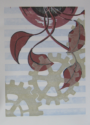
Contrast the use of the “golden gray” color above with the use of the same color in the image at right. In this one, the golden gray color does not resolve the colors in the image, and in fact, makes the dissonance between them worse.

The use of the color for the gears in this image, was, I believe, a mistake.

This image was difficult to finish because I created a visual problem when I printed the first few colors. I like the red in the leaves and the pot, and I like the light, slate blue of the horizontal stripes, but together, they look bad. They have very little in common, and adding the last color of the gears made it worse.

I am still not sure what color would have made this image work, but I think it is in the purple family. A purple might bridge the gap between the red and the blue and tie them together somehow.

In some ways, I backed myself into a corner with the red and blue, and created a color combination that does not have an easy resolution.

I find myself doing this quite a bit, because I am experimenting color combinations when I make these prints. I have tried a lot of combinations that are not obvious to me, and aren’t from the usual palette of colors that I would choose. I am trying new things, and sometimes it doesn’t work.

Final Notes

Color can be a tricky thing. Finding the right color to complement and make other colors look good together can be difficult, especially if you use colors that don’t play well together in the first place.

Tomorrow I will have a post with this same sort of look at color choice and resolution, except with examples from the prints that are in progress, but not quite done. I will be share with you what I am planning to do and why, instead of just telling you what I have already done, as I did today.

Also, these prints are currently available for sale to Newsletter Subscribers for my cost for supplies and shipping. They are my nice little bribe to get you to try out my newsletter. This special, “subscriber only” price only lasts until I finish all 101 of these prints, sometime in the next few weeks.

If you would like to see the rest of them and get your chance to purchase them for next-to-nothing prices, sign up for the Newsletter now.

Quick Thanks to Vivaldi

vivaldi4seasons

The Vivaldi clips I used above are from my CD of Vivaldi, “The Four Seasons”, performed by Anne-Sophie Mutter and the Trondheim Soloists. The disc also has “Devil’s Trill” by Tartini on it. It’s a good performance of the pieces, you can Click here to check it out on Amazon.

The disc also features a cover with Anne-Sophie in a strikingly striking pose. If you still need a recording of The Four Seasons for your music collection, this is a good choice.

If you click on the link and buy something, Amazon will give me a small piece of their huge pie (you pay the same price though). This allows me to buy food, make more art, and makes me happier.

As a result, I make more beautiful art, and share it with the world, making it a better place full of more happiness and good will towards men and women.

It’s probably actually your moral and patriotic duty to go buy, buy, buy!

Footnotes

*[note from above]Orange and purple are a split complement of green. The complement of green is red (they are opposite on the color wheel). A split complement is when you take one of the complementary colors, in this case red, and “split” it into two colors on either side of it on the color wheel. In this case, red is “split” into purple and orange, which are an equal distance away from red on either side of the color wheel. Usually, split complements look better when the split is much smaller, meaning that red would be split into a red-purple and a red-orange. The bigger the split, the harder it is to resolve the colors. Now click HERE to go back.

Printing 2 Recent Blocks

Enjoy this video of the trial printing for the two latest blocks in the 101 Woodblock Series. This is my first video, still learning the ropes. The background music is a bit louder than I thought, etc.

Let me know what you think below. Did you learn anything? Enjoy something in particular? Do you have a question about something I didn’t answer?

Christmas Comes Early

…when you buy yourself gifts!

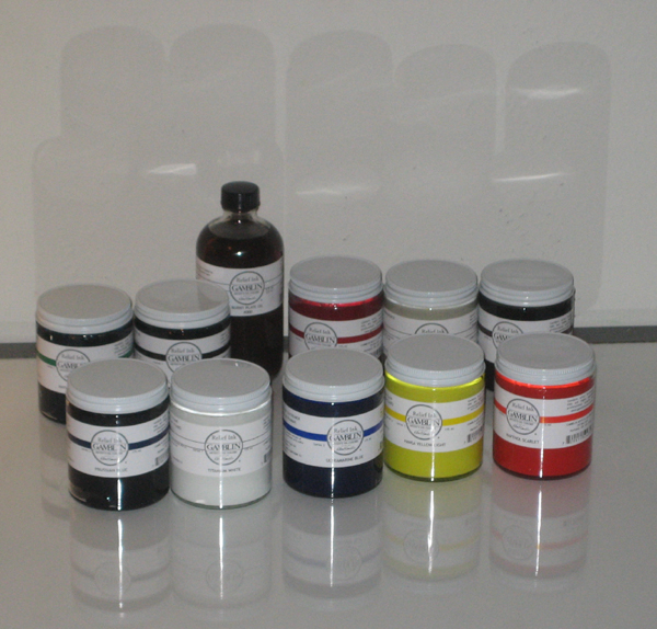
I received my order of supplies from McClain’s today. In addition to a selection of about a dozen very small woodblocks and a sample book of Washi papers, I got a set of good ink.

Gamblink Relief Inks

Gamblink Relief Inks

Getting new materials, especially new inks or paints, is hard to explain. It is a bit like getting a new car. Everything you do with them stands out as fresh and new.

I opened up the jars of ink as soon as I got home from work and got to printing. I did not have plans to print a particular run yesterday evening, but I wanted to try out these inks. They are smooth, almost runny. When I rolled out the ink and rolled it onto the block, I was surprised… these inks didn’t feel like they were mixed with oil at all! They feel like they are mixed with butter.

They roll smooth and evenly on the block, and just do what they are supposed to. This is a far cry of difference from the Speedball inks I have been using from the local art store.

I love these new inks, and I am eager to print an edition with them on nice Washi paper (once I finish the 101 Woodblock project early next year).

Quality materials are incredibly important, last night reminded me of that.

= = = = = = = =

On a side note, I highly recommend McClain’s for relief printmaking supplies. Their website is incredibly informative, easy to use and purchase from. Shipping was very fast, my order was in the mail the day after I placed it, and it arrived 2 business days after that. I will be buying a lot of stuff from them in the future.

Weekend Printing Results

continuing my current 101 Woodblock Series, I’ve been printing all weekend to get a bunch more started. My current count is 40 prints, completed, 40 in various stage of completion, and 21 more to begin.

I’ve been carving a couple blocks for a while, and recently finished them. Here’s one of the prints of the two blocks:

The most recent blocks printed

The most recent blocks printed

Much more work to do, time to get back to it.