How I Use Graph Paper

My friend Dr. WordPress over at Website in a Weekend wrote a fantastic article about the virtues of laying out your site using graph paper. This prompted me to write this post, about how I use graph paper.

Why use graph paper?

Before I write about how I use graph paper, however, I want to tell you why I use graph paper to design and layout websites. To put it simply, I use graph paper because it is faster, easier, and better web design.

Faster web design

It is faster because I can sketch out an idea far faster than I can in Photoshop. As a result, I can see a number of different design ideas very quickly. Sometimes I will have an idea in my head, and sketching it out gives me a good idea of what that idea looks like when it is actually presented. For my personal site, I am currently working from the third design I have considered.

Once a design is committed to code, it is far harder to change. To change the size or location of an element, you may have to change a good number of the elements of your website. Not fun. Changing the size or location of an element on paper is as simple as whipping out your eraser and making a few pencil marks. Getting things well sized and located is many times faster than editing a CSS stylesheet.

Easier web design

Once you have a layout on graph paper, it is very easy to translate this into code. Need to know how wide to make a certain div? Just count the squares. When everything is layed out on graph paper before a single line is typed into your stylesheet, the actual time spent translating that design to code goes much faster.

I do like to save time.

Another side benefit of this is that “happy accidents” are more easily translated to the code. Random marks, lines, borders, or whatever are easier to write into your code when there is a nice grid that shows what the radius of that rounded corner is, how many pixels over a certain element overlaps the sidebar, or whatever else you need to figure out.

Better web design

When it is easy to whip out a design in pencil and paper, it is very easy to revise. Sometimes when working on graph paper, I will have another idea for the design that I think may be even better than the one I am working on. The result of scrapping a previous design idea and starting fresh is almost always a better design. Good things about the previous design can usually be preserved, and the not-so-good elements are usually replaced with a better design. Doing a few quick permutations of a design idea is probably going to result in a better design than sticking with the first idea.

Also, I feel like design comes out as a more cohessive product when it is done on paper first. It is easy to get carried away thinking about a website as a collection of parts: your header, content area, sidebars, divs, widgets, etc. When working on paper, it is easier to see the relationship of all the parts, and to get a good sense of how the whole looks.

My method

My method comes from my tools. What are they?

There are 4 very important tools I use:

  • Graph paper
  • Pencil
  • Engineering scale
  • Calculator

In addition, I may use any number of colored pencils and pens.
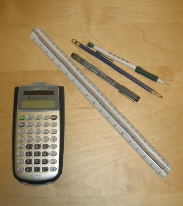
tools

I start my work by simply putting pencil down on paper. For my first pass, I work fast and loose, and get all of the design elements I want down and work on their arrangement. I include major image ideas, locations of sidebars, headers, how I want to break up content, and so forth. When I first start out, I just want to get a layout sketched out. I will do another sketch later to really define everything, so I don’t worry too much about accuracy.

I have two pads of graph paper, one that is 8-1/2″x11″, another that is 11″x17″. If I am doing a very loose concept sketch, I usually use the smaller paper, and save the bigger stuff until my second pass.

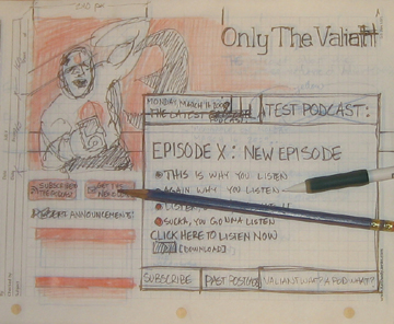
Which takes me to my second pass. Once I have a concept idea I like, I get more exact with it. I figure out the dimensions I want to work with, I break stuff up into a grid, and get more exact with defining things. I will usually put a bit of notes on this second pass, and include information about classes and ids that I plan to use throughout the design. In other words, I half think in design, I half think in code.

Sometimes the result is nice and tidy, sometimes the result is sloppy. Here’s an example of a sloppy one I did for Only The Valiant (click for a bigger image):

otvlayoutsmall

Next up comes the technical stuff of how this works.

The technical stuff

To put it simply, each square on the graph paper corresponds to a certain number of pixels or ems. I tend to work in ems a lot, and I generally use a scale of one square = 1.5 ems. This gives me a paper design that is fairly close to what will appear on screen.

The most helpful tool I use is my Engineering Scale. Note that if you are buying a scale, there are two common types of scales, an engineering scale and an architect scale. The engineering has nice round numbers on each end, like 10, 20, 30 , 40, 50, and 60. The architects scale has fractions, like 1/4, 1/2, 3/4, 3/8, etc. The Engineering scale is the one that is useful for what we are doing.

A quick aside, these are traditionally used for civil and architectural plans respectively. The numbers on each side show which scale that sequence of numbers measures. For the Engineering scale, the numbers represent the number of feet per inch. For instance, a civil engineering plan in 50 scale would represent 50-feet in each inch of paper. The architects scale works the other way around, and the number of the scale represents the number of inches that represent one foot. For example, the 1/4 scale means that 1/4″ represents 1-foot on the architectural plans.

I have found that the 60 scale works best for me, and this measures out 6 ems per inch, as you see below:
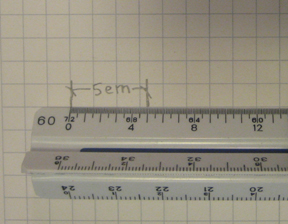
up-close

I use my calculator to translate back and forth between ems and pixels. Though I often define almost everything in ems, sometimes I need to know what that represents in pixels. I don’t resize my ems, so I am multiplying and dividing by 16 a lot to go back and forth between the two units.

Using the 40 or 50 scale works when measuring in ems, and the 10 scale will kinda work to measure in pixels (and will be quite accurate for a 96 dpi display).

I do everything in pencil first, then sometimes add color to see how that will look. I adjust and adjust as I go, tweaking things as I see fit. I have found that revision leads to a better design.

If you design on paper first, or even use graph paper, let me know how you do this in the comment section. I’m sure that there are other variations on this method that I don’t use, mostly because I am not used to using them (creature of habit), but I am curious!
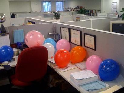
Nice..

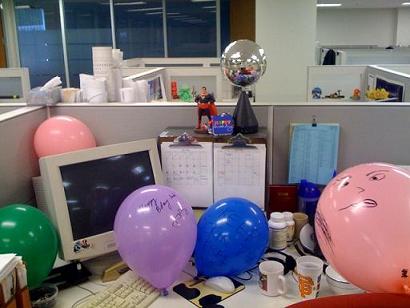
My thirtieth birthday is coming up this weekend, and my crew at work decided to decorate my cube up a bit.

Lots of balloons..

More decoration. The Superman next to the disco ball is always there, but the disco ball is not.

More balloons..

Most of the balloons have something written on them, including some messages that I (so far) have no idea what they mean written in Arabic and Chinese.

This is kind of funny, because today the company is having a celebration in honor of people that have worked at K/J for at least 20 years. They walked around this morning and gave balloons to everyone with at least 20 years under their belt. Folks who have worked here over 40 years (and there are a few) got two balloons.

By this measure, it seems I have worked here for 260 years.

Keep on rockin’ in the (not so) free world!

Memory Lane: UCSC Printmaking

Myself and my Art were one

Myself and my Art were one

I decided to get going with an art project yesterday, and it starts with printmaking.  I pulled out my boxes of stuff from my printmaking at UCSC days (I was an art major with an emphasis in Printmaking).  I have a stash of paper, the good stuff — Rives BFK — sitting in my print storage boxes along with all the stuff I made while in school.

It was a trip down memory lane, and a reminder that my time at UCSC were my most creative, wacky, diligent, and fun years.

My fellow studio mates and I managed to put out some fantastic work.  Part of the fun of opening up my box is to go through and look at all the stuff I was given or traded to get from my classmates.

It also reminded me of how much I enjoyed working in that studio, and even more so, how right it felt to work there.  And I worked like a dog.

I spent hours and hours there, I remember at one time going two weeks on about 4 to 5 hours of sleep a night because I was spending late, late nights in the printmaking studio.  The best times there always happened at night too.

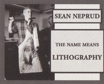
I found a stack of little printouts, stuff that either I or one of my friends put together, these are the images I attached to this post.  One of my friends took a picture of me posing in front of one of my lithographs, you see this above.  We spent a while to get it just right, and what you see is a photo, not something photoshopped together.

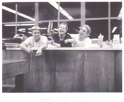
One night, me, Rachel, and Luke decided to see if we could all fit in the big sink in the studio.  Turns out we did, and we took a photo as proof.  Good times.  It was crammed as can be, and below the line of the sink I am bent and contortioned completely out of shape.  Luke and Rachel had to do pretty much the same.  The wackiness was well worth it though.

Luke, Rachel, and myself just hanging out in the sink late at night

Luke, Rachel, and myself just hanging out in the sink late at night

I spent so much time in this studio because I loved what I was doing.  It was more than just fun, I took it very seriously.  It felt like the right thing to be doing.  More than any other time in my life, I felt like I was doing what I was supposed to.

I could write a whole post about Lithography, and what it means to me.  The reason I like lithography correlates almost exactly with the reason I like web design.  It also explains why I think that engineering and art are very closely related, despite common belief.

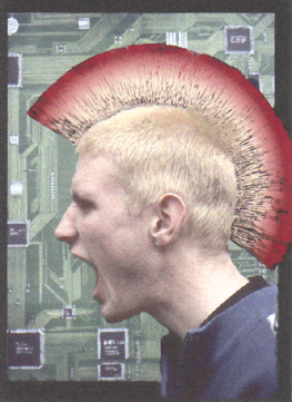
...or it means Punk Beyotch, it got confusing sometimes

...or it means Punk Beyotch, it got confusing sometimes

The above was my monitor card, a placard that hung on a weekly schedule indicating who was the person in charge at in the studio during non-school hours.

One of my class mates thought I was being a little presumptuous, and crossed out Lithography in the above card and replaced it with “punk beyotch”.  After that it changed back and forth a bit to all sorts of things, good times.

Looking through all of this stuff reminds me of what is really missing from my life right now, which is creating things.  I have done a bit with web design lately, but nothing as tangible as what I produced back in the days of UCSC Printmaking.

I’m hoping that this project I’ll be starting in the next couple days will help set this right.

Art Is Design

…at least it is on this site.

The scope of this site extends far beyond just web design. Design, after all, transcends just the internet.

I’ve got an art project coming up, it may be major, it may be minor, but the wheels are in motion to make it happen. It will be documented here. I plan to get this project in motion by this weekend. I just have to get a printing brayer and ink..

This project may be related to the upcoming Deacon Design 101 as well.

A Design Lesson From A Cute Women’s Magazine

At lunch me and my coworkers often entertain ourselves by reading through various magazines. This week, Real Simple Magazine is sitting in the lunch room.

At the end of the magazine they had a perforated, detachable cheat sheet that summarized some of the content of the magazine. The sheet itself was perforated so you could separate it into even small, wallet sized sections. One section had a recipe, one had information about a bottle of wine spotlighted in the magazine, one had information about makeup, etc.

I was astounded at this.

This simple, detacheable card was the most useful part of the magazine. This card allows anyone to take the information with them, and easily try out or implement the information in the magazine.

Brilliant design.

This got me to think about how, with design, you make something more useable and useful. I have a few things I want to implement along these lines, such as popout articles, instructions, references and the like. There is a lot more, but I think the overall key to this is to think about how the end user of your product, site, or thingy will actually use what you are providing them.

Design To Your Site’s Purpose

The best web sites accomplish just the right amount of stuff.

Bad web sites often try to do too much, or too little, and become hard to use.

What does your website attempt to do?

I thought about this while reading this article on design at User Interface Engineering. The summary of the article is that good design is invisible. We don’t notice when something works well, we only notice when something works poorly.

The example the article uses is Netflix as an example. The design is so good that you don’t even notice the design, things just work well, and it is easy to use.

Netflix is able to have such a good design because it does something simple, and specific. It allows the user to rent movies.

Netflix users know that Netflix actually does a whole lot more than just let you rent movies. You can watch movies on your computer, review movies, network with friends, get movie recommendations, etc. All of these features are hidden to the new user, and slowly get revealed. The design does not overwhelm the user with all of these features at once. If they did, the site probably would not be as successful.

The best, easiest to use websites are clear about their purpose, and are designed to promote that purpose. Extra features are revealed slowly.

Websites that display everything available on the site become hard to use and inaccessible. I have been to many websites that I know contain plenty of information I am interested in, but the design is so poor, that it is hard to navigate, and hard to find. I am not sure what feature of the site contains the information I want.

I give up on these types of sites pretty quickly now, because I don’t have time to figure out how the convoluted organization works.

When I design a website, I determine what the primary purpose of the site is, and design the site to promote that function. Other functions may be available, and I incorporate them into the design in a way so that they are slowly revealed to the user.

Knowing the primary purpose of your site, designing the site to promote that purpose, and making the site easy to use will result in better websites.

WordPress: How to scrape the Tags from Posts of a certain Category

One of the features of WordPress is that it has a 2-D taxonomy built into it (taxonomy refers to the method of categorizing information).

The built in taxonomy consists of Categories and Tags.

For this site, which I am working on redesigning, I want to separate large portions of this site by category. For instance, I want a portion of the site to be information and articles focusing on Web Design and Development. I want another to be my personal blog. I may add others down the road, like a section displaying my art, and so on.

My plan was to distinguish these areas by assigning them different categories within WordPress.

This would only leave me to use Tags to further categorize content within these major areas.

In this way, I am really using Tags like Categories. Sure, this leaves me without the functionality of tags, but really, I don’t care.

So here’s the problem:

WordPress doesn’t really treat Tags and Categories as a true 2-Dimensional taxonomy system. The way WordPress functions, it is more like a 1-Dimensional system with two segments, and slightly different functions are built in to each.

I wanted to be able to pull a list of all the tags assigned to posts of a certain category, but this proved hard to do, or hard to find out how to do, with WordPress’s current functions and documentation.

I found a piece of code that did something similar as a starting point, and modified it to make it do what I needed it to do.

This code determines which posts are in a specified category or categories, determines the id numbers of the tags associated with each post, throws out duplicate tag ids, then lists all of the tags with those id numbers in an unordered list.

Here’s the code:


EDIT: I moved the unordered list html tags to within the IF statement, so that you don’t end up with an empty unordered list.

Shortcomings that I know of: The list is not ordered by anything except internal WordPress database IDs, so it appears to be in random order. Also, I don’t know how this works with child categories.

If you know of a better way to do this, let me know!

Goldman Sachs Sues Blogger

There is a new link in my sidebar:
http://www.goldmansachs666.com/

Goldman Sachs is suing this blogger, citing trademark infringement. Use of a trademark in situations like this has stood up to the test of the law in the past, with “Walmart sucks” and “Disney sucks” websites.

The truly outrageous thing? How many billions dollars of your and my money has Goldman Sachs been given because they are “too big to fail”?

Way too much.

And this is how they spend it, by suing some guy that is acting within the law to criticize them and other banks.

I urge you to put a link in your sidebar to this site.

Fight the power!

OTV Design Considerations

Design thoughts:

I have spent a couple weekends working on the design of OnlyTheValiant.com. I want to put up a post describing and discussing the design issues and decisions that I faced.

This website is the home of a comic book discussion podcast. There are two goals of this website:

  1. To get a visitor to listen to the show, and
  2. To get a visitor to subscribe to the show.

Many of the design decisions were the result of a discussion about this site at the last incubation weekend.

My design decisions were largely guided by the following guidelines:

  • It should be clear what the point of the website is within the first 3 seconds
  • The site should guide the user to complete the intended goals listed above
  • The site should be easy to use, and items should be easy to find for both new and returning users
  • Extra and/or unnecessary information should be eliminated

The first decision I made concerned page width. When I browse the internet (or do anything else on my computers for that matter), I keep my windows at partial screen, not full screen. A wide site may not all be viewed by users like me. When I am using the entire width of the site for my “sales pitch” for the podcast, this is important. The flipside of this is that websites that are too narrow can look unprofessional, thanks to all of the crap that huge companies put out on the internet.

I started with 45 ems (720 px), but this seemed too narrow to me. I kept increasing the width until I finally settled on 54 ems (864 px). This felt like a good balance between not feeling too narrow (and unprofessional) and being visible in the browser window.

I decided that the front page would be different from the rest of the site in order to highlight the newest podcast episode. I want any user to quickly understand that the point of this website is the podcast, and make it easy for the user to listen to the show right away.

OTV Front Page

OTV Front Page

I decided on a color scheme of a gray background with red accents. The red was chosen because of the color scheme of the art that was used (the beautiful cover to Rai #1 by David Lapham). The gray was chosen by matching the middle gray color used in many browsers. The attempted effect was to visually push the background back. My hope is that this makes the things that I draw attention to stand out even more.

I created the new podcast box and moved it up so that it overlaps the header and takes up two-thirds of the screen width. I gave it a thick double border and a white background in order to make it seem that it is on top of the other content.

The yellow box in the top left of this new podcast box is meant to draw the eye to this box because of its bright color. I want the contents of this box to be the first thing that the user actually reads. It also evokes a comic book panel, which traditionally has a small caption box at the top.

I included the date of the podcast release in this yellow box. This is reminiscent of Valiant Comics specifically, which would often give the date in that box. I also want people to know that the episode is recent, and that the site is active, not a forgotten internet relic. It felt important to give the date the episode was released, but I felt that it would detract from the flow of the contents if it was in the white box, so this seemed a good solution to me.

The contents of the new podcast box are meant for ease of viewing and flow. The intended flow is a spark of interest from the title, further interest created by the bullet points, then action performed to listen to or download the episode. I tried to enhance everything that created this flow, and eliminate items that distracted from this flow.

The title of the podcast episode is the second largest text on the site, and due to the contrast, the most prominent. I left out the episode number in this title because I thought that it distracts from the title.

The bullet point text automatically alternates between regular and italics to make them easier to read. If the viewer gets to the bullet points, I want them to sell the viewer on listening to the episode.

This leads to the action portion of the box, and I prominently give the user two choices: listen with the built in audio player or download the file to their computer. I also include a few links to discussion sites, and list the file length, so that the viewer knows exactly what they are getting.

The links at the bottom of the new episode box attempt to answer three questions, which I think would be the three common questions a user might have after reading this box:

  1. How do I get this in the future?
  2. What else do you have?
  3. What the hell is this?

The intended purpose of the sidebar on this front page is twofold:

  1. Direct the user to subscribe to the show
  2. Give a hint that there is more to this podcast beyond what is presented on this first page, hinting that there may be good reason for the viewer to follow us

In the sidebar I included four buttons. I made these a bold red to match the color of the header. I want these to be the second most important feature for users to see, after the new episode box on the right. Three of these buttons let the user subscribe in one way or another, directly addressing the second goal of the site. The fourth button, a link to past episodes, is there to aid returning users, who may very quickly want to jump to this location. It also lets new users know that there is more than just the contents of this front page.

After the buttons, I have recent announcements listed. I opted to not put a header of “Announcements:” over these items, because a viewer should be able to determine that by the nature of the content. I put a lighter red behind each announcement title, to make them less prominent. The reason I chose to include these at all is that I want a new viewer to get the impression that this is an active site with stuff going on. I hope that this makes for a more engaging, compelling website.

I put the navigation menu at the bottom of the front page so that it is available to users, but does not detract from the rest of the content. This menu is at the top of the rest of the pages of the site to aid navigation and usability.

For pages other than the front page, I returned to a more traditional layout with a header, navigation menu, sidebar, and content area. Once people have clicked into the site from the main page, I believe users have invested a little into the site, and ease of use becomes more important than forcing the user’s eye to the content.

OTV Secondary Page Example

OTV Secondary Page Example

I kept subscription information prominently placed as the first sidebar item, staying focused on the goal. I also included other stuff such as links to related websites to give users who click around the site more to see.

I may add more content to the website, with information about podcasting and Valiant comics, so that it becomes a location people people can click around and waste time. When I do this, the pages will be added as sidebar links.

I kept the content area as clean as possible, and only used the left line to connect a block of content with the title above it. This felt necessary, because without that line, each item in a list seemed to blend with the next. The placement and layout of these lists of episodes or announcements could use some fine tuning, but I haven’t decided yet what will be best. One thing I want to avoid is design for the sake of design.

On my to do list of things to add are:

  • expanding/collapsing text for the episode information when viewing past episodes. The user can then read the information about each episode when a title catches their eye. This will make past episode navigation easier because the page won’t be so long
  • A menu when viewing past episodes to be able to see only episodes of a certain type. Episode types are noted by tags, so it will need to be a menu of all the tags used
  • Remove any mention of comments on pages and posts that are closed to comments. It currently says “comments off” or “comments are closed”. This should be pretty easy to remove.

There is room to add to this site, the possibilities for added features include a forum, newsletter signup and archive of past newsletters, contests, and galleries.

This was a fun site to build!

Going In Circles

The shortest distance from point A to point B is a straight line:

Straight Line!

Straight Line!

The longest distance from point A to point B is a never-ending circle around point B:

Not so straight...

Not so straight...

Why do we end up going in circles around point B when we should go straight to it?

Let me explain.

Often time I find myself, and I see others, not moving straight forward toward their goal. We end up doing other stuff that makes us move laterally to our goal, without making any real progress.

Examples:

  • Buying a workout book when our goal is to lose weight
  • Reading a blog about how to meet women instead of approaching a woman and meeting her
  • Tweaking the design of a website rather than creating a product to sell

I have been guilty of all of these at some point or another.

I see it a lot in the “dating advice” world, men do stuff to get “better with women” that has absolutely nothing to do with actually meeting a woman. If you are great with women, but you aren’t meeting any women, are you really great with women?

If you are planning out your diet, are you really losing weight? If you are building a commercial website, are you really making money?

I am in a group of like-minded entrepreneurs, but is what I am doing actually accomplishing anything? I have been spending most of my stirfry time (free time to work on my personal projects) on OTV.

I enjoy OTV, it feels good to do it, and I am learning about web design, syndication, podcasting, entertainment, and other things that could eventually be applied to projects that will make me money, but they aren’t right now.

From an entrepreneurial sense, I am moving no closer to point B from point A, though I am doing a whole lot of stuff. I am shuffling around, working on this and that, but am not any closer to point B in any way that matters.

Point B, by the way, is making enough money to thrive from active and passive internet sources.

I spent stirfry weekend focusing on website design, and have been spending what tiny amount of free time I have had since then (about 5 minutes) looking into this as well.

I am going in a circle.

I like design, it feels good to learn about design, and I would like to make money from design. Thus, I tell myself that this is a valuable thing to learn. The truth is, though, that if I ever do make money from design, I won’t be making money because of knowledge I have, but because I market and sell a skill I have.

Chances are I have other skills I could be selling to people RIGHT NOW.

I’m just not doing that.

It feels good to be doing something, and it is easy for me to tell myself that this thing I am doing is part of the bigger picture of getting from point A to point B.

But it’s not.

An orbit is not a straight line.