Design thoughts:
I have spent a couple weekends working on the design of OnlyTheValiant.com. I want to put up a post describing and discussing the design issues and decisions that I faced.
This website is the home of a comic book discussion podcast. There are two goals of this website:
- To get a visitor to listen to the show, and
- To get a visitor to subscribe to the show.
Many of the design decisions were the result of a discussion about this site at the last incubation weekend.
My design decisions were largely guided by the following guidelines:
- It should be clear what the point of the website is within the first 3 seconds
- The site should guide the user to complete the intended goals listed above
- The site should be easy to use, and items should be easy to find for both new and returning users
- Extra and/or unnecessary information should be eliminated
The first decision I made concerned page width. When I browse the internet (or do anything else on my computers for that matter), I keep my windows at partial screen, not full screen. A wide site may not all be viewed by users like me. When I am using the entire width of the site for my “sales pitch” for the podcast, this is important. The flipside of this is that websites that are too narrow can look unprofessional, thanks to all of the crap that huge companies put out on the internet.
I started with 45 ems (720 px), but this seemed too narrow to me. I kept increasing the width until I finally settled on 54 ems (864 px). This felt like a good balance between not feeling too narrow (and unprofessional) and being visible in the browser window.
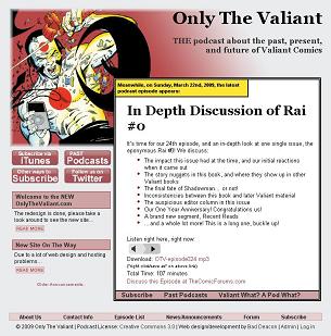
I decided that the front page would be different from the rest of the site in order to highlight the newest podcast episode. I want any user to quickly understand that the point of this website is the podcast, and make it easy for the user to listen to the show right away.

OTV Front Page
I decided on a color scheme of a gray background with red accents. The red was chosen because of the color scheme of the art that was used (the beautiful cover to Rai #1 by David Lapham). The gray was chosen by matching the middle gray color used in many browsers. The attempted effect was to visually push the background back. My hope is that this makes the things that I draw attention to stand out even more.
I created the new podcast box and moved it up so that it overlaps the header and takes up two-thirds of the screen width. I gave it a thick double border and a white background in order to make it seem that it is on top of the other content.
The yellow box in the top left of this new podcast box is meant to draw the eye to this box because of its bright color. I want the contents of this box to be the first thing that the user actually reads. It also evokes a comic book panel, which traditionally has a small caption box at the top.
I included the date of the podcast release in this yellow box. This is reminiscent of Valiant Comics specifically, which would often give the date in that box. I also want people to know that the episode is recent, and that the site is active, not a forgotten internet relic. It felt important to give the date the episode was released, but I felt that it would detract from the flow of the contents if it was in the white box, so this seemed a good solution to me.
The contents of the new podcast box are meant for ease of viewing and flow. The intended flow is a spark of interest from the title, further interest created by the bullet points, then action performed to listen to or download the episode. I tried to enhance everything that created this flow, and eliminate items that distracted from this flow.
The title of the podcast episode is the second largest text on the site, and due to the contrast, the most prominent. I left out the episode number in this title because I thought that it distracts from the title.
The bullet point text automatically alternates between regular and italics to make them easier to read. If the viewer gets to the bullet points, I want them to sell the viewer on listening to the episode.
This leads to the action portion of the box, and I prominently give the user two choices: listen with the built in audio player or download the file to their computer. I also include a few links to discussion sites, and list the file length, so that the viewer knows exactly what they are getting.
The links at the bottom of the new episode box attempt to answer three questions, which I think would be the three common questions a user might have after reading this box:
- How do I get this in the future?
- What else do you have?
- What the hell is this?
The intended purpose of the sidebar on this front page is twofold:
- Direct the user to subscribe to the show
- Give a hint that there is more to this podcast beyond what is presented on this first page, hinting that there may be good reason for the viewer to follow us
In the sidebar I included four buttons. I made these a bold red to match the color of the header. I want these to be the second most important feature for users to see, after the new episode box on the right. Three of these buttons let the user subscribe in one way or another, directly addressing the second goal of the site. The fourth button, a link to past episodes, is there to aid returning users, who may very quickly want to jump to this location. It also lets new users know that there is more than just the contents of this front page.
After the buttons, I have recent announcements listed. I opted to not put a header of “Announcements:” over these items, because a viewer should be able to determine that by the nature of the content. I put a lighter red behind each announcement title, to make them less prominent. The reason I chose to include these at all is that I want a new viewer to get the impression that this is an active site with stuff going on. I hope that this makes for a more engaging, compelling website.
I put the navigation menu at the bottom of the front page so that it is available to users, but does not detract from the rest of the content. This menu is at the top of the rest of the pages of the site to aid navigation and usability.
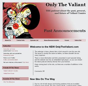
For pages other than the front page, I returned to a more traditional layout with a header, navigation menu, sidebar, and content area. Once people have clicked into the site from the main page, I believe users have invested a little into the site, and ease of use becomes more important than forcing the user’s eye to the content.

OTV Secondary Page Example
I kept subscription information prominently placed as the first sidebar item, staying focused on the goal. I also included other stuff such as links to related websites to give users who click around the site more to see.
I may add more content to the website, with information about podcasting and Valiant comics, so that it becomes a location people people can click around and waste time. When I do this, the pages will be added as sidebar links.
I kept the content area as clean as possible, and only used the left line to connect a block of content with the title above it. This felt necessary, because without that line, each item in a list seemed to blend with the next. The placement and layout of these lists of episodes or announcements could use some fine tuning, but I haven’t decided yet what will be best. One thing I want to avoid is design for the sake of design.
On my to do list of things to add are:
- expanding/collapsing text for the episode information when viewing past episodes. The user can then read the information about each episode when a title catches their eye. This will make past episode navigation easier because the page won’t be so long
- A menu when viewing past episodes to be able to see only episodes of a certain type. Episode types are noted by tags, so it will need to be a menu of all the tags used
- Remove any mention of comments on pages and posts that are closed to comments. It currently says “comments off” or “comments are closed”. This should be pretty easy to remove.
There is room to add to this site, the possibilities for added features include a forum, newsletter signup and archive of past newsletters, contests, and galleries.
This was a fun site to build!