I create a lot of problems for myself that I later have to fix.
A lot of those problems have to do with color.
The 101 Woodblock Series project is largely a design project. I formulated the idea for this project when I was still thinking a lot about design, rather than art. That influence has found its way into this project. Most of the thinking and artistic consideration that goes in to each print has to do with balancing color and shape in a way to make a pleasing image.
Most of the prints have 4 or 5 colors printed on them, which requires mixing a lot of colors, especially considering that each of the 101 prints is different.
The trick is to get all of the colors to work together.
Sometimes, everything works out, and the image just comes together. The colors work together well, and the resulting image is rather… pleasing.
Much more frequently, I create a bit of a “challenge” with the first 2 or 3 blocks, and have to figure out how to fix this “challenge”.
In the challenging prints, the colors don’t quite go together, and the image does not look complete. Often a final color is required to make the disparate colors come together and look good. I think of this as “resolution” of the colors, with “resolution” used in the sense of “resolving” things.
Resolution explained with Music
In Music Theory, Resolution refers to the part of the music that brings everything together, and makes the piece of music feel like it is complete. It is the final note that makes the piece of music complete.
Technically, Resolution is a change within the music from dissonance (sounds that don’t sound good together) to consonance (sounds that do sound good together).
The parallels to printmaking are that I often have to find a color that makes all the previous colors – which don’t quite look good together – fall in to place and look good.
Before going on, I want to show you, with music, what resolution sounds like. I picked part of The Four Seasons, by Vivaldi, to demonstrate Resolution.
This audio file has the very last chord edited out, so that it is unresolved. Take a listen.
Vivaldi Unresolved:
Without the final note in the piece, it feels like everything is left hanging, it is unfinished.
Compare the above to the following audio clip, which is the same music, but with the ending chord left in.
Vivaldi Resolved:
The last chord completes the music, and makes it sound finished. Everything that came before it works together as an overall piece of music, when the last note is added at the end to resolve the music.
Resolution applied to color
I often find myself in situations where I have to pick the right color to visually resolve the colors I previously printed. The colors on the paper up to that point don’t quite work, don’t feel complete. I have to think about what color will tie all the others together, just like the last note in The Four Seasons ties that piece of music together.
I’d like to take you through a brief color imagination experiment:
Imagine something purple. Not bad.
Now add some orange next to it. Not good.
Orange and purple have a natural dissonance them. They don’t look good together. It is difficult to find a 3rd color you can add to these 2 and make the combination look good. It can be done, but it is a challenge (hint: the color that can do this begins with “green” – click to read why*).
Now imagine green and blue together. These colors usually look pretty good together, because they are close in hue. Another color is needed though to make these two colors really pop, other wise they may look fairly drab together. Because they are so similar, the combination of the two can be boring. A small bit of red, or a red-orange color may make those colors really look good together. A neutral color, like brown or gray, can also bring these colors together. Since blue and green naturally work well together, they are easier colors to resolve with a 3rd color.
Examples from Complete Prints
I recently finished a batch of prints, some of them resolved well, some of them did not. In this section I will explain which I think resolved well, which did not, and why.

The challenge is to find a color to counter the warm oranges and reds
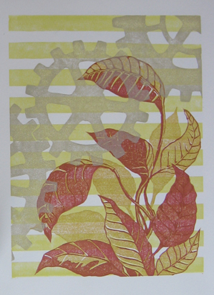
The print on the left surprised me. I started by printing the horizontal stripes, and then the 2 blocks for the leaves. The result was a very vibrant image full of warm colors, yellow, orange, and red. I like the vibrancy of these colors, but I knew that I needed something else to counter the warmth.
Without something to cool down the image a little bit and pull back the warm colors, this image could be too vibrant, to the point that it is difficult to look at. In fact, you can see the print as it looked with just the 3 vibrant warm colors in this post: Weekend Printing Results.
The warm colors in this print are similar in value and hue, and the image gets lost in a sea of orange. This image required a 4th color to resolve the previous 3.
My first thought was to put a cool color, like a blue or a green in there, but after thinking about this, I thought that a cool fourth color would stick out too much, and the image would be a visual game of “one of these things is not like the other”. I took a gamble with the gray color I printed the gears with, and I think it worked out well.
The gray color I printed has a touch of yellow and green to it, and has almost a “cool golden” color to it. The touch of cool that the image needed was added, but with a toned down, grayish hue, so that the value of the cool color did not contrast too much with the overall warmth of the image. The warm vibrancy of this image is something I like about it, and I did not want to counteract that, I just wanted to cool it down a little so that it wasn’t overpoweringly vibrant.

The same color used before did not resolve the colors in this image
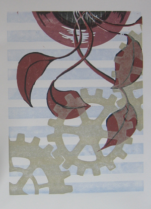
Contrast the use of the “golden gray” color above with the use of the same color in the image at right. In this one, the golden gray color does not resolve the colors in the image, and in fact, makes the dissonance between them worse.
The use of the color for the gears in this image, was, I believe, a mistake.
This image was difficult to finish because I created a visual problem when I printed the first few colors. I like the red in the leaves and the pot, and I like the light, slate blue of the horizontal stripes, but together, they look bad. They have very little in common, and adding the last color of the gears made it worse.
I am still not sure what color would have made this image work, but I think it is in the purple family. A purple might bridge the gap between the red and the blue and tie them together somehow.
In some ways, I backed myself into a corner with the red and blue, and created a color combination that does not have an easy resolution.
I find myself doing this quite a bit, because I am experimenting color combinations when I make these prints. I have tried a lot of combinations that are not obvious to me, and aren’t from the usual palette of colors that I would choose. I am trying new things, and sometimes it doesn’t work.
Final Notes
Color can be a tricky thing. Finding the right color to complement and make other colors look good together can be difficult, especially if you use colors that don’t play well together in the first place.
Tomorrow I will have a post with this same sort of look at color choice and resolution, except with examples from the prints that are in progress, but not quite done. I will be share with you what I am planning to do and why, instead of just telling you what I have already done, as I did today.
Also, these prints are currently available for sale to Newsletter Subscribers for my cost for supplies and shipping. They are my nice little bribe to get you to try out my newsletter. This special, “subscriber only” price only lasts until I finish all 101 of these prints, sometime in the next few weeks.
If you would like to see the rest of them and get your chance to purchase them for next-to-nothing prices, sign up for the Newsletter now.
Quick Thanks to Vivaldi
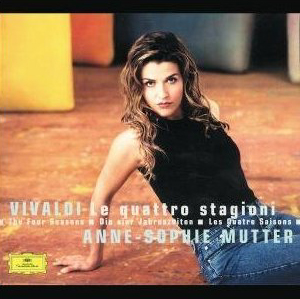
The Vivaldi clips I used above are from my CD of Vivaldi, “The Four Seasons”, performed by Anne-Sophie Mutter and the Trondheim Soloists. The disc also has “Devil’s Trill” by Tartini on it. It’s a good performance of the pieces, you can Click here to check it out on Amazon.
The disc also features a cover with Anne-Sophie in a strikingly striking pose. If you still need a recording of The Four Seasons for your music collection, this is a good choice.
If you click on the link and buy something, Amazon will give me a small piece of their huge pie (you pay the same price though). This allows me to buy food, make more art, and makes me happier.
As a result, I make more beautiful art, and share it with the world, making it a better place full of more happiness and good will towards men and women.
It’s probably actually your moral and patriotic duty to go buy, buy, buy!
Footnotes
*[note from above]Orange and purple are a split complement of green. The complement of green is red (they are opposite on the color wheel). A split complement is when you take one of the complementary colors, in this case red, and “split” it into two colors on either side of it on the color wheel. In this case, red is “split” into purple and orange, which are an equal distance away from red on either side of the color wheel. Usually, split complements look better when the split is much smaller, meaning that red would be split into a red-purple and a red-orange. The bigger the split, the harder it is to resolve the colors. Now click HERE to go back.
Tags: Color, Saturation, Value

Is that “compliment” or “complement?”
Very touch with the Vivaldi.
-d
.-= Dave Doolin´s last blog post ..Whose in Charge Here? You, or your blog? =-.