Archive for September, 2009

How To Find Out When You’re Getting Lucky

Friday, September 18th, 2009

This isn’t anything new, it’s pretty old hat, and it’s pretty obvious too, but it is what I am doing.

One thing Eben Pagan pointed out in his Altitude program is that you need to know when you are getting lucky in business, and follow that route.

I’ve been figuring out where I’ve been getting lucky by digging in to the search result keywords for my blogs. Google Analytics has a neat feature that let’s you see what keywords people are searching for to find your site. These keywords make great titles and content for new posts and articles! You have proof that people are looking for this information, and they are finding your site, so you might as well produce this content, or more content, or better content on these subjects.

On one of my blogs, I have a certain keyword search (after my name and the name of the site) that has given me the highest number of hits from search engines. All of this is because of one post I wrote on this subject, which is showing up on the first page of google for that search. I have an opportunity to create more content on this subject and provide it to these people.

This is a win-win situation. I know I can create better content on this subject than the other search results are providing. I also get more people exposed to that blog, with the chance of converting them to ongoing readers.

I am borrowing from my buddy Dr. WordPress who wrote a series of posts with practical blogging tips, and I am going to write a series of practical tips discussing the subject matter of that key word search.

I got lucky by writing an article that has gotten highly ranked by search engines for a search on that subject, now, I need to capitalize on that and be thankful that I got lucky.

Viva Blog Vegas

Wednesday, September 16th, 2009

I just found out that I won a pass to Blog World Expo from Mashable.com. Folks entered by leaving a comment about why they wanted to attend Blog World.

I’m hoping to get a lot of good information and inspiration that will help take my websites to the next level of performance. Plus, I might have a little bit of fun in Las Vegas.

Here was my entry:

I’m actually not a very good writer.

I can’t effortlessly whip out a thousand words or two on a subject. I struggle to find the words that will communicate with my readers, and inspire or inform them to make their life better. I write, and re-write, and it sometimes takes hours to craft a post that I think others may think is worth reading.

And I do it anyway.

The things about writing, and specifically blogging, that are a struggle are the things that make me do it. It is a challenge, and because of that challenge, I am drawn to it. I love that writing isn’t easy for me, and because of that, writing is far more rewarding than other things that I have a natural knack for.

Blogs have levelled the playing field and removed the barriers to entry. Anyone can have a blog up and running in just a few minutes these days. People all around the world can read what you and I write seconds after we decide to share it.

I’ve chosen blogs as my primary way of sharing what I have to offer with other people. Now I am faced with the giant task of writing compelling content, and finding ways to show people what I have to offer. Blog World Expo will teach me how I can keep working to do this.

I admit, I am greedy. I don’t want to sit in a cubicle my whole life. I don’t want to work form 9 to 5 every day, and dress up in slacks and a shirt to go in to the office. I want out. Specifically, I want out by communicating and creating value to share with other people. I want to learn how to make my writing, and my blogs, more compelling. I want to improve my life, and I want to do that by making other people’s lives better.

Blog World Expo is right for me.

You can see the comment on the blog post by clicking here.

Still Using IE6?

Monday, September 14th, 2009

Are you using Internet Explorer 6 to look at this website?

If you are, you might think I am an incompetent web designer. (You may also just know that you are using bad software, but I’ll get to that)

Internet Explorer 6 (IE6) still has a considerable amount of people using it. The numbers range from just under 15% of users to just over 30% of users using IE6, depending on which source you check.

Of course, IE6 is the browser that many businesses have decided is their official supported browser, so many people in Corporate America use IE6. This is very frustrating for those of us that know better, but are required to use certain software.

So why is this site jacked?

IE6 has a bug (one of many) that doubles the margin on floated elements. The columns on this site are “floated”, so that they can be displayed next to each other. There are also margins between them and the side of the page, so that they will be spaced properly. IE6 doubles these margins, which squeezes out one of the columns, because there isn’t enough room on the page. The last column ends up underneath the other columns.

Why does IE6 double these margins? This practice is clearly counter to the specifications for HTML and CSS, the programming languages that this determine what you see in your browser.

IE6 is just bad software that holds back the web. It is the stupid kid in the classroom that holds back all the smarter kids from moving on to the next lesson.

I recommend using Firefox or Chrome, but even upgrading to Internet Explorer 7 or 8 will fix a lot of the problems.

Maybe I’ll get around to including some hacks to get around this into the code for this site, but really, should I have to hack my site so it looks vaguely how it should in a browser as widely used as IE6?

Web Art: Some Examples

Saturday, September 12th, 2009

In previous posts, I have brainstormed on certain qualities that may help to define what is unique about art created for the.  Keep in mind, when I say “web art”, I don’t mean art done in traditional mediums and merely displayed or distributed using the internet, I mean artwork that is created to use the internet as the medium to make the artwork.

Past posts in this series have talked about what web art may be, and some of the qualities that define it.  You can check out these previous posts here:

In this post I am going to discuss a couple of examples of honest to goodness web art, so that you can get an idea of what exactly I have been talking about.  These examples each show at least some of the qualities of web art that I discussed previously.

Piano Etudes

First up as an example is Piano Etudes by Jason Freeman.  The artist composed and performed these Piano Etude (short pieces of music for piano), but then went a step further.  The recorded music was broken up into little pieces, and the user can arrange these pieces however he would like, creating his own arrangement.  The user gets to work with short pieces of music created by the artist, and the result is a collaboration between the artist and the user.

This collaboration is a little different than the usual artist collaboration, where two artists work in tandem to create a finished work.  In this collaboration, one artist creates the building blocks that can be used, and the user assembles them.  In this way, the user becomes an artist themselves, as he plays an integral part in creating a finished piece of music. 

Here is an example of Piano Etude 1 arranged by composer, friend, and frequent blog commenter Tiven.

These Etudes incorporate non-linearity in an interesting way, and also relies on user interaction.  This type of project is unique to computers, and to the internet.  This type of experience cannot be created with traditional media.

Web Yarns

Alan Bigelow makes interactive stories.  You can find them at WebYarns.com.  Each one of these requires the user to guide themselves through the story, which is presented with words, images, and sound.  The path through his stories are often non-linear, the user must determine the path through the story.  The artist does not have total control over the experience, and lets interaction by the user play a large role in the unfolding experience of this work of art.  

I was particularly drawn to Because You Asked, perhaps because of my affinity for self-portraits.  I suggest clicking on the link before reading more, because I will be talking about the specifics of the piece of art.  The final multimedia portrait that is created as the user navigates the work of art is pre-determined, but the path, and the experience while that final product is created is up to the user.  The start point and the end point are set, the time and order in which each of the phrases that make up the portrait is up to the user.  Some aspects of the progression of time are left up to the user to determine, such as when certain phrases are revealed, but other aspects of time, primarily how long it takes for the final image to emerge, are part of the programming.

= = = = = = = = = = =

As I find new works of web art that I find interesting, I will post them here, and discuss them.

Coming up next, I’ll wrap up this series, and in particular discuss the relationship between programming and creativity that is a unique part of web art.
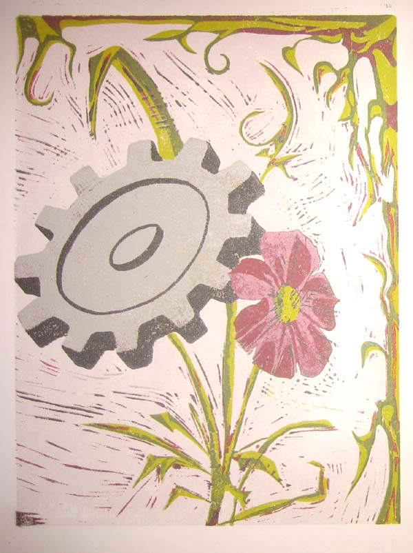
I’m Busy Printmaking, No Time For Real Posts

Wednesday, September 9th, 2009

An image from the 101 Woodblock Series

The first round of completion has come around..

The second round should be complete by the end of this weekend, if my order from Graphic Chemical Supply ever shows up!

Art Galleries and Collectors Have Dinosaur Mentality

Tuesday, September 8th, 2009

The New York Times is running an article, Digital Creations Come of Age about Digital Art and some of the little annoying problems that collectors and dealers are facing trying to collect and sell this stuff.

They are looking at this entirely wrong.

In the age of Pirate Bay, unique ownership of anything in digital form is like trying to scoop up water with a net.

For those of you that didn’t go read the article, the author writes about the challenges that artists and collectors face when buying and selling digital art. A piece of digital art, after all, is made up of a bunch of 1’s and 0’s on a computer, disk, or other digital storage device.

If someone makes a work of art with digital methods, what is the original piece of art? If the art is nothing but a file, how can anyone be sure that their copy is unique or original?

The article goes on to say,

Uniqueness is central to the digital art paradox. On one hand, its lack of uniqueness is a fundamental characteristic, part of its originality; on the other hand, the sense of exclusive ownership that uniqueness bestows is what collectors and investors typically want.

The problem that these artists and collectors face only come up because they are trying to apply the old model of art to new media. The “fundamental characteristic” that digital art may not be unique shouldn’t be considered a problem, it is an interesting part of the art, Collectors and Investors be damned.

The whole cycle of museum/collector/investor is one of the reasons why art seems so inaccessible. If you are not “part of the club”, you just won’t get it. Digital art has the potential to reach beyond that art culture, since it can be freely accessible to everyone.

The article ends by kinda indicating this, even if it does go a bit overboard and gives in to the temptation to use hyperbole:

Perhaps the idea of the unique object is becoming obsolete, just as software programs that are only used online rather than owned, are slowly replacing physical software packages that one owns.

Digital art should be embraced for what it is, and should be distributed and shared with the world in the way that most makes sense given the characteristics of the medium.

If this doesn’t fit in to the defined structure that galleries, collectors, and investors have come up with for traditional artistic media, then the party should go on without them, and they can show up to this new party if they want.

If you haven’t yet, go check out the New York Times article here:

Digital Creations Come of Age

Vote for OnlyTheValiant.com!

Tuesday, September 1st, 2009

This post is a quick break from all of the posts talking about Web Art, I’ll return you to that regularly scheduled programming tomorrow.

I submitted one of my websites, OnlyTheValiant.com, into a WordPress design contest over on FresheVenture.com. Please take a few seconds to vote for my site.

I love to design websites using WordPress, because it is a very flexible and adaptable framework to build sites off of. It isn’t perfect for everything, but it is fantastic for a lot of things. I’ve spent quite a while really understanding how WordPress works, and put a lot of that knowledge to use with OnlyTheValiant.com.

I’m very proud of that site, I think it has a clean layout and effectively promotes the most important content on the site. I spent a lot of time working to make sure the sight had all of the information it needed, and also wasn’t cluttered.

CLICK HERE to vote for the website

After you click, scroll down the page till you see OnlyTheValiant, check the button right next to it, and click on VOTE.

It takes less than a minute, and is a great way to support my design work. Thank you!

If you are interested in more of my thoughts on the design of OTV, I wrote up some of my thoughts on my personal blog. The design of my personal blog is incomplete (ie. non-existant), but the content is there: OTV Design Considerations.