Archive for May, 2009

Nice..

Friday, May 29th, 2009

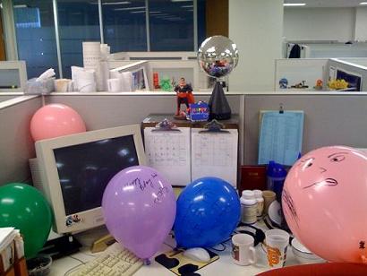
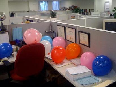
My thirtieth birthday is coming up this weekend, and my crew at work decided to decorate my cube up a bit.

Lots of balloons..

More decoration. The Superman next to the disco ball is always there, but the disco ball is not.

More balloons..

Most of the balloons have something written on them, including some messages that I (so far) have no idea what they mean written in Arabic and Chinese.

This is kind of funny, because today the company is having a celebration in honor of people that have worked at K/J for at least 20 years. They walked around this morning and gave balloons to everyone with at least 20 years under their belt. Folks who have worked here over 40 years (and there are a few) got two balloons.

By this measure, it seems I have worked here for 260 years.

Keep on rockin’ in the (not so) free world!

Memory Lane: UCSC Printmaking

Wednesday, May 27th, 2009
Myself and my Art were one

Myself and my Art were one

I decided to get going with an art project yesterday, and it starts with printmaking.  I pulled out my boxes of stuff from my printmaking at UCSC days (I was an art major with an emphasis in Printmaking).  I have a stash of paper, the good stuff — Rives BFK — sitting in my print storage boxes along with all the stuff I made while in school.

It was a trip down memory lane, and a reminder that my time at UCSC were my most creative, wacky, diligent, and fun years.

My fellow studio mates and I managed to put out some fantastic work.  Part of the fun of opening up my box is to go through and look at all the stuff I was given or traded to get from my classmates.

It also reminded me of how much I enjoyed working in that studio, and even more so, how right it felt to work there.  And I worked like a dog.

I spent hours and hours there, I remember at one time going two weeks on about 4 to 5 hours of sleep a night because I was spending late, late nights in the printmaking studio.  The best times there always happened at night too.

I found a stack of little printouts, stuff that either I or one of my friends put together, these are the images I attached to this post.  One of my friends took a picture of me posing in front of one of my lithographs, you see this above.  We spent a while to get it just right, and what you see is a photo, not something photoshopped together.

One night, me, Rachel, and Luke decided to see if we could all fit in the big sink in the studio.  Turns out we did, and we took a photo as proof.  Good times.  It was crammed as can be, and below the line of the sink I am bent and contortioned completely out of shape.  Luke and Rachel had to do pretty much the same.  The wackiness was well worth it though.
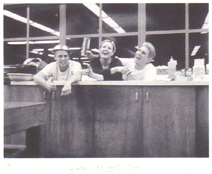
Luke, Rachel, and myself just hanging out in the sink late at night

Luke, Rachel, and myself just hanging out in the sink late at night

I spent so much time in this studio because I loved what I was doing.  It was more than just fun, I took it very seriously.  It felt like the right thing to be doing.  More than any other time in my life, I felt like I was doing what I was supposed to.

I could write a whole post about Lithography, and what it means to me.  The reason I like lithography correlates almost exactly with the reason I like web design.  It also explains why I think that engineering and art are very closely related, despite common belief.
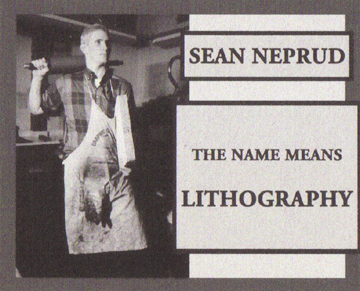
...or it means Punk Beyotch, it got confusing sometimes

...or it means Punk Beyotch, it got confusing sometimes

The above was my monitor card, a placard that hung on a weekly schedule indicating who was the person in charge at in the studio during non-school hours.

One of my class mates thought I was being a little presumptuous, and crossed out Lithography in the above card and replaced it with “punk beyotch”.  After that it changed back and forth a bit to all sorts of things, good times.

Looking through all of this stuff reminds me of what is really missing from my life right now, which is creating things.  I have done a bit with web design lately, but nothing as tangible as what I produced back in the days of UCSC Printmaking.

I’m hoping that this project I’ll be starting in the next couple days will help set this right.
Art Is Design

Wednesday, May 27th, 2009

…at least it is on this site.

The scope of this site extends far beyond just web design. Design, after all, transcends just the internet.

I’ve got an art project coming up, it may be major, it may be minor, but the wheels are in motion to make it happen. It will be documented here. I plan to get this project in motion by this weekend. I just have to get a printing brayer and ink..

This project may be related to the upcoming Deacon Design 101 as well.

A Design Lesson From A Cute Women’s Magazine

Tuesday, May 26th, 2009

At lunch me and my coworkers often entertain ourselves by reading through various magazines. This week, Real Simple Magazine is sitting in the lunch room.

At the end of the magazine they had a perforated, detachable cheat sheet that summarized some of the content of the magazine. The sheet itself was perforated so you could separate it into even small, wallet sized sections. One section had a recipe, one had information about a bottle of wine spotlighted in the magazine, one had information about makeup, etc.

I was astounded at this.

This simple, detacheable card was the most useful part of the magazine. This card allows anyone to take the information with them, and easily try out or implement the information in the magazine.

Brilliant design.

This got me to think about how, with design, you make something more useable and useful. I have a few things I want to implement along these lines, such as popout articles, instructions, references and the like. There is a lot more, but I think the overall key to this is to think about how the end user of your product, site, or thingy will actually use what you are providing them.

Design To Your Site’s Purpose

Friday, May 15th, 2009

The best web sites accomplish just the right amount of stuff.

Bad web sites often try to do too much, or too little, and become hard to use.

What does your website attempt to do?

I thought about this while reading this article on design at User Interface Engineering. The summary of the article is that good design is invisible. We don’t notice when something works well, we only notice when something works poorly.

The example the article uses is Netflix as an example. The design is so good that you don’t even notice the design, things just work well, and it is easy to use.

Netflix is able to have such a good design because it does something simple, and specific. It allows the user to rent movies.

Netflix users know that Netflix actually does a whole lot more than just let you rent movies. You can watch movies on your computer, review movies, network with friends, get movie recommendations, etc. All of these features are hidden to the new user, and slowly get revealed. The design does not overwhelm the user with all of these features at once. If they did, the site probably would not be as successful.

The best, easiest to use websites are clear about their purpose, and are designed to promote that purpose. Extra features are revealed slowly.

Websites that display everything available on the site become hard to use and inaccessible. I have been to many websites that I know contain plenty of information I am interested in, but the design is so poor, that it is hard to navigate, and hard to find. I am not sure what feature of the site contains the information I want.

I give up on these types of sites pretty quickly now, because I don’t have time to figure out how the convoluted organization works.

When I design a website, I determine what the primary purpose of the site is, and design the site to promote that function. Other functions may be available, and I incorporate them into the design in a way so that they are slowly revealed to the user.

Knowing the primary purpose of your site, designing the site to promote that purpose, and making the site easy to use will result in better websites.

WordPress: How to scrape the Tags from Posts of a certain Category

Friday, May 8th, 2009

One of the features of WordPress is that it has a 2-D taxonomy built into it (taxonomy refers to the method of categorizing information).

The built in taxonomy consists of Categories and Tags.

For this site, which I am working on redesigning, I want to separate large portions of this site by category. For instance, I want a portion of the site to be information and articles focusing on Web Design and Development. I want another to be my personal blog. I may add others down the road, like a section displaying my art, and so on.

My plan was to distinguish these areas by assigning them different categories within WordPress.

This would only leave me to use Tags to further categorize content within these major areas.

In this way, I am really using Tags like Categories. Sure, this leaves me without the functionality of tags, but really, I don’t care.

So here’s the problem:

WordPress doesn’t really treat Tags and Categories as a true 2-Dimensional taxonomy system. The way WordPress functions, it is more like a 1-Dimensional system with two segments, and slightly different functions are built in to each.

I wanted to be able to pull a list of all the tags assigned to posts of a certain category, but this proved hard to do, or hard to find out how to do, with WordPress’s current functions and documentation.

I found a piece of code that did something similar as a starting point, and modified it to make it do what I needed it to do.

This code determines which posts are in a specified category or categories, determines the id numbers of the tags associated with each post, throws out duplicate tag ids, then lists all of the tags with those id numbers in an unordered list.

Here’s the code:


EDIT: I moved the unordered list html tags to within the IF statement, so that you don’t end up with an empty unordered list.

Shortcomings that I know of: The list is not ordered by anything except internal WordPress database IDs, so it appears to be in random order. Also, I don’t know how this works with child categories.

If you know of a better way to do this, let me know!