A Short and Irreverent Art History, Part 4

Or…

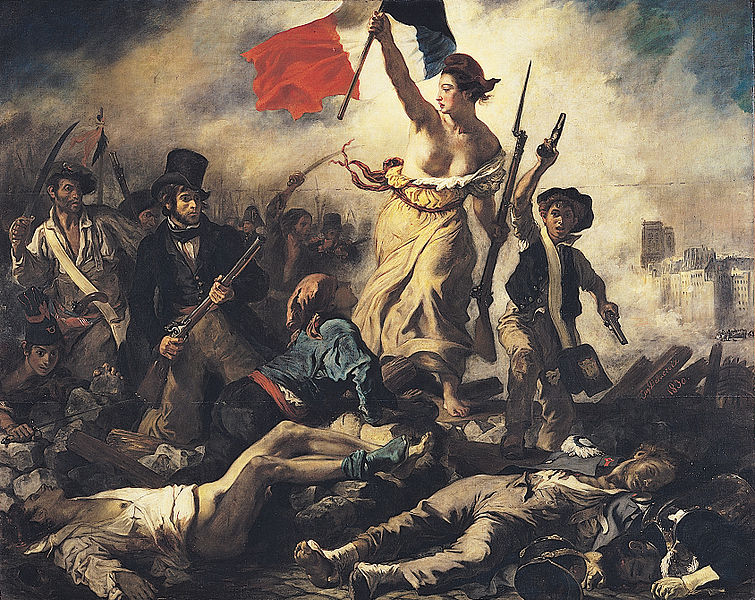
Things Fall Apart… When they are forcibly disassembled

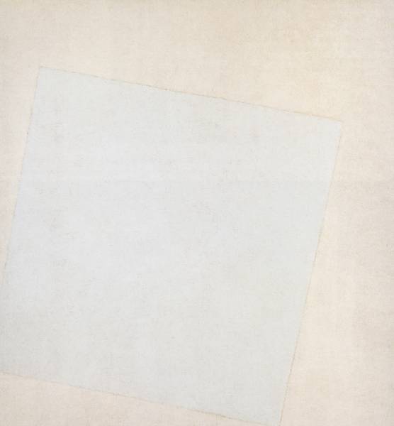
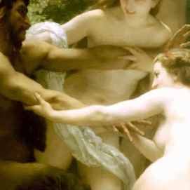
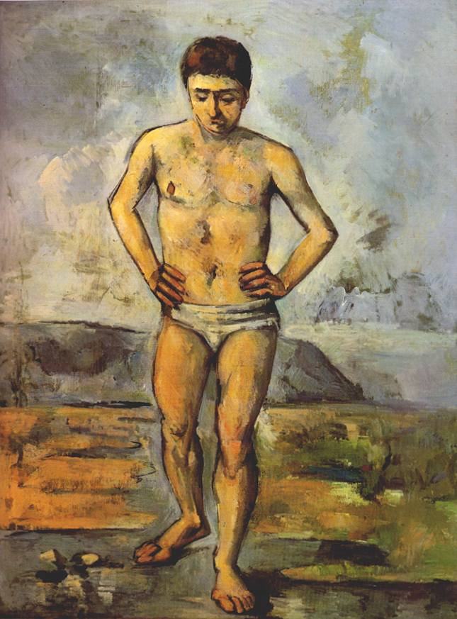
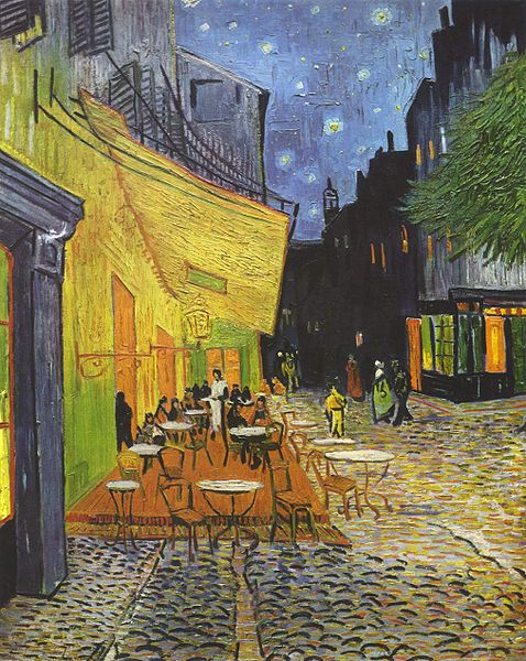
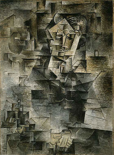
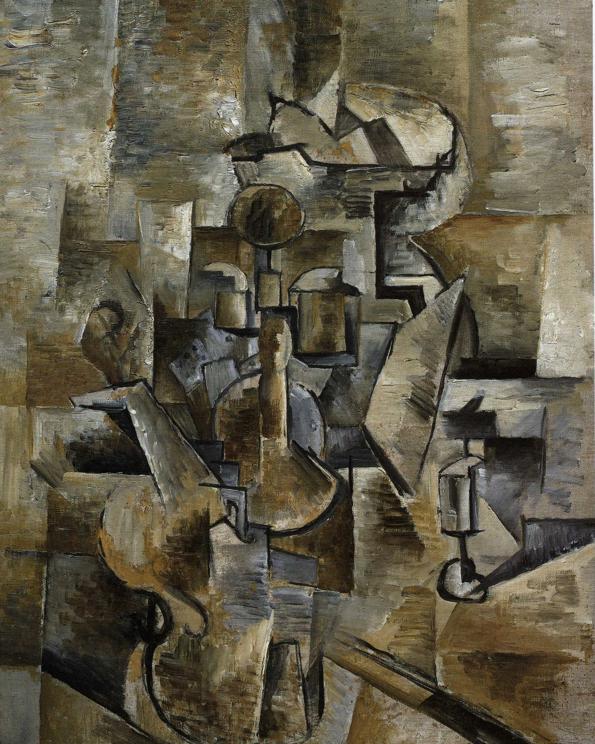
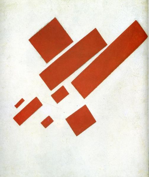
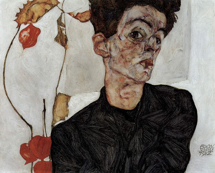
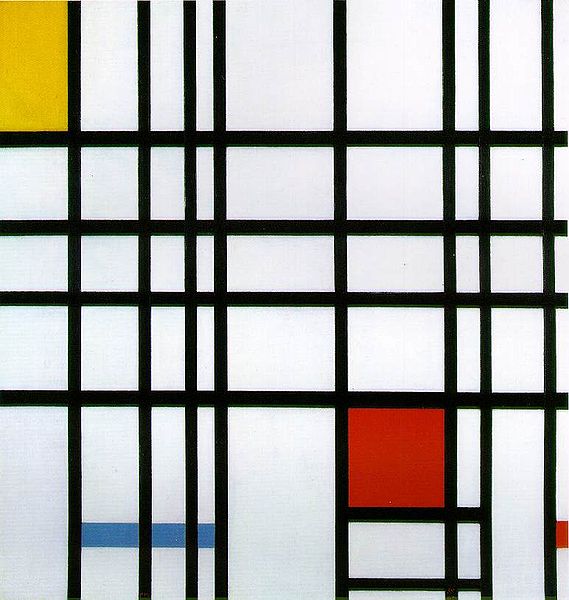
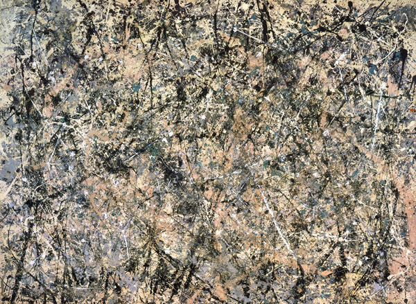
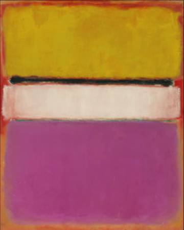
The modernists went as far as they could go, they proved the thesis of Modern Art – art didn’t have to have subject matter, it could be a “pure” creation, subject matter and the materials used to make it were one and the same.

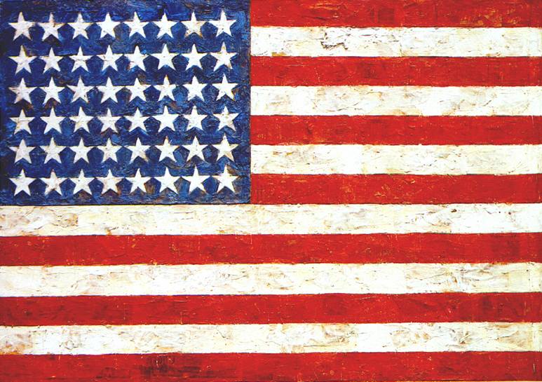
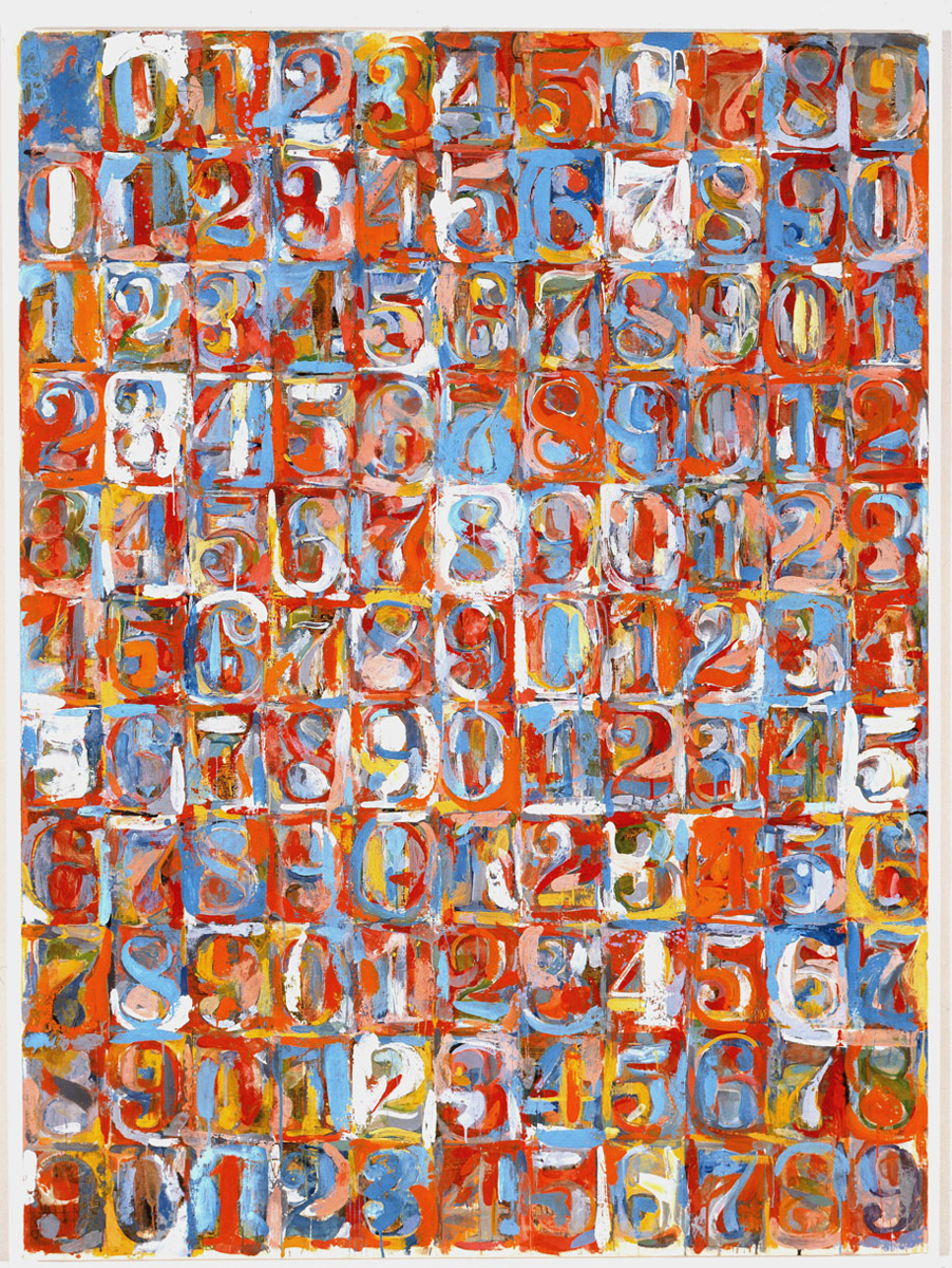
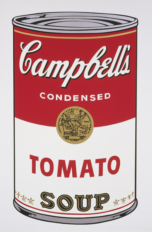
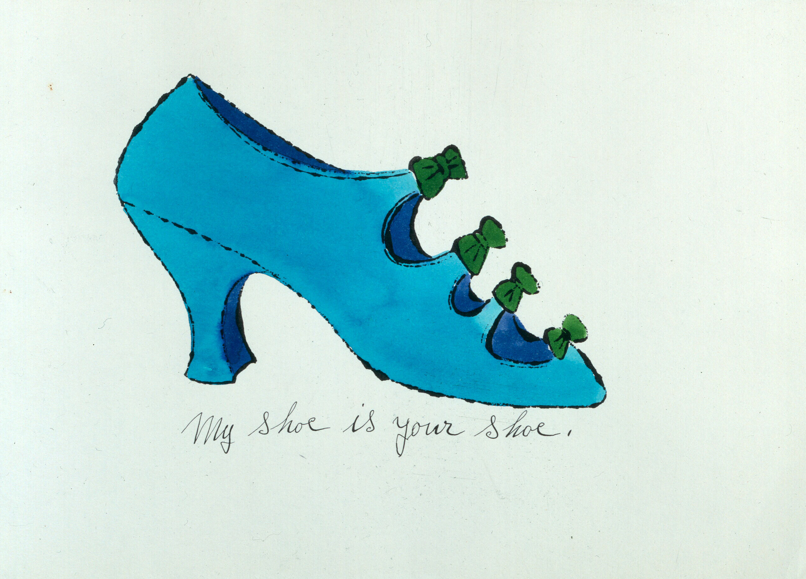
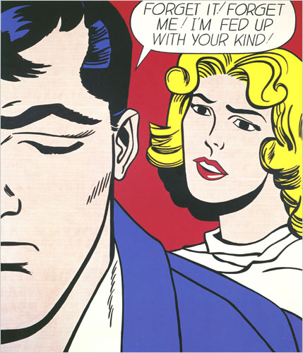
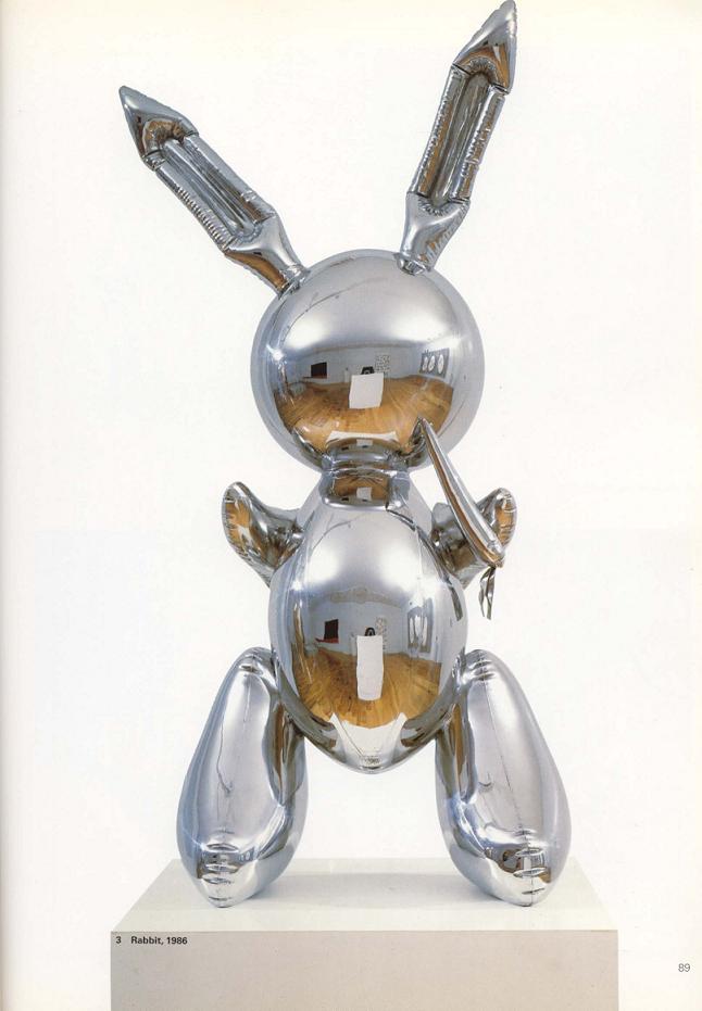
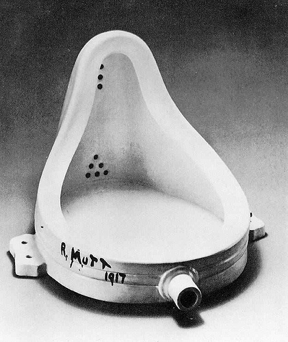
In the 1950s, a couple of upstarts thought that was boring, and did something different, and they drew (no pun intended) subject matter from ordinary, daily things. Flags, numbers, soup cans, and shoes. Pop Art was invented.

It’s hard to explain how Pop Art was a radical departure from modernism, but the main departure was to say, “art isn’t some hoity toity, amazing thing, a reflection of ‘high’ culture; anything can be art”.

And then all hell broke loose.

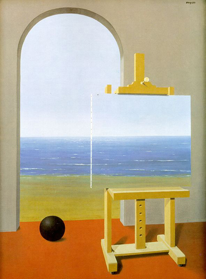
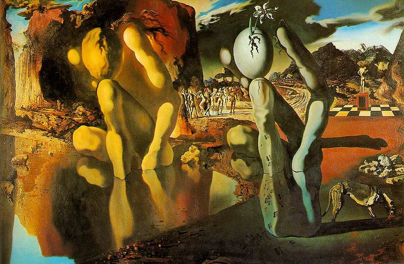
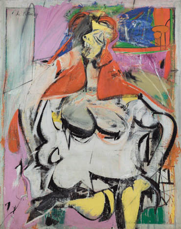
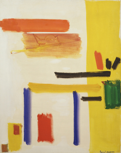
Honestly, it is hard to write this entry of my “short, irreverent” history, because so much happened in the 1960s, 70s, 80s and 90s that was so different from anything that had previously been called art, it doesn’t fit into a linear narrative as well as Modern Art does. It was an explosion that went in many directions at once.

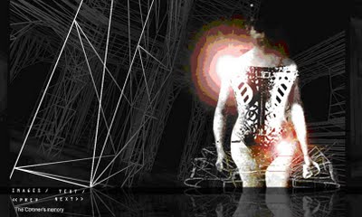
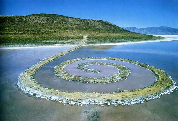
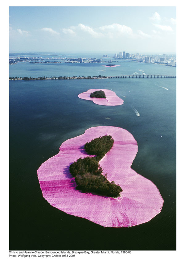
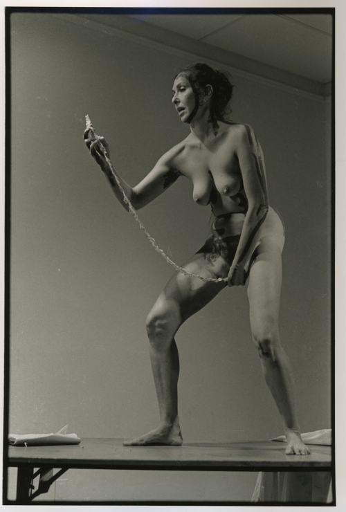
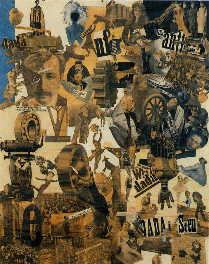
There was performance art, installations, pop art, assembelage, video, conceptual art, digital art, and other bizarre ways to make art. Art addressed gender, nature, consumerism, space and environment, kitsch, and religion.

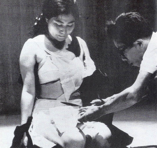
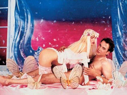
A lot of art from this time was “shocking” (link is NSFW), and a lot of people would say, just plain strange or uncalled for (another not quite SFW image). Often, when people see post-modern art, the response is, “how is this art?”

It seems like art became random in the post-modern era, but I think there was a common thread, just like there was a common thread in the Modern era. The thesis of Post-Modern art is that there isn’t a distinction between art and life. Anything can be art, if attention is brought to it as art, and anything that was art could be part of life.

Art wasn’t a “thing” to be “made” that would sit in a gallery or museum to be looked at when someone wanted to “experience art”, it was something that happened all around us, all the time. Life is art, and art is life, it has the meaning that we give it, and it obtains meaning when we draw attention to it.

The wall between art and life was brought down. Post-Modern art disassembled the meaning of art, each movement and method unravelled the meaning of art in a different direction.

That’s pretty damn cool.

The problem is that it leaves art completely deconstructed, completely disassembled, lacking any definition and structure. This sucks for artists now.

There are a whole lot of pieces laying all over the floor now that the post-modernist are through with it. It is the morning after a raging, drunken party, and we wake up, the house is trashed, and we have the mother of all headaches.

Up next, the fallout, and where we are now.

A Short and Irreverent Art History, Part 3

Or…

How Modern Art backed itself into a Corner

This is Part 3 of this series, in which I talk about what Modern Art means. Part 1 talks about the rules of art for hundreds of years, and how impressionists broke those rules. Part 2 talks about how the stones the impressionists threw turned into an avalanche of abstraction. You should read part 2 before reading below (if you haven’t already), because this entry picks up where it ends. This entry is really the second half of Part 2, I cut it into parts because of length.

Like before, clicking on the links below will launch a pop-over image, without taking you away from the page. (Though there aren’t many links in this one)

On to pontification.

Abstraction Hits A Wall

There’s one thing I wonder about when I look at the Modern Art period, and the background for this question addresses why folks sometimes have difficulty appreciating Modern Art.

The most interesting thing about Modern Art was the road that artists traveled down, the ways that artists changed the philosophies of what art is during the first half of the 20th century.

Individual works of art are a record of the road they were on, but it turns out that the journey down the road was more interesting than any of the individual stops. Each of those stops along the way, cubism, fauvism, expressionism, whateverism, don’t always make a lot of sense on their own, because each one is a move further down this “Modern Art” road. They build upon the progress that came before, and push further down the road towards pure abstraction.

When I look at a painting of a white square, I look at it as a step towards pure abstraction, a step towards proving that art doesn’t need a subject, a step towards demonstrating that art was about raw art materials, and what could be done with them. Outside of that context, however, a white square isn’t very interesting and doesn’t make much sense.

This is where Modern Art loses a lot of people. The context is missing. An abstract collection of shapes isn’t always interesting or beautiful, at least from an objective view. The meaning and importance depends on the context in which it was made, and how it expanded the boundaries of art.

The history of Modern Art is the history of this march towards pure abstraction, taken one step at a time. I sense that it was a proud march, artists bravely pushing boundaries and courageously proving art could be more and more abstract.

Getting back to my question about this, what I wonder is, did they realize this road was a dead end?

There is a natural limit to abstract art. There is a point at which art cannot be any more abstract, because it is as abstract as is possible with a tube of paint and a canvas. That limit was reached in the 1940s and 1950s, and this was the destination of the Modern Art road.

When artists reached this destination, everyone discovered that the road wasn’t a road at all, it was more like a pier. There was no where left to go.

Modern Art was a dead end, artists had moved in this direction as far as was possible. Even worse, it was the getting there that was interesting. It isn’t nearly so interesting to stay there. They could either hang out at the end of the pier, or walk back to the shore. Both options are boring.

Luckily, a couple strange guys, Jasper Johns and Andy Warhol, saw a third way; they decided to jump off the pier into the ocean, and that’s when things really got wacky.

Tomorrow, this series continues with the cleverly named Post-Modern art that came after Modern Art.

A Short and Irreverent Art History, Part 2

Art History is a mess of people, pictures, and strange “isms”. Some of it looks great, some of it… can be harder to appreciate. I’ve got my own take on what Art History is about, and what was important. If you haven’t read my irreverent history of art up to impressionism, You should read it first, because this picks up where that ends.

Clicking on the links below will launch a pop-over image, without taking you away from the page. Hover over the image for an informational caption, click next to the image to make the image go away.

Let’s continue the story.

…and then a bunch of upstart impressionists made all other art styles irrelevant with their sloppy smears of paint on canvas. Monet’s painting of a woman out for a walk may seem downright tame and old school today, but at the time, it was new and original.

The revolution of the impressionists is that they allowed the paint to be seen. The impressionists didn’t smooth out each brush stroke out and blend every color like artists had for (hundreds of) years before. You could see every dab of paint, and every brushstroke, on the canvas.

These small pebbles of change started the avalanche that is Modern Art, an avalanche that would end with subject matter indistinguishable from the materials used to make the art.

[A quick note about the term Modern Art – it can refer to both the time frame (1865-1950), or the styles developed in that time frame (impressionism to abstract expressionism). These art styles followed a certain progression, and explored a certain philosophy of art, which reached a culmination in the 1940s and 1950s. For better or worse.]

Impressionism made the rounds for a decade or two, until some folks started to expand on this “painterly” thing. The result was the keenly named post-impressionism, which features artistic super stars like Cezanne, Seurat, Toulouse-Lautrec, Matisse, and Van Gogh.

In the early 1900’s, this Spanish guy named Picasso made a painting of some women, and depicted them out of a bunch of flat, angular shapes. The art world was rocked, and cubism was invented by Picasso, along with his buddy Braques. Picasso became super famous, even though he was still alive.

After cubism rocked everybody’s socks off, a bunch of other folks developed a bunch of “isms”: suprematism, futurism, expressionism, surrealism, DaDa, etc. These were all just a bunch of new weird ways to paint things, but they all had one thing in common: the paint, and how it could be used to depict things, became far more important and interesting than the actual subject matter. (Except DaDa and surrealism, which were just weird)

This is the time when artists depicted things very abstractly, and more and more, paintings became pure combinations of shape and color, and did not depict anything “real”.

This culminated in Abstract Expressionism. External subject matter was gone completely, the subject of the paintings was the paint itself. This is the era when Hans Hofman smeared paint on his canvas with his palette knife, Jackson Pollock danced around his canvases and flung paint on them, and Mark Rothko painted cloudy squares of color on his canvas.

This is what Modern Art is all about – art became less and less about the subject matter, and more and more about how the materials were used to depict the subject matter. Eventually, subject matter disappeared entirely.

This series continues tomorrow, I will talk about what Modern Art means, and how it was just a dead end road.

A Short and Irreverent Art History, Part 1

[Note: This is the history of Art as I see it. Expect liberties. Every link in this post launches a popover image that exemplifies the art or artist I discuss, run your mouse over the image for a caption. Click liberally for the full experience.]

For the longest time, Art was all about the church and the bible. Paintings and sculptures and stuff were all about the Glory of God. This makes sense, because for most people, all they did was work in squalor, and go to church, and nobody wants to be reminded of squalor.

There were lots of neat paintings and sculptures by Renaissance artists (if you can remember all 4 Ninja Turtle names, you know them). Eventually, some artists started branching out, and painted mythic scenes, rich people, and bowls of fruit. In Holland they invented the “landscape painting” and paintings of “normal people“. Painting was very realistic, and the more realistic, the better.

All this realistic, “highly skilled” type of painting got stale eventually, and by the mid 1800’s in France, paintings were basically softcore porn, with the excuse that they depicted “mythic” or “historical” scenes. But always with naked chicks.

In the 1860’s this young upstart named Edouard Manet thought this was lame (at least, the “calling it mythic” part – he still liked the naked chicks part). He made a couple paintings that at the time were called “crappy“, and are now called “groundbreaking” and “revolutionary”. The paintings were “painterly“, rather than photorealistic. Before Manet, artists tried to “hide the paint”. Paintings were meant to look like the color had magically appeared on the canvas, not applied with a brush. Basically, they tried to make paintings look as lifelike as possible. Manet ignored this, and made his paintings look a bit more like they were made out of, well, paint.

(By the way, Manet wasn’t just a crappy painter, he actually could paint in the style that was “proper” for the time, he just chose not to – Modern Art wasn’t started by a talentless hack.)

A bunch of guys and gals (Monet, Renoir, Cassatt, Morisot, Pissarro, Degas, etc) thought Manet was on to something, and the Impressionism movement steam rolled forward. The era of Modern Art had begun.

Tomorrow: Modern Art, the style, the era, and what it is all about.

Deliberate Practice in Art and Drawing(Revisited)

I’ve been thinking about deliberate practice in art a bit lately. I have time to revisit this, the spice mines aren’t taking as much of my time.

A little backstory, starting in late 2009. At the end of last year, I spent a while planning for 2010. I determined what I wanted to accomplish and how I was going to accomplish it. I had a plan in place, and it was good. “No plan survives first contact with the enemy“, however, and the new year saw me loaded up with work at DayJob. A lot of work (so much I only had a little time to send out a dispatch from the spice mines every now and then).

Things have shifted again, I’m still busy, but not so much that I’m working nights and weekends. My Utah trip was at a folcrum point. When I returned, work wasn’t requiring all my time like it had been for the first several months of the year.

I have time to dedicate to my art, but I don’t have a discipline of practice or schedule in place to make the most of it. Hence, time to revisit Deliberate Practice.

Deliberate Practice One Hour A Day

I’m going to mash 3 ideas together –

First, I want to revisit the idea of doing my most important activity for 1 hour every day. Drawing is the fundamental skill of art. If I am not improving as a draftsman, why should I bother?

Second, I want to create a clear program to improve my drawing ability. I just read Switch, by Chip and Dan Heath (of Made To Stick fame). The book is alright, but the topic is fascinating to me: how do people change? In the book, they focus on three ways to create change: our mind must know what to do, our emotions must be positive, and our environment must facilitate the change. 

Emotion? Check. I’m pretty motivated. Environment? Check. My apartment is filled with art supplies and places to draw. Clear plan in place? Che.. er, hmm. Maybe I’ll just, uh… draw something? Often, my hang up to drawing is, “what am I going to draw?” It is not a hard decision to make, but just having to make the decision makes the process harder. I am shopping for jam, and there are too many choices*.

What I need is a clear plan of study, so that when I sit down to draw for an hour every day, I don’t have to think about what to work on, I just continue with the plan. I just got one of those 33% off coupons for Borders, my plan is to buy a drawing instruction book on my way home from work today. I hope this will provide the type of structure that I am looking for, so I don’t have to deal with paralysis of analysis.

That said, if anyone has a suggestion for an intermediate to advanced drawing book, please don’t hold out on me. Leave a comment with a suggestion. 

Third, Deliberate Practice. As a refresher, here are the characteristics of deliberate practice:

  1. It is designed specifically to improve performance
  2. It can be repeated, a lot
  3. Feedback is continuously available
  4. It is mentally demanding
  5. Typically, it is not that fun

I think this plan will hit all of these cylinders.

Motivation

I was talking to my dear friend Ivana last night, I told her about my usual routine of working a bit in the morning, going to the DayJob all day, then working again in the evening. She pointed out it is rather a lot to do.

I started thinking about my motivation, because the productivity I am shooting for goes against the common view of what is “balanced”.

I think that what motivates me is imagining myself in 10 years, looking back at what I did over those years. I want to show that I accomplished something, grew my abilities, and did something.

The only way to do that is to work. A lot.


Notes:

The example of too much jam is from an often cited study in which shoppers were first shown a display of 6 flavors of jam in a grocery store. The number of sales were recorded, then the display was modified to show 24 flavors of jam. They sold less jam when there were more options, the conclusion is the more choices we have, the more difficult it is to make any choice at all.

Click here to go back up.

Kindred Art – Art That Speaks To Me Loudest

Wednesday is a busy day for me – rush to work in the morning, work all day, spend the evening at a buddies house, pick up some groceries, and finally make it home around 9 pm.

pencil sketch of my hand

Pencil Sketch from my sketch book

After getting laundry in the washer, I finally had time to myself around 9:15. Time to draw. I put on some music, got out my pencils, and started drawing the nearest thing to me, my other hand.

Let me back up half a sentence, because this bit gets to what I’m writing about today. I didn’t just put on some music, I put on Mahler, Das Lied Von Der Erde.

Gustav Mahler is a favorite composer, when I listen to his music, I feel like it was written about me. I first heard Mahler in a bookstore, at one of those “CD preview” machines, listening with headphones. Within the first two minutes of the 9th symphony, I was enthralled. If you want to know what what it is to feel both the pain and beauty of life (at the same time), listen to Mahler’s 9th.

As I drew, I thought about kindred artists. Every now and then, I will find art that I feel was made for me, or about me. The art captures something better than I can explain myself. I seem to find these few and far between, but when I first encountered Mahler, his music was this kind of art.

(Strangely, it is rare that visual arts enthrall me like this. Every now and then something will really stand out to me, but I usually don’t understand why. I can’t figure out why I can stare at Mark Rothko’s “color field” paintings all day, but I can. I’ve been casually reading Rothko’s book, The Artist’s Reality: Philosophies of Art, to figure this out.)

The poetry of E.E. Cummings strikes me in this way. His organization of words is the most similar to the way I feel about the world that I have read. This was another instance when I knew within minutes that I found something that resonated with me. I read Since Feeling Is First, and I knew that whatever that was true for him, that made him write those words, was also true for me.

I finished up my work in my sketch book for the night as Das Lied Von Der Erde finished, I put my clothes into the dryer, and ate the dinner that was heating in the oven.

My CD player switched to the next CD, Mahler’s 9th. I grabbed 100 Selected Poems, sat on my window sill by the fire escape, smoked a cigarette, and read.

* * * *

Is there an artist or artists whose work strikes you especially strongly? I’m curious. Leave a comment if you’d like, let’s talk about it.

* * * *

A note about recordings: I linked above to the Pierre Boulez recording of Das Lied Von Der Erde. It is a decent performance, and a modern recording. I bought it mainly because I like Pierre Boulez’s work on the rest of Mahler’s Symphonies. I highly recommend Das Lied von der Erde conducted by Bruno Walter, however. It is a much older recording, but the performance is outstanding. I have this recording on vinyl, I haven’t gotten the remastered CD yet, but reviews I have read seem to indicate the remaster is quite good. It sounds phenomenal on vinyl. If you want to hear the 9th, I like Mahler, Symphony 9, conducted by Pierre Boulez. I’ve also got Leonard Bernstein’s recording of the 9th, but it doesn’t seem to have the urgency that I like so much in Boulez’s recording.

Druid Arch Woodblock Print in Process

I’m working on a new woodblock print based on my destination at the end of Elephant Canyon: Druid Arch.

I was rather struck by this arch. To get to it, I had to hike through a canyon, then finally up a rocky hill. I scrambled up and over rocks to climb a couple hundred feet up the end of the canyon, before reaching a rock plateau that looked back on the canyon.

Druid Arch

Druid Arch, at the end of Elephant Canyon

When I turned my head to the left, I saw this tall arch, standing 100 feet up in the air above this plateau. I drew this arch then, and I am printing it now.

The colors and shapes of the desert strike me the most. The rocks are large, massive, un-moving, yet arches like Druid Arch look fragile, like the slightest push could topple the entire thing. The rock edges are smooth in places, weathered by who-knows how many years of water and wind, yet in other areas the edges are sharp and hard, where the water worked its way into the rock, eventually causing it to break apart quickly and fiercely.

The rocks themselves are rich reds, oranges and whites, cut by the dark shadows against the rock edge. Most of all, the sky in the desert is blue. It is vibrant, and when I looked at the arch with the sky behind it, the blue began to vibrate and pulse with brightness and luminosity.

It is a challenge to capture the entirety of this experience in a small printed image.

This arch stands up above a rock plateau at the end of a canyon I reached 6 miles into this desert canyon. It stands about 100 feet tall.

I sketched Druid Arch while I was out there, and I am developing this woodblock print from the sketch and from photos I took.

From the Grand to the Mundane

This weekend I found myself in the middle of process hell. I haven’t written much about process hell, but it is when my work consists of carving, mixing ink, rolling and printing blocks, making sure images register, cleaning up ink (and hands, and rollers), preparing paper, and other tedious bits of the printmaking process. All my work was printmaking grunt work over the weekend.

There was a bright spot, however. As I was working, I realized I was at an interesting point in the process that illustrates how a print is planned and how the image takes shape. I took a picture of the assortment of materials I was working with to show and describe to you. The numbered descriptions below the image describe each item in the picture below.

A Woodblock Print in process

A woodblock print in process of being developed (click to enlarge)

  1. Graphite and Color Pencil Sketch – Before I touch a woodblock, I sketch the image to solidify my plan. I started with pencil to get the overall shapes correct, then added color to figure out how many blocks I would need to do what I want. My plan is to use three blocks, one for the blue of the sky, and two for the arch. One block will print the light yellow areas in the sketch, another will print the dark areas shown in the sketch. The third color, the reddish brown color will be created by overlapping the two other colors.
  2. First Carved Woodblock – When I am satisfied with my sketch, I transfer the image to the first block. To do this, I draw a heavy line around the edge of the image with a soft pencil, my 6B or 9B. I then press the sketch against the woodblock, and rub the back of the sketch, making the pencil lines transfer to the block. The blocks that define the arch will be bounded by the blue of the sky, so I carved the sky first.
  3. Mylar Transfer Paper – After the first block is carved, I transfer the image to the other blocks. This requires a more precise process than when I transferred the sketch to the block (as described above). To achieve the required precision, I print the first block on a sheet of mylar. Mylar is a plastic, and the ink largely remains on the surface of the mylar (in other words, it adsorbs instead of absorbs the ink). I take a fresh block, align it with the mylar, and rub the mylar against the block. As long as I align the mylar with the block correctly, the result is a fairly precise transfer of ink from one block to another.
  4. Woodblock with transfered image – The process I described above results in a block with the ink from the first block transferred to it. I brush the block with Talcum Powder (i.e. baby powder, makes the block smell nice too). The talc absorbs into the ink, removing the tackiness, leaving the surface of the ink dry. This keeps me from smearing the ink and making a mess as I work on the block. You can see I wrote “light” on this block, to help me keep track of which color this block will print. This block will be the lighter color of the two blocks I print to compose the arch.
  5. Partially carved Woodblock – This block will print the darker of the two colors in the arch. I have carved away the area that will be printed blue, and I will carve away more from this block before I am done, to define the areas in the arch that will not receive the darker ink. When I finish this block, I will repeat the process of printing the image on the mylar, and transfer this image onto the second block (in number 4 above). The second block will then have the image from both of the other blocks transferred on to it, and I’ll be able to finish the carving process.

More Work To Come

The process is interesting, but tedious.

The most difficult part of the carving process is carving the second and third block, because these define the arch. The first block was fairly easy to carve, since it only depends on having the boundary of the arch with the sky defined. The success of the image will depend on how well the other two blocks work together to define the structure of the arch.

After the blocks are carved, the other challenge is picking and mixing the right colors to print. I spent the last week printing an edition of another woodblock print, only to realize, at the end, that I was unhappy with the color decisions I had made. I learned from the process, however, and I will be able to apply what I learned to this print of Druid Arch.

As of this writing, I have the second block carved and ready to print, I should be proofing this print later in the week, and start editioning the print this coming weekend.

Printing the National Parks

I came across some vintage travel posters from early last century as I wandered through my RSS feed this morning (via lines and colors).

Zion National Park Vintage Travel Poster

Zion National Park Vintage Poster
Click to go to National Geographic's site for a larger image

It turns out that one of the posters advertises Zion National Park, and another depicts Arches National Park (though it wasn’t a national park when this was made).

It is timely that these appeared today, I am working on a woodblock print from some of the stuff I drew in Arches National Park while I was there a couple weeks ago.

What I really find fascinating about these is the visual perspective they offer, particularly, how to depict these large landscapes with just a few colors. The Arches poster has 5 colors, though it is possible that the darkest brown is created by overlapping the medium brown on top of the green. That’s how I would do it, though I am not sure how silkscreen inks behave with transparency. Silkscreen is the printing medium I have the least (read: none) experience with.

I have carved 4 blocks for the image of Arches, and I am working to create a few extra colors by using overlapping blocks.

This is one of the bigger challenges I face with a multi-block print: how to use the blocks effectively and efficiently to present the most amount of visual information with the least amount of elements. Each color added is another block added, which means hours of painstaking carving.

Arches National Park Vintage Travel Poster

Arches National Park Vintage Travel Poster
Click to go to National Geographic's website. The larger image is worth it.

When designing a print of something as large and nuanced as a gigantic rock arch rising from the desert in front of a vivid blue sky, I have to make decisions about what is important to depict. Not every detail can be shown, certain things need to be generalized, and certain details ignored, in order to create the overall picture.

Simplicity of design, and making just a few colors work to convey an image, and convey them beautifully, is one of the challenges of printmaking. This challenge is one of the reasons I enjoy printmaking so much. The process requires careful planning, then when the elements are printed together, an image slowly starts to take shape out of the jumble of colors.

These posters accomplish this requirements of using minimum elements for maximum effect masterfully. They are simple, they make use of just a few printing elements, and still convey the beauty of their subject. I hope to be able to do a fraction as well as these with my current series of blocks.

There are a number of posters on the National Geographic website. They are worth spending a minute looking at.

As for my take at printing the National Parks, I have the first two blocks printed on the first image, the prints are hanging to dry in front of my window of my apartment. I should have results to share this weekend, the 2nd and 3rd prints should roll out next week.

WTF? SF MoMA Gives Me Satanic Drug Dogs!

I renewed my membership to the SF Museum of Modern Art the other day. Well, actually about 5 months ago, but I’ve been sitting on this post a while.

They gave me a poster when I renewed my membership. I got the girl who helped me to admit that she gave me the poster because I am special (I told her to tell me that, after all), though I think they gave everyone who renewed that week a poster.

I didn’t look at the poster until I got home later that day.

It kinda freaks me out.

Country Dog Gentlemen by Roy De Forest.  I'm scared of those dogs too.

Country Dog Gentlemen by Roy De Forest. Satanic dogs on acid.

If somebody told me to draw satanic dogs, then asked me to draw them like they were all tripping, I don’t think I could depict that as well as this poster does.

That’s what I see, but maybe it’s just me.

It turns out this painting is by Roy De Forest, who was a professor at UC Davis from the 60’s to the 90’s. He passed away a few years ago, in 2007. He lived in Port Costa later in life, right up in the North Bay. He was a local Bay Area artist for the majority of his life, so kudos to SF MoMA for promoting the local guys.

It’s still a freaky poster though. I later saw it hanging by the entrance to the children’s education center in the museum. I wonder if this painting has inspired many nightmares?

Back From Reality: Recompression

After my trip to Utah, I got back, and spent an afternoon in Union Square to readjust to the city.

I call it recompression, because that’s what it felt like.

San Francisco City Street

The City Canyon in the morning

It was louder. There are a lot more sounds in the city.

Everything moves faster. It is harder to stop.

My good friend Tiven welcomed me back from reality when I got home from Utah, and he was right. While I was out in the middle of nowhere, walking amongst giant, strange, colorful rocks, and sleeping next to the Colorado River, I felt a certain realness about the place.

That realness was hard to find in the City at the moment.

I sat in the square for an hour or two, watching everything. Ate a sandwich. Talked to a homeless guy. I felt like a rock in a river, everything moving past me, things were gone before I even realized they were there.

The sound in the city is a cacaphony, a mixture of dozens of sounds, combines into a rolling jumble.

I started to think of the building walls as the walls of our own canyons, and the streets as the deep cut wash ways in between. The city is it’s own Fiery Furnace, it has it’s own Devil’s Garden.

Most of all though, it has people. People that flow through these canyons, scale the canyon walls, and climb the mountains. People carve this landscape, like the water carves the landscape of the desert.

That is the big difference between the desert and the city: people.

People shape this place, and people make the city what it is.

Without people, this city would be nothing but canyons made of concrete and steel.

It is people that make the city worth living in.